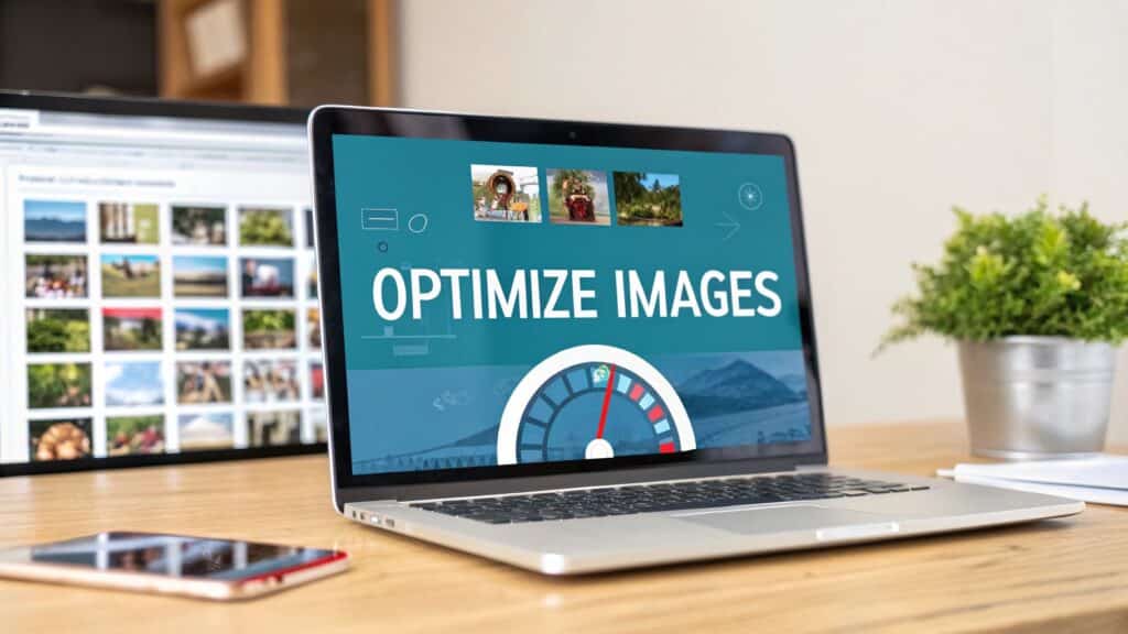
Optimizing your website’s images really boils down to three key things: picking the right format, shrinking the file size, and writing good alt text. When you nail this process, your visuals load lightning-fast without looking blurry, which is a massive win for both your visitors and your search engine rankings. A practical example of how to optimize website images is an e-commerce product page; if the product photos load slowly, a potential customer is more likely to leave before they can even consider making a purchase.
Why Image Optimization Is Your Secret SEO Weapon
Before we get into the nuts and bolts, let’s talk about why this is such a big deal. Large, heavy images are almost always the number one reason a website feels slow. They eat up a ton of bandwidth, making people wait around for your content to appear. More often than not, they just get frustrated and leave.
That bad first impression does more than just annoy visitors—it actively hurts your SEO. Google has made it crystal clear that page speed is a huge ranking factor. When your images drag down your load times, especially on mobile, it creates a domino effect:
- Higher Bounce Rates: People will click the back button before your page even has a chance to load.
- Worse User Engagement: A choppy, slow experience kills any chance of a user sticking around to interact with your content.
- Lower Conversion Rates: Nobody is going to buy a product or fill out a form on a site that feels broken and slow.
The Real-World Business Impact
This isn’t just theory; we’ve seen the direct link between page speed and business results time and time again. Big brands have proven that even tiny improvements can lead to huge returns.
Walmart, for example, found that for every single second they shaved off their page load time, their conversions jumped by 2%. Later, a company called Zitmaxx Wonnen saw its mobile revenue shoot up by an incredible 98.7% after they got their load time down to just three seconds, mostly by overhauling their image optimization. More recently, NDTV slashed their bounce rates by 50% after optimizing their images and improving their Core Web Vitals scores. You can read more about these image optimization case studies to really see the impact.
The takeaway here is simple: optimizing your images isn’t just a technical checklist item. It’s a core business strategy that directly impacts user happiness, search visibility, and your bottom line.
When you’re figuring out how to improve website speed, tackling your images should be at the top of your list. It’s one of the highest-impact changes you can make with a relatively small amount of effort. By making your images leaner and meaner, you create a much better experience for your audience and send all the right signals to Google.
Choosing the Right Image Format for the Job
Picking the right image format isn’t just a minor technical checkbox; it’s one of the first and most critical decisions you’ll make when optimizing images for your website. Think of it like a builder picking the right tool for the job. You wouldn’t use a sledgehammer to hang a picture frame, right? The same logic applies here. Each format has its own strengths and weaknesses that directly impact file size, visual quality, and ultimately, your site’s performance.
The old standbys you probably know are JPEG, PNG, and maybe SVG. Each one has a specific job it does well. A vibrant, detailed photograph for a travel blog? That’s a perfect use case for a JPEG, which is designed to handle millions of colors efficiently. But if you’re working with a company logo that needs a transparent background, a PNG is your go-to. Using a JPEG would just leave you with a clunky, unprofessional white box around it.
The New Kids on the Block: Modern Formats
While JPEG and PNG have been the workhorses of the web for decades, newer formats like WebP and AVIF are completely changing the game. These next-gen formats offer significantly better compression, which means you get the same (or better!) quality at a much smaller file size.
Imagine an e-commerce store with thousands of high-resolution product shots. Switching from JPEG to WebP could slash page load times, which we all know leads to a better user experience and can have a real impact on sales. Actionable Insight: Use a free online converter to turn your existing JPEGs and PNGs into WebP files. Test them on your site and measure the speed difference with Google PageSpeed Insights.
The core of image optimization is finding that sweet spot between image quality and file size. Modern formats like WebP are now the standard recommendation for any site with lots of images because their superior compression directly boosts your Core Web Vitals scores.
Adopting these newer formats is a huge step forward in any modern optimization workflow. For a much deeper look into striking this balance, our WordPress image optimization guide walks through more advanced strategies.
This image breaks down the key differences and best uses for common web image formats.
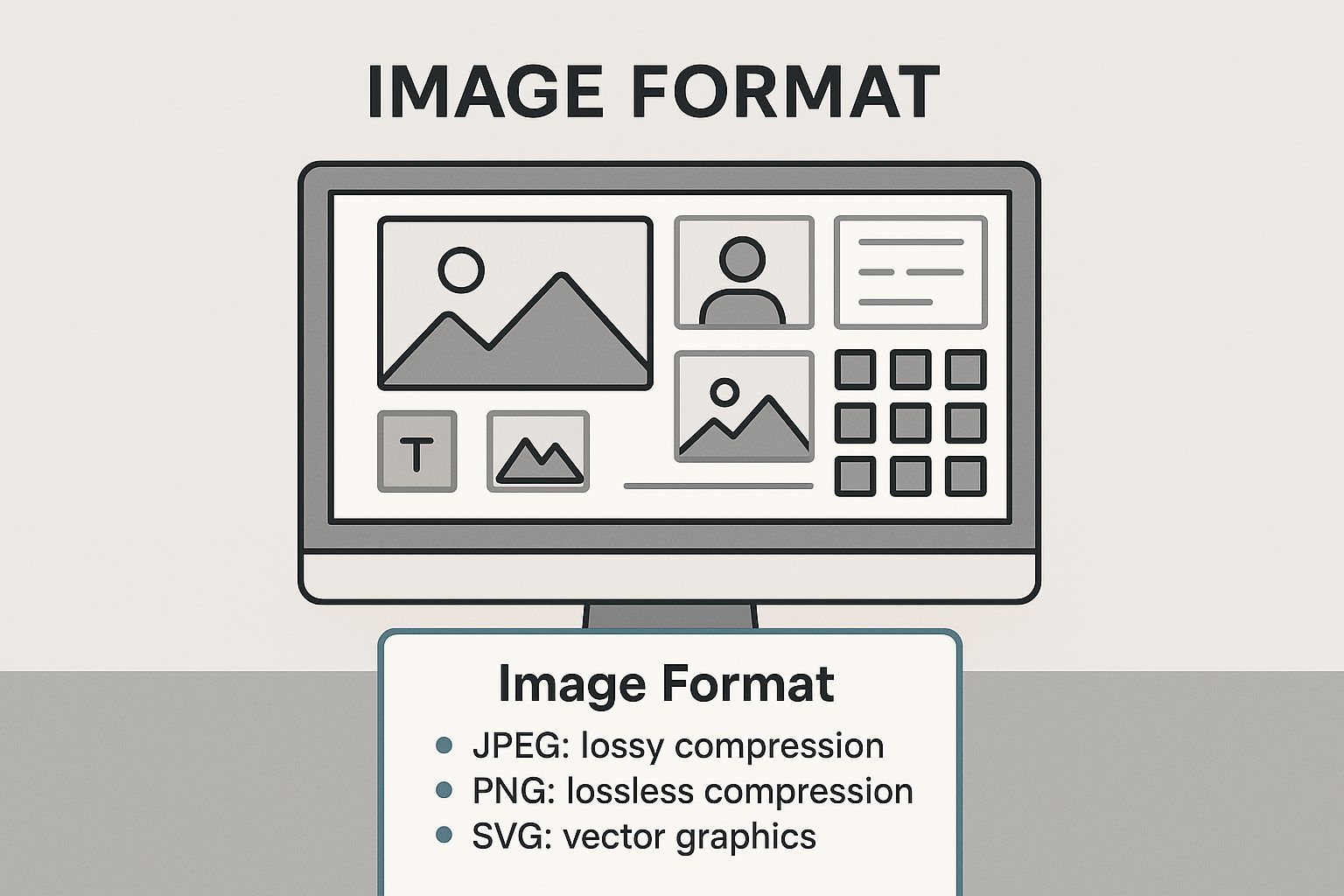
As you can see, modern formats like WebP often come out on top as the best all-around choice for web performance.
A Practical Comparison
To make the right call, you need to understand the trade-offs. Here’s a quick-reference guide I put together to help you decide which format to use and when.
Image Format Comparison Guide
| Format | Best For | Compression Type | Supports Transparency? | Key Benefit |
|---|---|---|---|---|
| JPEG | Complex photos, images with many colors | Lossy | No | Excellent color handling, widely supported |
| PNG | Logos, icons, graphics with sharp lines | Lossless | Yes | Preserves transparency and sharp details perfectly |
| WebP | A versatile replacement for JPEG & PNG | Lossy & Lossless | Yes | Superior compression, animation support |
| SVG | Logos, icons, simple illustrations | Vector (N/A) | Yes | Infinitely scalable with no quality loss |
Choosing the right format from this list is a fundamental skill for balancing your site’s performance with its visual appeal. It’s not just about making things look good; it’s about making them load fast, too.
Here’s a quick rundown of what this all means in practice:
JPEG (Joint Photographic Experts Group): Your default for photographs and images with gradients or millions of colors. It uses lossy compression, which cleverly discards a tiny bit of data to shrink the file size, but the quality difference is usually impossible to spot.
PNG (Portable Network Graphics): The undisputed champion for graphics that need a transparent background, like logos or icons. It uses lossless compression, meaning it keeps every single pixel of data. The trade-off? Much larger file sizes compared to JPEGs.
WebP: This format, developed by Google, is a fantastic all-rounder. It supports both lossy and lossless compression, transparency, and even animation. On average, WebP files are 25-34% smaller than an equivalent JPEG without any noticeable drop in quality. It’s a huge win for performance.
SVG (Scalable Vector Graphics): This one is different. SVGs are vector-based, built from mathematical formulas instead of pixels. This allows them to scale to any size—from a tiny favicon to a massive billboard—without ever getting blurry. They are perfect for logos, icons, and simple illustrations.
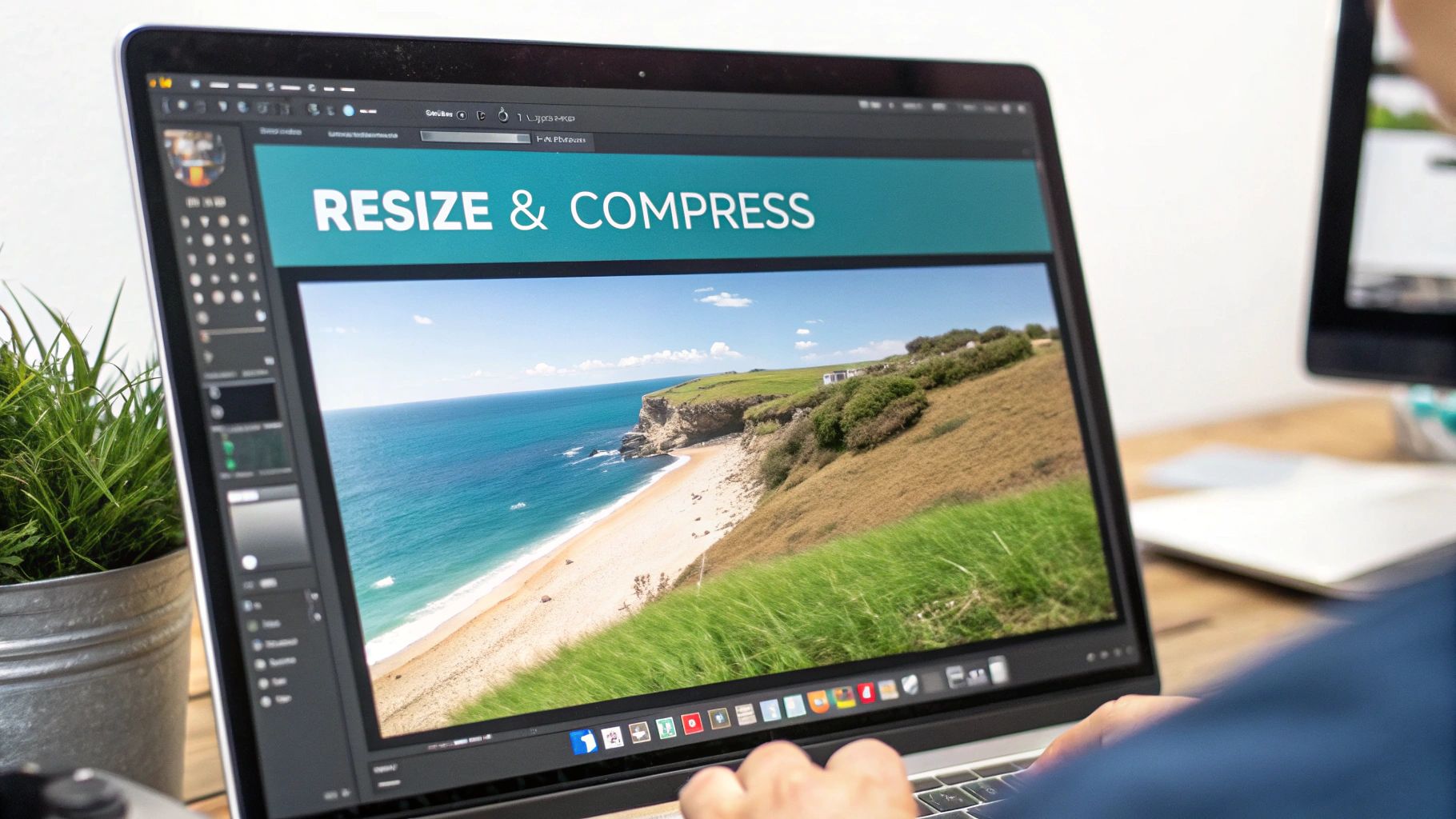
Getting Image Compression and Sizing Just Right
Choosing the right format is a great start, but the real magic happens with smart compression and sizing. This is where you’ll see the biggest wins for your page speed because you’re directly shrinking the file size—the number one thing that makes images slow down a website. Once you nail this workflow, you can repeat it for every image you upload, keeping your site lean and fast.
First, let’s talk about the two main types of compression: lossy and lossless.
Think of lossless compression like packing a suitcase perfectly. You fit everything in more efficiently to save space, but all the original items are still there. It trims the file size without any drop in quality, which is perfect for technical diagrams or crisp graphics where every single pixel counts.
Lossy compression, on the other hand, is more like packing that same suitcase but deciding to leave behind a few things you won’t really miss. It cleverly removes tiny bits of image data that the human eye is unlikely to notice. For most photos on the web, this is the way to go. You get a massive reduction in file size for a drop in quality that’s often completely invisible.
Finding the Sweet Spot for Dimensions
Before you even touch a compression tool, you have to resize your images. One of the most common mistakes I see is people uploading a 4000-pixel wide photo straight from their digital camera. No website needs an image that huge. It just forces the browser to do the extra work of shrinking it down, which wastes a ton of bandwidth.
Instead, figure out the right size for where the image will actually be displayed. A good rule of thumb is to keep most images between 1280px and 1920px wide and aim for a file size under 200KB. A full-width hero image might sit comfortably at 1920×1080 pixels, while a standard blog post image could be closer to 1200px wide. Sticking to these guidelines is a game-changer for load times.
The goal is simple: don’t upload files that are bigger than they need to be. By resizing first, you make the compression tool’s job easier, which leads to an even smaller final file and better scores on your Core Web Vitals.
Easy-to-Use Tools That Get the Job Done
You don’t need to be a Photoshop pro to handle this. There are plenty of fantastic, user-friendly tools that make image compression a breeze.
- TinyPNG / TinyJPG: My go-to for quick and easy compression. It’s a web-based tool where you just drag and drop your files, and it uses smart lossy compression to shrink them down dramatically.
- ImageOptim: If you’re on a Mac, this free app is a must-have. It finds the best compression settings for you and strips out unnecessary metadata, giving you a great mix of power and simplicity.
- Squoosh: This is a seriously powerful, browser-based tool from Google. It lets you play with different compression settings and formats in real-time, showing you a live preview so you can see exactly how the quality is affected.
If you’re on Shopify, you might want to explore some platform-specific techniques. There are some excellent Shopify home page image size optimization strategies that can help you dial things in perfectly.
Just remember the workflow: resize first, then compress. It’s a simple process that ensures every image you add to your site is optimized for performance from the get-go.
Writing SEO-Friendly Alt Text and File Names
Shrinking file sizes is a huge part of image optimization, but it’s only half the battle. You also have to give search engines and screen readers the context they need to understand what your images are actually about. This is where well-crafted alt text and descriptive file names become your secret weapons for boosting both accessibility and search rankings.
Think about it from a search engine’s perspective. A crawler can’t see your image the way a person does. It relies completely on the text you provide to figure out what’s in the picture. Skipping this step is like hanging a masterpiece in a gallery with a blank description card—a massive missed opportunity.
Crafting a Winning File Name
Your optimization work starts before you even upload the image. The file name is your very first chance to give Google a clue. A generic, camera-generated name like IMG_8754.jpg tells a search engine absolutely nothing.
Instead, get into the habit of creating descriptive, keyword-rich file names that accurately describe the image. Always use hyphens to separate words; it’s the standard practice search engines understand best.
Let’s look at a real-world example:
- Before:
DCIM_1023.JPG - After:
blue-suede-running-shoes-on-white-background.jpg
This simple switch makes a world of difference. The “after” example is not just descriptive, it’s searchable. Someone typing “blue suede running shoes” into Google is now far more likely to come across your image and, by extension, your website.
Writing Alt Text That Actually Works
Alternative text (or alt text) is an HTML attribute you add to an <img> tag. Its main job is accessibility—it’s what screen readers announce to visually impaired users, allowing them to “see” the image through words. But it’s also a powerful SEO signal. On top of that, if an image ever fails to load, the alt text shows up in its place, so the user still knows what was supposed to be there.
Good alt text paints a picture with words. It should be descriptive but also concise. And while it’s a perfect spot to include your target keyword, you have to avoid “keyword stuffing” at all costs. The description must sound natural and be genuinely helpful.
The best alt text describes the image for someone who can’t see it, while naturally weaving in relevant keywords. The goal is always to be helpful, not just to cram in as many search terms as possible.
Let’s break down what makes for good and bad alt text with a practical example for an image of a golden retriever playing fetch:
- Bad (Keyword Stuffing):
alt="dog puppy retriever pet fetch ball" - Okay (Too Vague):
alt="dog with a ball" - Good (Descriptive & SEO-Friendly):
alt="A golden retriever catching a red ball in a grassy field"
The “Good” example is perfect. It’s descriptive enough for a screen reader and includes the core keywords (“golden retriever,” “ball,” “field”) in a way that feels completely natural. If you want to get into the technical weeds, Wikipedia’s page on the alt attribute offers a great deep dive.
By mastering both file names and alt text, you give your images the best possible shot at ranking well and driving valuable traffic to your site.
Going Beyond the Basics with Advanced Optimization
Once you’ve got the fundamentals down—choosing the right format, compressing your files, and writing good alt text—it’s time to dig into the techniques that really move the needle on performance. This is where we get into responsive images and lazy loading, two absolute must-haves for any modern website, especially with so much traffic coming from mobile devices.
These strategies are all about being smarter with how and when you deliver images to a user’s browser. Getting this right leads to faster initial page loads, a much smoother experience for your visitors, and a nice little boost to your Core Web Vitals scores.
Serving Up the Perfect Image with Srcset
The srcset attribute is one of the most powerful and, frankly, underutilized tools for image optimization. It’s a simple idea with a huge impact: instead of one image for all, you give the browser a menu of different-sized versions of the same image. The browser then gets to be the smart one, picking the perfect size based on the user’s screen dimensions and resolution.
This completely changes the game for mobile users. A tiny phone screen won’t be forced to download a massive, high-resolution image designed for a 27-inch desktop monitor. It just downloads the smaller, appropriate version, saving bandwidth and precious loading time.
Here’s a practical code example:
<img src="flower-small.jpg"
     srcset="flower-small.jpg 480w,
             flower-medium.jpg 800w,
             flower-large.jpg 1200w"
     sizes="(max-width: 600px) 480px,
            (max-width: 900px) 800px,
            1200px"
     alt="A vibrant red flower with green leaves">
In this example, we’ve provided three image options and told the browser exactly which one to use depending on the viewport width. It’s a set-it-and-forget-it way to ensure everyone gets a fast experience.
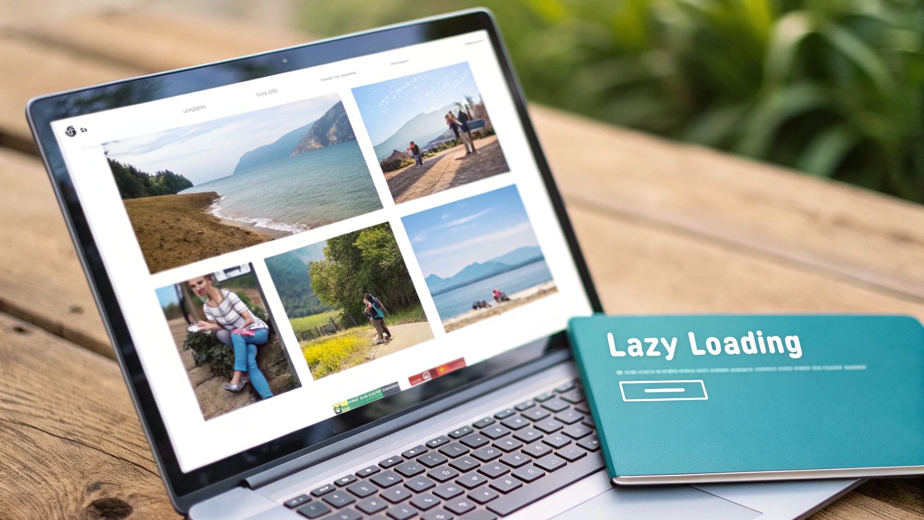
Don’t Load What You Can’t See: Lazy Loading
Another critical technique is lazy loading. It’s brilliant in its simplicity. Instead of loading every single image on a page right away, the browser only loads the images that are currently visible. As the user scrolls down, the images further down the page are loaded just before they come into view.
For image-heavy pages like blog posts or product galleries, the performance gains are massive. The initial page load is lightning-fast because the browser is only dealing with the content “above the fold.”
Lazy loading isn’t just a gimmick; it directly improves your Largest Contentful Paint (LCP) score. By deferring images that aren’t immediately visible, you’re telling the browser to prioritize the most important content first.
Implementing it is surprisingly easy these days. You have two main options:
- Native Lazy Loading: The modern, simple approach. Just add
loading="lazy"to your<img>tag, and all major browsers will handle the rest. It doesn’t get much easier than that. - JavaScript Libraries: If you need more granular control or need to support older, legacy browsers, a library like Lazysizes is a fantastic, battle-tested solution.
If you’re looking to dive even deeper, there’s a complete guide to optimizing images for web to boost site speed that covers these topics in great detail. Remember, these advanced image tricks are just one piece of the puzzle. They work best when combined with other performance-enhancing strategies, like the ones we cover in our guide to 10 WordPress speed optimization techniques.
Frequently Asked Questions
Diving into image optimization often brings up a ton of questions. You’re trying to make your site fast without turning your beautiful photos into pixelated messes. I get it. Here are some straightforward answers to the questions I hear most often.
What’s the Biggest Mistake People Make with Website Images?
Hands down, the single biggest error is uploading images straight from a camera. I’ve seen it countless times—a gorgeous photo that’s 4000 pixels wide and weighs a whopping 5MB. That kind of file size will absolutely kill your page speed.
Before an image ever touches your website, it needs to be prepped. First, resize it to the largest size it will actually be displayed at. A full-width blog hero image, for example, probably doesn’t need to be wider than 1200px. After resizing, run it through a compression tool. Your goal should be to get that file size well under 200KB.
How Do I Know if My Images Are Actually Optimized?
You don’t have to guess. The easiest way to get a clear picture is to use a free tool like Google PageSpeed Insights or GTmetrix. Just plug in your URL, and they’ll spit out a detailed performance report that flags any problematic images.
These reports are your best friend for a quick audit. They don’t just say “fix your images”; they’ll pinpoint exactly which ones are too big in file size or dimensions. Sometimes, they even give you an already-compressed version you can download and swap in.
Can I Fix Images That Are Already on My Website?
Yes, absolutely. You’re not stuck with slow images forever. If you’re on a platform like WordPress, you can use a plugin like Smush or ShortPixel. These tools can scan your entire media library and compress your existing images in bulk, which is a huge time-saver.
If you’re not on WordPress, the process is a bit more manual. You’ll likely need to download the images, run them through a web-based tool like TinyPNG, and then re-upload them to replace the old files. It’s a little work, but the performance gains are immediate and totally worth it.
Does a CDN Actually Help with Image Optimization?
A Content Delivery Network (CDN) is a game-changer for image delivery. Think of it as a global network of servers that all hold a copy of your images. When someone visits your site, the images are served from the server physically closest to them, which drastically cuts down on loading time.
On top of that, many modern CDNs do the heavy lifting for you. They can automatically compress images, convert them to next-gen formats like WebP for browsers that support it, and resize them on the fly. It simplifies your whole process. You can get a deeper technical dive by reading up on the Content Delivery Network page on Wikipedia.
Ready to stop worrying about slow load times and start seeing real results? At Galant Studios, we specialize in comprehensive website optimization that turns your site into a high-performance, traffic-driving machine. Let us handle the technical details so you can focus on growing your business. Book a call with us today!