
With Google’s mobile-first indexing now the undisputed standard, the line between your mobile strategy and your overall SEO success has completely vanished. If your website isn’t flawlessly optimized for mobile users, it’s not just underperforming; it’s actively losing ground to competitors who are. The reality is simple: the majority of search traffic originates from smartphones, and search engines prioritize sites that deliver an exceptional experience on these devices.
This guide moves beyond generic advice to provide a comprehensive, actionable roadmap. We will dissect eight critical mobile SEO best practices that directly impact your search rankings and user engagement. You won’t find vague suggestions here. Instead, you’ll get specific implementation steps, practical examples, and clear instructions to elevate your mobile presence.
We will cover essential strategies from the ground up, including:
- Responsive Web Design: Ensuring a seamless layout across all screen sizes.
- Mobile Page Speed: Drastically cutting load times to reduce bounce rates.
- Mobile-First Indexing: Aligning your site with how Google crawls and ranks content.
- Mobile-Friendly UI: Designing intuitive navigation and interactive elements for smaller screens.
- Local SEO for Mobile: Capturing “near me” searches and driving foot traffic.
Each section is designed to give you the tactical knowledge needed to not just meet Google’s expectations but to create a mobile experience that converts visitors into customers. This is your definitive checklist for mastering mobile search performance and securing a competitive edge.
1. Responsive Web Design
Responsive Web Design (RWD) is the cornerstone of modern mobile SEO best practices. It ensures your website provides an optimal viewing experience across a vast range of devices, from desktop monitors to tablets and smartphones. Instead of creating separate mobile (m-dot) and desktop sites, RWD uses a single URL and one set of HTML code. The layout dynamically adapts to the user’s screen size using flexible grids and CSS media queries.
This “one site fits all” method simplifies management and prevents common SEO issues like duplicate content. Serving the same content to all users from a single URL is a powerful signal to search engines, streamlining crawling, indexing, and ranking efforts. For a practical example, look at a news site like Smashing Magazine. On a desktop, it displays multiple columns of content, but on a mobile device, the same content reflows into a single, easy-to-scroll column, all from the same URL.

Why It’s a Top Priority
With Google’s mobile-first indexing, the mobile version of your site is the primary one used for ranking. A responsive design guarantees that search engine bots and human visitors see the same content, creating a consistent and reliable user experience that Google rewards.
“A responsive design is no longer a ‘nice-to-have’; it is a fundamental requirement for discoverability and user satisfaction in a mobile-first world.”
Actionable Implementation Tips
To effectively implement responsive design, focus on flexibility and the user experience:
- Adopt a Mobile-First Approach: Design the mobile experience first, then scale up to larger screens. This forces you to prioritize essential content and functionality. For example, a restaurant website would prioritize its menu, location, and a “Reserve Now” button for the mobile view, then add more decorative elements for desktop.
- Use Flexible Units: Instead of fixed pixels, use relative units like percentages (%), ems, or rems for layout grids and typography. This allows elements to fluidly resize based on the screen.
- Optimize Images: Implement the
srcsetattribute in your<img>tags to serve different image sizes based on screen resolution and size, significantly improving page load times on mobile. - Create Touch-Friendly Elements: Ensure buttons and navigation links are large enough and have adequate spacing to be easily tapped with a finger, avoiding user frustration. For a deeper dive into how your site can adapt to various screen sizes, explore the principles of mobile responsive web design.
2. Mobile Page Speed Optimization
Mobile page speed optimization is the practice of ensuring web pages load as quickly as possible on mobile devices. In an era where users expect instant access to information, speed is not just a feature; it’s a fundamental aspect of user experience and a confirmed Google ranking factor. A classic example is Amazon, which calculated that a one-second page load slowdown could cost it $1.6 billion in sales each year.
The impact of speed is well-documented. Pinterest increased sign-ups by 40% after improving page load times, while the BBC found it lost an additional 10% of users for every extra second their site took to load. These examples underscore that optimizing for mobile speed is a critical component of any successful mobile SEO best practices strategy, directly influencing both search visibility and business outcomes.

Why It’s a Top Priority
Since Google’s 2018 “Speed Update” and the subsequent introduction of Core Web Vitals, mobile page speed has become a direct and measurable ranking signal. Slow-loading pages lead to higher bounce rates, lower user satisfaction, and reduced conversions, all of which signal a poor user experience to search engines. A fast mobile site is essential for capturing and retaining user attention in a competitive digital landscape.
“Every second of delay in mobile page load time can drastically reduce conversions and user engagement, making speed optimization a non-negotiable for modern SEO.”
Actionable Implementation Tips
To effectively boost your mobile page speed, focus on reducing the total amount of data the browser needs to download and render:
- Audit with PageSpeed Insights: Regularly use Google’s PageSpeed Insights tool to analyze your mobile site’s performance. It provides a detailed report with actionable recommendations based on real-world user data. For instance, it might tell you to “Eliminate render-blocking resources,” which means you need to rearrange how your CSS and JavaScript files load.
- Implement Lazy Loading: Configure images and iframes to load only when they are about to enter the viewport. This technique, known as lazy loading, prioritizes above-the-fold content and significantly cuts initial load times.
- Compress and Optimize Images: Use modern image formats like WebP, which offer superior compression compared to JPEG and PNG. Also, ensure images are correctly sized for mobile screens to avoid sending unnecessarily large files.
- Minimize Code and Requests: Minify your CSS, JavaScript, and HTML files to remove unnecessary characters and comments. Combine multiple CSS or JS files into a single file to reduce the number of HTTP requests the browser must make.
- Enable Server-Side Compression: Use GZIP or Brotli compression on your web server to reduce the size of the files being sent to the user’s browser, which can dramatically decrease load times.
3. Mobile-First Indexing Optimization
Mobile-first indexing is a fundamental shift in how Google understands and ranks websites. Announced in 2016 and now the default for all sites, this approach means Google predominantly uses the mobile version of your content for indexing and ranking. This evolution in search makes optimizing your mobile site a non-negotiable component of any successful digital strategy, as it directly determines how search engines perceive your entire online presence.
This principle forces businesses to prioritize the mobile experience, not as an afterthought, but as the core version of their site. For example, an e-commerce store must ensure product descriptions, images, and reviews are identical across both desktop and mobile. A practical scenario would be if a blog hides certain widgets or author bios on the mobile version to save space. With mobile-first indexing, Google might not see that hidden content, potentially devaluing the page.
Why It’s a Top Priority
Since Google’s crawler, Googlebot, primarily views your site through a mobile lens, any discrepancies can severely impact your rankings. A stripped-down mobile site that hides important content or lacks key internal links will be seen as less valuable, leading to diminished visibility in search results. Adhering to mobile-first indexing is essential for accurate indexing and competitive ranking.
“In a mobile-first world, your mobile website is your website. There is no longer a distinction in the eyes of Google.”
Actionable Implementation Tips
To align with mobile-first indexing, focus on consistency and accessibility across all devices:
- Ensure Content Parity: The content on your mobile site, including text, images, and videos, must be the same as your desktop site. Use collapsible sections like accordions for lengthy content on mobile to improve user experience without hiding it from Google. A classic example is an FAQ page where questions are visible, and answers are revealed on tap.
- Synchronize Meta Data: Your meta titles, descriptions, and other tags should be identical on both versions. Discrepancies can confuse search engines and dilute your SEO signals.
- Verify Structured Data: Make sure any structured data (like schema markup) present on your desktop site is also implemented correctly on the mobile version to support rich results.
- Check All Crawlable Links: Important internal and external links must be present and accessible on the mobile site. To ensure your site is ready for search engines prioritizing mobile content, you can further explore how to master the mobile-first approach for digital success.
4. Accelerated Mobile Pages (AMP)
Accelerated Mobile Pages (AMP) is an open-source framework, originally championed by Google, designed to create lightning-fast mobile web pages. It achieves near-instant load times by using a streamlined version of HTML, known as AMP HTML, which imposes strict limitations on CSS and JavaScript. Pages built with AMP are often cached on Google’s own servers, allowing them to be served to mobile users almost instantaneously directly from search results.
This focus on raw speed makes AMP a powerful tool for publishers and content-heavy sites. Its impact is well-documented; The Washington Post saw an 88% improvement in load time for AMP content, while Gizmodo experienced 80% faster loads. This speed directly enhances the user experience, which is a critical component of effective mobile SEO best practices.

Why It’s a Top Priority
While AMP is no longer a direct ranking factor, page speed remains a crucial one, and AMP is one of the most effective ways to guarantee a fast mobile experience. For news publishers and bloggers, an AMP version can significantly reduce bounce rates and increase engagement, as users are far less likely to abandon a page that loads in under a second.
“AMP strips web pages down to their essential elements, delivering pure speed and a frictionless content consumption experience for mobile users.”
Actionable Implementation Tips
Implementing AMP requires creating parallel versions of your pages. Here’s how to do it effectively:
- Start with Key Content: Begin by creating AMP versions of your most popular content, such as blog posts, articles, or news stories. These high-traffic pages will benefit most from the speed improvements.
- Use Correct Canonicalization: Ensure your AMP page includes a
<link rel="canonical" href="your-original-page-url">tag pointing to the original non-AMP version. Likewise, the original page should have a<link rel="amphtml" href="your-amp-page-url">tag pointing to the AMP version. This prevents duplicate content issues. - Validate Your Code: Use Google’s AMP Test tool during development to find and fix validation errors. Valid AMP is required for pages to be served from Google’s cache and receive special treatment in search results.
- Monitor Performance: Keep a close eye on the AMP report in Google Search Console. It will alert you to any errors or issues that could prevent your pages from being indexed and served correctly.
- Leverage AMP for More: Consider extending AMP beyond articles. The framework also supports stories, ads, and emails, offering a way to deliver fast experiences across multiple channels. For a technical overview, the Wikipedia page on Accelerated Mobile Pages provides a solid starting point.
5. Mobile-Friendly User Interface Design
Beyond a technically responsive layout, a truly mobile-friendly experience hinges on User Interface (UI) design optimized for touch and small screens. This practice ensures that every element is intuitive and easy to use with a thumb. It goes beyond resizing content and focuses on creating an interface that feels natural on a mobile device, prioritizing usability and accessibility.
This focus on mobile-first interaction is a core element of modern mobile SEO best practices. A user who can navigate, click, and convert with ease is less likely to bounce, sending positive user engagement signals to search engines. For a practical example, think of the Airbnb app. Its mobile interface uses large, clear buttons for “Check Availability” and simple swipe gestures to browse photos, making the complex process of booking a stay feel effortless on a small screen.
Why It’s a Top Priority
Google’s algorithms increasingly factor in user experience metrics. A clunky, hard-to-use mobile interface leads to high bounce rates and low engagement, which can directly harm your search rankings. A well-designed mobile UI not only delights users but also signals to search engines that your site provides a high-quality, relevant experience worthy of a top spot.
“Your website’s interface is the conversation you have with your user. On mobile, that conversation needs to be clear, concise, and incredibly easy to follow with a single thumb.”
Actionable Implementation Tips
To create a genuinely mobile-friendly UI, focus on the nuances of touch interaction:
- Design for Thumbs: Place key navigation elements and call-to-action buttons within the “thumb-friendly zone” at the bottom and center of the screen for easy one-handed operation.
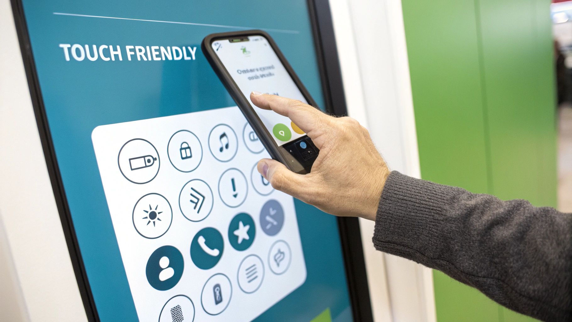
- Use Large, Tappable Targets: Ensure buttons, links, and form fields are at least 48×48 pixels, as recommended by Google. Add ample spacing between interactive elements to prevent accidental taps. A simple example is increasing the padding around social media icons so users don’t accidentally click the wrong one.
- Simplify Forms: Minimize the number of required fields in your forms. Use mobile-friendly inputs like dropdowns, steppers, and date pickers to reduce the need for typing.
- Optimize Navigation: Employ familiar mobile navigation patterns like a hamburger menu for extensive options or a bottom tab bar for core features. Ensure navigation is consistent and predictable. For a deeper look at designing a seamless mobile experience, you can explore the principles of mobile-friendly website design.
6. Local SEO Mobile Optimization
Local SEO Mobile Optimization is the process of fine-tuning your online presence to capture customers searching for nearby businesses on their smartphones. This strategy recognizes that mobile users often have immediate, location-based intent. They are looking for directions, business hours, or a specific product “near me,” and your business needs to appear at that exact moment of need.
This practice goes beyond general SEO by focusing on geographical signals and mobile-specific search features. A practical example is a user searching “coffee shop near me.” The businesses that appear in the Google Maps “local pack” at the top of the results have successfully optimized for local mobile search. Companies like Home Depot excel at this, offering mobile users local store inventory levels, while Starbucks uses its app’s store locator to seamlessly guide customers to the nearest coffee shop.
Why It’s a Top Priority
A significant portion of mobile searches have local intent. When a user searches for “pizza place” or “car repair near me,” Google prioritizes businesses that are physically close and have a well-optimized local presence. Failing to optimize for mobile local search means you are invisible to a massive segment of highly motivated buyers in your immediate area, making this one of the most crucial mobile SEO best practices for brick-and-mortar businesses.
“For local businesses, mobile is not just a channel; it is the primary bridge connecting a digital search to a physical footstep through your door.”
Actionable Implementation Tips
To effectively optimize for mobile local search, focus on accuracy, relevance, and accessibility:
- Ensure NAP Consistency: Your business Name, Address, and Phone number (NAP) must be identical across all online directories, your website, and your Google Business Profile. Inconsistencies create confusion for search engines and can harm your local rankings.
- Optimize for “Near Me” and Voice Search: Structure your content to answer common local queries. For instance, create a page titled “Best Plumber in Downtown Seattle” and include phrases like “emergency plumbing services near downtown Seattle” to match what users are actually searching for.
- Encourage Mobile Reviews: Positive reviews are a powerful local ranking signal. Make it easy for customers to leave feedback from their phones by sending them a direct link to your Google review page via text or email after a purchase.
- Utilize Local Business Schema: Implement structured data (Schema.org markup) for your local business. This helps search engines understand critical information like your address, opening hours, and services, which can result in rich snippets in search results. To put your mobile local SEO plan into action, delve deeper into effective local SEO strategies that can help your business dominate local search results. You can also learn more about how these signals work by exploring key local SEO ranking factors.
7. Mobile Technical SEO Implementation
Beyond design and speed, Mobile Technical SEO Implementation focuses on the behind-the-scenes optimizations that ensure search engines can properly crawl, index, and understand your mobile content. This discipline addresses the technical foundation of your site, making sure that settings like canonical tags, redirects, and sitemaps are configured correctly for mobile users and search engine bots. It’s the framework that supports all other mobile SEO efforts.
A practical example of this is properly handling pop-ups. Google penalizes sites that use intrusive interstitials (pop-ups that cover the main content) on mobile because they create a poor user experience. A technical SEO expert would ensure that any necessary pop-ups, such as cookie consent banners, are implemented in a way that doesn’t violate Google’s guidelines, thereby protecting the site’s mobile rankings.
Why It’s a Top Priority
With mobile-first indexing, Google predominantly uses the mobile version of your content for indexing and ranking. Any technical issues on your mobile site, such as incorrect canonical tags pointing to the desktop version or blocked resources in robots.txt, can severely damage your search performance. Proper mobile technical SEO ensures search engines see your mobile site exactly as you intend them to.
“A flawless mobile user experience is built on a solid technical foundation. Neglecting mobile technical SEO is like building a skyscraper on sand.”
Actionable Implementation Tips
To strengthen your site’s mobile technical foundation, focus on these critical areas:
- Configure the Viewport Meta Tag: Ensure every page has a
<meta name="viewport" content="width=device-width, initial-scale=1.0">tag. This tag tells browsers how to control the page’s dimensions and scaling, making it render correctly on mobile devices. - Verify Canonical Tags: On sites with separate mobile URLs (m-dot), ensure each mobile page has a
rel="canonical"tag pointing to its equivalent desktop URL. The desktop page should have arel="alternate"tag pointing back to the mobile version. - Audit with Google’s Tools: Regularly use Google Search Console’s “Mobile Usability” report to identify errors like “Content wider than screen” or “Clickable elements too close together.” Use the Rich Results Test to validate your structured data for mobile-friendliness.
- Check for Mobile Crawl Errors: Monitor your site for any crawl errors specific to the mobile Googlebot. Ensure that critical resources like CSS, JavaScript, and images are not blocked in your
robots.txtfile, as this prevents Google from fully rendering and understanding your mobile page. For a comprehensive overview, you can learn more about technical SEO optimization.
8. Mobile Content Strategy and Optimization
A Mobile Content Strategy is the practice of creating and structuring information specifically for the on-the-go consumption patterns of mobile users. This goes beyond simply making text fit on a small screen; it involves rethinking content format, length, and delivery to match the context of mobile browsing. It acknowledges that mobile users are often multi-tasking and seek quick, scannable information.
The core principle is to deliver value efficiently. For a practical example, instead of a long-form article on “How to Cook Pasta,” a mobile-first content strategy would present it as a step-by-step numbered list with an embedded video at the top for users who prefer watching over reading. Companies like BuzzFeed excel at this with their highly shareable listicles, while platforms like Medium have perfected the mobile reading experience with clean typography and ample white space.
Why It’s a Top Priority
Mobile users have different intent and less patience than desktop users. A content strategy that ignores this reality will lead to high bounce rates and poor engagement signals, telling Google that your page isn’t a good answer to their query. Optimizing content for mobile ensures visitors can find what they need quickly, leading to a better user experience and, consequently, improved mobile search rankings.
“Your content isn’t truly optimized until it’s optimized for the user’s context, and on mobile, that context is all about speed and clarity.”
Actionable Implementation Tips
To effectively create a mobile-first content strategy, prioritize scannability and immediate value:
- Use “Snackable” Formatting: Break up large text blocks with short paragraphs (2-3 sentences), bullet points, and numbered lists. This makes content easier to scan and digest on small screens.
- Create Concise, Powerful Headlines: Mobile screens show fewer characters in search results. Write shorter, more conversational headlines that get straight to the point and capture attention immediately. For instance, “Five Easy Ways to Improve Your Mobile SEO” is better than “A Comprehensive Guide to the Methodologies of Mobile Search Engine Optimization.”
- Implement Expandable Content: Use accordions or “read more” toggles for secondary information. This keeps the initial view clean and allows users to explore details if they choose, without overwhelming them.
- Design Mobile-Specific CTAs: Instead of small text links, use large, easily tappable buttons for your calls-to-action. Place them strategically where a user is most likely to act. For a deeper understanding of how user behavior shapes content, review the principles of content strategy.
Mobile SEO Best Practices Comparison
| Item | Implementation Complexity 🔄 | Resource Requirements ⚡ | Expected Outcomes 📊 | Ideal Use Cases 💡 | Key Advantages ⭐ |
|---|---|---|---|---|---|
| Responsive Web Design | Moderate to High – managing complex media queries | Moderate – CSS and front-end dev resources | Consistent UX across devices, SEO friendly | Websites needing unified multi-device access | Cost-effective, Google recommended, easy maintenance |
| Mobile Page Speed Optimization | High – requires technical optimization and continuous monitoring | High – dev and performance tools needed | Faster load times, improved rankings & engagement | Sites prioritizing speed and SEO ranking | Better SEO, reduced bounce, higher conversions |
| Mobile-First Indexing Optimization | Moderate to High – content parity and mobile usability checks | Moderate – content management and SEO oversight | Mobile-first indexing, future-proof SEO | Sites transitioning to mobile-first SEO | Aligns with Google indexing, improves mobile UX |
| Accelerated Mobile Pages (AMP) | High – restricted coding and framework compliance | High – AMP-specific development and maintenance | Near-instant loading, possible search feature boost | Content-heavy sites needing super-fast mobile pages | Extremely fast, better on slow networks, featured placement |
| Mobile-Friendly User Interface Design | Moderate – design overhaul and UI adjustments | Moderate – UI/UX expertise | Better user engagement and accessibility | Apps and sites focused on touch usability | Higher conversions, improved accessibility, reduced frustration |
| Local SEO Mobile Optimization | Moderate – ongoing local listings upkeep | Moderate – SEO and content resources | Increased local search visibility and foot traffic | Local businesses targeting mobile search users | Higher local rankings, foot traffic, better local customer connection |
| Mobile Technical SEO Implementation | High – requires technical SEO expertise | High – SEO specialists and technical audits | Improved crawlability and indexing | Large or complex sites needing mobile SEO | Better search visibility, rich snippets, solves technical issues |
| Mobile Content Strategy and Optimization | Moderate – requires content restructuring | Moderate – content creators and strategists | Higher engagement and better mobile consumption | Content publishers focusing on mobile users | Improved engagement, social sharing, mobile search performance |
Putting Your Mobile SEO Plan into Action
The digital landscape has fundamentally shifted, with the small screen in your pocket now representing the primary battlefield for online visibility. As we’ve explored, mastering the nuances of mobile search isn’t just a single task; it’s a comprehensive strategy woven from responsive design, lightning-fast page speed, and a deep understanding of the mobile user’s intent. The journey from a desktop-centric mindset to a mobile-first approach is the single most critical pivot any modern business can make to secure its future growth.
This guide has provided a detailed roadmap covering eight essential pillars, from the foundational necessity of responsive design and the performance demands of Core Web Vitals to the granular details of mobile-friendly UI and a localized content strategy. Each of these mobile SEO best practices works in tandem. A fast-loading site is ineffective if the content is unreadable on a phone, and a beautifully designed mobile interface will fail to convert if local searchers can’t find your business on their map app.
From Knowledge to Action: Your Next Steps
The difference between a good and a great mobile strategy lies in execution and continuous improvement. Don’t let this wealth of information become passive knowledge. Instead, transform it into a prioritized action plan.
Here are your immediate next steps:
- Conduct a Mobile Audit: Start by running your website through Google’s Mobile-Friendly Test and PageSpeed Insights. This will give you a baseline performance score and a concrete list of technical issues to address, directly related to the principles we’ve discussed.
- Prioritize for Impact: You don’t have to fix everything at once. Identify the low-hanging fruit. Is your font size too small? Are your tap targets too close together? These are often quick fixes with significant user experience benefits. Then, move on to more complex projects like image compression or optimizing your JavaScript delivery.
- Walk in Your Customer’s Shoes: Go through your entire website on a mobile device, from discovery to conversion. Try to find your business on Google Maps, navigate to your product pages, and attempt to fill out a contact form. Where did you encounter friction? This firsthand experience is invaluable for identifying user interface and navigation flaws.
The Continuous Journey of Mobile Optimization
Remember, mobile SEO is not a “set it and forget it” discipline. It’s a dynamic and ongoing process. As user behavior evolves and search engine algorithms are updated, your strategies must adapt. The core principles of providing a fast, accessible, and valuable mobile experience will remain constant, but the methods for achieving them will change.
Implementing these mobile SEO best practices is your commitment to meeting users where they are: on their phones, on the go, and with high expectations. By delivering an outstanding mobile experience, you not only align with Google’s ranking preferences but also build trust, drive engagement, and ultimately, convert visitors into loyal customers. The investment you make in your mobile presence today will pay dividends for years to come, solidifying your brand’s relevance in an increasingly mobile-first world.
Feeling overwhelmed by the technical details of mobile optimization? Galant Studios specializes in transforming complex mobile SEO challenges into tangible growth opportunities for businesses like yours. Let our expert team handle the intricacies of responsive design, page speed, and technical SEO, so you can focus on what you do best. Visit Galant Studios to see how we can help you dominate the mobile search landscape.