
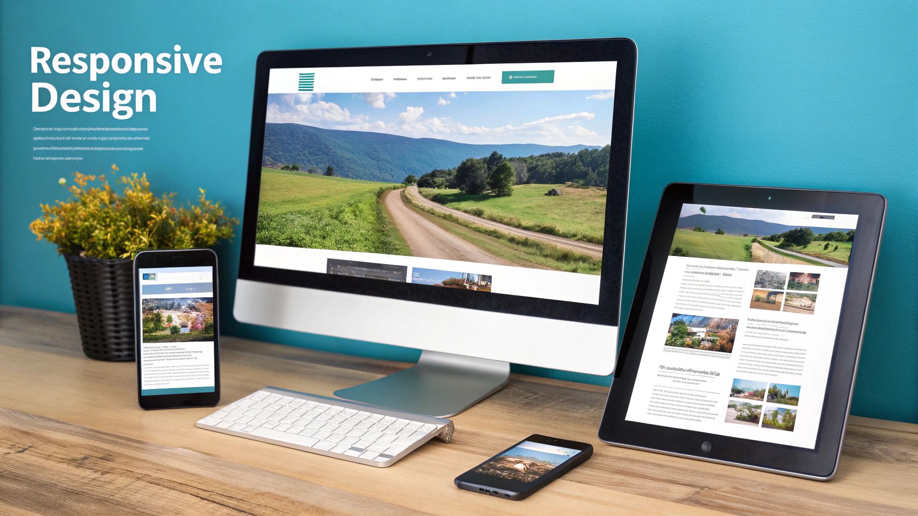
When we talk about mobile-friendly website design, we’re really talking about creating a website that works beautifully on any device someone might use, especially their phone. It’s all about giving every visitor a great experience with layouts that adapt, pages that load in a snap, and navigation that’s a breeze to use, no matter the screen size.
Frankly, if your site isn’t built for mobile today, you’re pretty much invisible to most of your audience.
Why Mobile-First Design Is No Longer Optional
Let’s get past the obvious: “everyone has a smartphone.” The real question is, what does a poor mobile experience actually cost you? Not too long ago, having a mobile site was a neat bonus. Now, it’s the absolute foundation of your online presence. It directly affects how visible you are, whether people trust you, and ultimately, your bottom line.
Ignoring this isn’t just a missed opportunity; it’s actively choosing to fall behind.

The biggest push for this change came from Google itself with its mobile-first indexing policy. This isn’t a recommendation—it’s how the web works now. Google primarily looks at the mobile version of your site to decide how to rank it. For example, if your mobile site is slow, buggy, or a watered-down version of your desktop experience, your entire SEO takes a hit, not just your mobile rankings.
The Real Cost of a Bad Mobile Experience
User behavior tells a very clear story. When someone lands on a site that forces them to pinch, zoom, and struggle to read, they get frustrated. Fast. That frustration almost always leads them to hit the “back” button.
This creates a few huge problems for any business:
- Sky-High Bounce Rates: People have zero patience for clunky mobile sites. A bad experience is a surefire way to send your bounce rate through the roof, which tells search engines your site isn’t helpful.
- Damaged Brand Reputation: A poorly designed mobile site just looks unprofessional and untrustworthy. First impressions are everything, and an amateur mobile experience can sour a potential customer on your brand for good.
- Lost Conversions and Revenue: Every extra second a page takes to load, or every button that’s too small to tap, is a roadblock. For an e-commerce site, this friction during checkout can directly lead to abandoned carts and lost sales.
The modern consumer expects a seamless experience, whether they’re on a laptop or a phone. When the mobile experience is bad, they don’t blame the technology—they blame the business. It’s about respecting your customer’s time and attention.
Before diving into the technical details, it’s helpful to understand the core principles that make a website genuinely mobile-friendly.
Core Pillars of Mobile Friendly Website Design
| Pillar | Description | Key Objective |
|---|---|---|
| Responsive Design | The layout automatically adjusts to fit any screen size, from a large monitor to a small smartphone. | Ensure a consistent and readable experience on all devices without pinching or zooming. |
| Performance | The site loads quickly, with optimized images, streamlined code, and efficient server responses. | Minimize wait times to reduce bounce rates and keep users engaged. |
| User Experience (UX) | Navigation is simple, buttons are easy to tap, and content is scannable and easy to digest. | Make it effortless for users to find what they need and complete their goals. |
These pillars work together to create an experience that feels intuitive and professional, no matter how a user accesses your site.
Meeting Modern User Expectations
The data backs all of this up. As of 2025, mobile devices drive about 59.7% of all global website traffic. That’s a massive leap from under 35% back in 2015. This shift has completely changed how we need to think about building for the web.
This is exactly why mobile friendly website design has to be a core part of your business strategy, not just an item on a technical checklist. It’s about meeting people where they are with an experience that’s helpful, fast, and easy.
Of course, prioritizing mobile is just one part of the puzzle. For a more complete look at how to build a website from the ground up, this guide offers a fantastic overview that will complement the mobile-first principles we’re covering here.
Crafting a Truly Responsive Layout
This is where the rubber meets the road. All the theory about mobile-friendly design comes down to building a layout that actually works in the real world. We’re not just shrinking a desktop site; we’re creating an experience that feels completely natural, no matter the device. The goal is a seamless flow where your content is always easy to read and interact with.
This all starts with a flexible foundation. Forget fixed-pixel widths that instantly break when the screen size changes. Modern web design is built on fluid grids, which use relative units like percentages. This allows every element on the page to resize in proportion to the screen it’s on.
Go Fluid with Grids and Flexible with Images
A common setup I’ve used for years is a 12-column grid. It’s incredibly versatile. On a wide desktop monitor, you might have your main content taking up eight columns and a sidebar filling the other four. But when that screen shrinks down to a phone, you can reconfigure the layout so the sidebar stacks neatly underneath the main content, with both taking up the full 12 columns. Simple, effective, and it completely eliminates that dreaded horizontal scroll.
Images are another classic culprit for breaking mobile layouts. A massive, fixed-width image will blow right past the screen edges, forcing a user to pan around. Luckily, the fix is elegantly simple.
Just by adding this one little CSS rule, you’re telling the browser to let an image be its natural size but to never let it get wider than the container it’s in:
img {
  max-width: 100%;
  height: auto;
}
This tiny snippet is a cornerstone of responsive web design. It ensures your images scale down perfectly on smaller screens without getting squished or stretched, solving one of the most persistent layout headaches.
Master CSS Media Queries for Targeted Tweaks
If fluid grids are the foundation, then media queries are the magic. These are essentially conditional rules in your CSS that apply specific styles only when the screen meets certain criteria, like being narrower than 600 pixels. This is how you go beyond just shuffling columns and start creating a genuinely adaptive experience.
Think of them as “if-then” logic for your design. If the screen is small, then make the text bigger.
Here are a few practical examples of how I use media queries on almost every project:
- Boost Font Size: Text that looks great on a 27-inch monitor can be unreadable on a phone. A media query can bump up the base font size for smaller viewports, saving your users from squinting. For example:
@media (max-width: 600px) { body { font-size: 16px; } }. - Hide Non-Essential Elements: That cool decorative background image? It might just be clutter on a mobile screen. Media queries let you hide these elements with
display: none;on smaller devices to keep the focus on the content. - Rethink Navigation: A big horizontal navigation bar is great for desktops, but it’s a disaster on mobile. With a media query, you can instantly transform it into a compact “hamburger” menu, freeing up valuable screen space.
It’s easy to fall into the trap of thinking media queries are just for layout changes. Their true power is in fine-tuning the entire user experience—making text more readable, buttons easier to tap, and the whole site feel more intuitive on any device.
Always Build with a Mobile-First Mindset
When you sit down to write your CSS, you’ve got two choices. You can start with your desktop styles and then write overrides for smaller screens, or you can start with mobile and build up from there. For my money, the mobile-first approach is the only way to go.
By starting with the smallest screen, you’re forced to prioritize. You have to decide what’s absolutely essential, which naturally leads to a leaner, faster-loading base for your site. From there, you use media queries to “progressively enhance” the design as more screen space becomes available—adding columns, bringing back secondary elements, or using larger images.
This isn’t just a philosophical choice; it leads to cleaner, more efficient code. Instead of constantly fighting and overriding desktop styles, you’re just adding new rules as they’re needed. The result is better performance, which is a massive win for mobile users who might be on a spotty connection. To dig deeper into these principles, the Responsive Web Design category has some great additional resources.
How to Optimize for Speed and Core Web Vitals
Getting your layout to look good on a phone is only half the battle. If your site is slow, it doesn’t matter how great it looks—people will leave before they even see it. Think about it: a slow-loading page is the modern-day equivalent of a “Closed” sign on your front door. Performance isn’t just a technical check-box; it’s a critical part of the user experience.
The data doesn’t lie. A staggering 53% of mobile users will bounce if a site takes longer than three seconds to load. That’s a massive loss of potential customers. On the flip side, businesses with fast mobile websites see a 67% higher chance of making a sale. Speed directly translates to revenue.
This is exactly why Google rolled out Core Web Vitals. They’re not just arbitrary numbers; they’re specific metrics that measure how a real person actually experiences your website. They help you diagnose exactly what’s making your site feel slow or clunky.
Demystifying Core Web Vitals
Let’s cut through the technical jargon. What do these metrics actually mean for someone browsing on their phone?
Largest Contentful Paint (LCP): This is all about perceived load speed. It measures how long it takes for the biggest thing on the screen—usually an image or a large block of text—to appear. A practical example of poor LCP is when you visit a product page and have to stare at a blank space where the main product image should be.
Interaction to Next Paint (INP): This one measures responsiveness. When a user taps a button or opens a menu, how long does it take for something to happen? A high INP is that frustrating lag where the site feels frozen, like tapping “Add to Cart” and nothing happens for a second.
Cumulative Layout Shift (CLS): This measures visual stability. Have you ever gone to tap a link, only to have an ad pop in and push it down, causing you to tap the ad instead? That’s a layout shift. A high CLS score means your page elements are jumping around, creating a chaotic and frustrating experience for users.
If you really want to get a handle on Google’s performance standards, digging into Core Web Vitals is the best place to start. It’s essential for making your mobile site both fast and user-friendly.
Practical Steps to Boost Your Site Speed
Okay, so you know your scores. Now what? Improving them comes down to taking concrete actions to fix the common bottlenecks that drag down mobile sites.
The diagram below maps out how a streamlined navigation path—a key part of a good user experience—contributes to better performance.
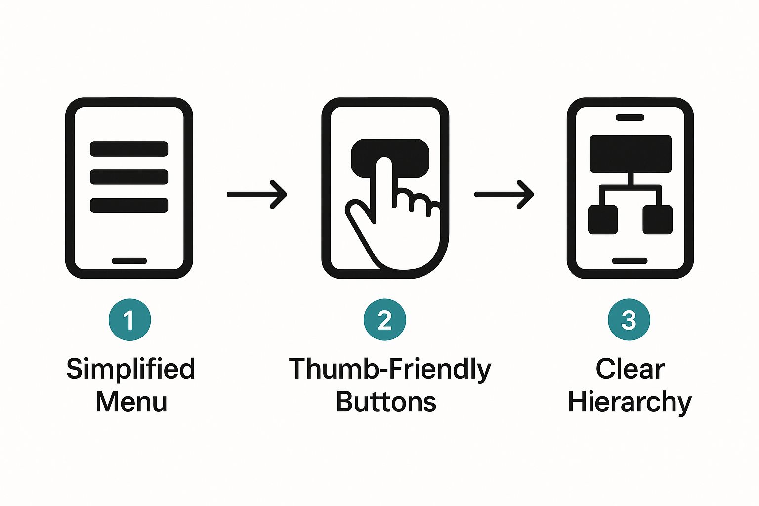
As you can see, a simpler, clearer user journey leads to higher engagement and helps people get things done faster on their phones.
The following checklist provides a roadmap for improving your site’s mobile performance. Think of it as a series of small, manageable tasks that add up to a much faster website.
Mobile Performance Optimization Checklist
| Optimization Area | Actionable Task | Impact on Performance |
|---|---|---|
| Image Handling | Compress all images before uploading and convert them to modern formats like WebP. | Reduces page weight, directly improving LCP scores. |
| Code Efficiency | Minify CSS and JavaScript files to remove unnecessary characters and spaces. | Decreases file sizes for faster download and parsing times. |
| Resource Loading | Implement browser caching to store static assets on the user’s device for repeat visits. | Dramatically speeds up loading for returning visitors. |
| Third-Party Scripts | Audit and defer loading of non-essential scripts (e.g., analytics, ads) until after the main content loads. | Frees up the main thread, improving INP and initial load. |
| Layout Stability | Specify dimensions (width and height) for all images and ad slots in your code. | Prevents content from jumping around, lowering CLS scores. |
By systematically working through these areas, you can make targeted improvements that have a real, measurable impact on your mobile site’s speed and user experience.
Compress and Modernize Your Images
Big, clunky images are almost always the number one cause of a slow LCP. Before you upload a single image, you should be running it through a compression tool. Even better, make the switch to a modern format like WebP. It offers far better compression than old-school JPEGs and PNGs, often without any noticeable drop in quality. This one move can shave seconds off your load time.
Minify Your Code
Your website’s code files (CSS, JavaScript) are often full of extra stuff—spaces, comments, line breaks—that browsers don’t need. Minification is simply the process of stripping all that out. Most content management systems and build tools have plugins or built-in settings that can do this for you automatically, resulting in smaller files that download much faster.
Leverage Browser Caching
Why make a visitor’s browser re-download your logo every single time they visit a new page? With browser caching, you can tell their browser to save a local copy of your site’s static files. The next time they visit, the page loads almost instantly because the assets are already on their device. This is a game-changer for repeat visitors.
Treat performance optimization like a detective’s work. Is your LCP terrible? Your first suspect should be your images. Is INP lagging? Go hunt down a slow-running script. Is CLS causing chaos? Check for images or ads loading without defined dimensions. By tackling the specific problem, you get real results.
Designing for Touch and Readability
Getting your site to fit on a mobile screen with a responsive layout is just the first step. The real magic happens when you nail the user experience (UX), making it genuinely easy and enjoyable to use. We’re talking about the small details that transform a functional site into one people actually like using.
The biggest shift you have to make is remembering people are using their thumbs, not a hyper-accurate mouse pointer. This one fact should inform every single design decision you make, from button size to the space between links.
Embrace Thumb-Friendly Design
Have you ever tried to tap a tiny link on your phone, only to hit the one right next to it? It’s a classic, and incredibly frustrating, mobile experience. This happens because the design ignores the reality of the “thumb zone”—the part of the screen someone can comfortably reach with their thumb. Your most important interactive elements need to live right there.
To save your users from the dreaded mis-click, you need to get two things right:
- Make Tap Targets Big Enough: Your buttons and links should be at least 48×48 pixels. That’s the sweet spot for most adult fingers to tap accurately without having to zoom in.
- Give Them Breathing Room: Jamming links together is asking for trouble. Surround every tappable element with plenty of white space—think at least 8 pixels between touch targets—so fingers don’t accidentally graze the wrong thing.
Designing for touch isn’t just about making things bigger. It’s about respecting the user’s physical interaction with their device. A well-spaced, thoughtfully placed button can be the difference between a smooth conversion and someone giving up in frustration.
Think about a mobile checkout form. A practical example is replacing a tiny text link for “Apply Coupon” with a clear, full-width button. It’s a simple change, but it makes the action obvious and incredibly easy to perform, smoothing out a critical step in the customer’s journey.
Prioritize Readability Above All Else
People use their phones everywhere—from a dark room to the blinding glare of the sun. Your text has to be readable in all of them. This is where your font choices and color contrast become absolutely critical.
Legibility is everything. No one should have to pinch-and-zoom just to read your blog post. Start with a clean, simple font. That fancy script font might look amazing on a huge desktop monitor, but on a small screen, it often becomes an unreadable blur.
- Font Size and Line Height: I’ve found that a base font size of 16px is the absolute minimum for body text on mobile. You then need to pair that with a generous line height of around 1.5em to let the text breathe and make it easier to scan.
- High-Contrast Color Palettes: Light gray text on a white background is an accessibility nightmare, especially outdoors. Use a tool to check your colors against the Web Content Accessibility Guidelines (WCAG). You should be aiming for a contrast ratio of at least 4.5:1 for your standard text.
Simplify Navigation and Forms
On a mobile screen, every pixel counts. You can’t afford to waste that precious real estate on clunky navigation bars or ridiculously long forms. Keeping things simple is the best way to help people find what they need and get things done.
When it comes to navigation, the hamburger menu (the three-line icon) has become a universal standard for a reason. It neatly tucks your navigation away, keeping the interface clean and focused. Just make sure that when someone taps it, it opens up a clear, simple list of options.
Forms are another area where mobile users have zero patience. Every single field you add increases the odds they’ll just abandon the process entirely.
- Be Brutal with Form Fields: Only ask for what is absolutely essential. Do you really need a phone number for a newsletter signup? Probably not.
- Use Mobile-Friendly Inputs: Make life easier for your users by leveraging HTML5 input types. For instance, using
<input type="tel">for phone numbers or<input type="email">for email addresses automatically brings up the right keyboard on their device, which makes filling out the form much faster. - Break Up Long Forms: If you have a complex process like a checkout, don’t show it all at once. Break it into smaller, logical steps and add a progress bar. This makes the whole thing feel less intimidating and keeps the user moving forward.
7. Test Your Mobile Website Like a Pro
A design isn’t really done until you’ve tested it. It’s one thing to build a mobile-friendly site that looks great on your big desktop monitor, but it’s a completely different ballgame to ensure it works flawlessly in a user’s hand. If you skip this step, you’re guaranteed to miss the subtle issues that frustrate visitors and send them running.
The good news? You don’t need a high-tech lab filled with hundreds of devices to get this right. Some of the most effective tools are already hiding in your web browser.
Start with Browser-Based Emulators
Your first line of defense is the device simulator built into browsers like Google Chrome or Firefox. With a click, you can see how your site looks on dozens of popular phones and tablets, from the latest iPhone to older Androids. This is the fastest way to check how your layout responds at different breakpoints—those specific screen widths where your design shifts.
But here’s a word of caution: emulators are great for catching obvious layout breaks, but they aren’t perfect. They can’t fully replicate the quirks of a real device, like how a specific mobile browser renders fonts or how an older phone struggles with a complex animation. Think of emulation as a quick sanity check, not the final word.
Use Automated Tools for a Deeper Dive
Once you’ve spot-checked the visuals, it’s time to dig into the technical side. Google offers a couple of fantastic, free tools that every web pro should be using. They go beyond just how a site looks and measure its actual performance, usability, and accessibility on mobile.
Here are the two must-haves for your toolkit:
- Google’s Mobile-Friendly Test: This gives you a straightforward pass/fail score. It tells you if your page meets Google’s core standards for mobile usability. It’s a quick, simple way to validate your work.
- PageSpeed Insights: This is your performance bible. It gives you a detailed report card with Core Web Vitals scores for both mobile and desktop. Even better, it gives you specific, actionable advice, like pointing out exactly which images are slowing things down.
The Mobile-Friendly Test is perfect for getting that initial green light. A successful result, like the one below, confirms you’re on the right track.

This screenshot shows what you’re aiming for—a clear “Page is usable on mobile” message. It confirms you’ve handled the fundamentals like setting the viewport and using readable font sizes.
Testing isn’t just about finding what’s broken. It’s about finding what’s frustrating. An emulator won’t tell you that a button is technically tappable but awkwardly placed for someone trying to use their phone one-handed.
Nothing Beats Testing on a Real Device
Emulators and automated reports are essential, but they can’t replicate a real human experience. The final, most crucial step is to grab some actual phones and tablets and put your site through its paces. This is where you uncover the kind of problems that analytics and automated tools will always miss.
For example, an emulator can’t show you that a complex animation stutters on a three-year-old iPhone, or that the touch targets for your menu are just a little too close together for comfort. You don’t need a huge budget; just borrowing phones from friends, family, or colleagues can give you a solid range of devices to work with.
When you’re testing on a real device, here is an actionable checklist:
- Check Key Breakpoints: Open the browser and manually resize the window. Does the layout adapt smoothly? Watch for any overlapping elements or, even worse, the dreaded horizontal scrollbar.
- Confirm Touch Targets: Use your thumb—not a precise mouse cursor—to tap every button, link, and form field. Are they easy to hit? A good rule of thumb is a minimum size of 48×48 pixels with plenty of space around them.
- Measure Load Times on a Slow Network: Don’t just test on your blazing-fast office Wi-Fi. Use your browser’s developer tools to throttle the network down to a sluggish 3G connection. This will show you what a massive chunk of your audience actually experiences.
- Verify Readability: Can you read all the text comfortably without pinching to zoom? If not, your font is too small. I’ve found a base font size of 16px is a reliable starting point for body text.
A truly professional approach combines all three of these methods. You use emulators for speed, automated tools for data, and real devices for that all-important human touch. It’s this thorough process that separates a site that simply works on mobile from one that’s a genuine pleasure to use.
Got Questions? We’ve Got Answers
Diving into mobile-first design can feel like a lot, and it’s natural for questions to pop up. Let’s walk through some of the most common ones I hear from clients to clear things up and help you refine your game plan.
Responsive vs. Adaptive Design: What’s the Real Difference?
It’s easy to get these two mixed up, but they work in fundamentally different ways.
Responsive design is like water—it uses a single, fluid layout that automatically contorts and shifts to fit whatever screen it’s on. The code is the same for a phone, tablet, or desktop; it just rearranges itself beautifully. For a deeper dive, Wikipedia’s entry on Responsive Web Design offers an excellent technical overview.
Adaptive design, on the other hand, is more like having a few different sets of clothes for different occasions. The server figures out what device is visiting and delivers one of several pre-built, fixed layouts designed for that specific screen size. It’s less flexible but can sometimes be more precisely tailored for common devices.
For my money, responsive design is the modern gold standard. Its sheer flexibility means your site will look great on the devices people are using today and the ones they’ll be using tomorrow. It’s the foundation of a truly future-proof mobile experience.
How Much Does Mobile Design Really Matter for SEO?
It matters immensely. Ever since Google shifted to mobile-first indexing, your site’s mobile version is what search engines look at first to rank your content. A clunky, slow, or hard-to-use mobile site is a major red flag for Google.
Think about it from their perspective: a great mobile site keeps people engaged longer and lowers bounce rates. For example, if a user on a phone lands on your blog post, reads it all, and then clicks to another page, that’s a powerful signal to Google that your site is valuable. This directly helps you climb the rankings.
What Are the Most Common Mobile Design Blunders?
I see the same few mistakes trip people up time and time again. The good news is that they’re completely avoidable once you know what to look for.
- Tiny Tap Targets: There’s nothing more frustrating than trying to tap a link or button with your thumb and hitting the wrong one. Aim for a minimum interactive element size of 48×48 pixels to save your users the headache.
- Unreadable Text: If someone has to pinch-to-zoom just to read your paragraphs, you’ve already lost them. I always recommend starting with a base font size of at least 16px for body copy.
- Performance Neglect: Slow load times are the ultimate conversion killer. The biggest culprits are almost always massive, uncompressed images and bloated code. Tidy those up, and you’ll see a huge difference.
- Aggressive Pop-ups: We’ve all been there—a pop-up takes over the entire screen, and the tiny ‘x’ to close it is impossible to find. These are so disruptive on mobile that users will often just give up and leave.
How Critical Is a Good Mobile Experience for Keeping Users Around?
It’s everything. A smooth, intuitive mobile experience is what builds trust and makes people want to come back. In fact, a site that’s a pleasure to use on a phone can boost repeat traffic by up to 75%. People remember when an experience is seamless.
On the flip side, a poor experience can actively damage your brand. The data doesn’t lie: 57% of users won’t recommend a business if its mobile site is poorly designed. And with over 84% of visitors saying they prefer to browse on sites built for mobile, failing to meet that expectation is no longer an option. If you want to dive deeper, there are some fascinating web design statistics that back this up.
At Galant Studios, we build fast, intuitive, and high-performing websites that are stunning on every single device. If you’re ready to transform your online presence and turn mobile visitors into loyal customers, let’s talk.