
In today’s interconnected society, a website serves as a primary gateway to information, services, and community. But is that gateway truly open to everyone? More than one billion people worldwide live with some form of disability, and an inaccessible website can inadvertently exclude a significant portion of a potential audience, creating digital barriers where bridges should be. Adhering to website accessibility best practices is not merely about technical compliance with standards like the Web Content Accessibility Guidelines (WCAG); it is a fundamental commitment to inclusivity and a cornerstone of a superior user experience for all visitors.
Building an accessible website also makes strong business sense. An inclusive digital presence can expand your market reach, enhance your brand reputation, and improve your overall SEO performance. Many accessibility improvements, such as clear structure and alternative text, benefit all users, including those on slow internet connections or using different types of devices. These principles are closely tied to user experience design fundamentals, where the ultimate goal is to create a seamless and effective experience for every person who visits your site.
This comprehensive guide moves beyond theory to provide actionable, practical steps for implementation. We will explore nine essential practices that form the foundation of a truly accessible website. From mastering semantic HTML and ensuring keyboard navigability to optimizing color contrast and making media accessible, you will gain the insights needed to create a more welcoming and effective online environment. Let’s dive into the specific techniques that will help you open your digital door to everyone.
1. Semantic HTML Structure
The foundation of any accessible website is its structure. Semantic HTML is the practice of using HTML elements that accurately describe their content’s meaning and role, rather than just its appearance. For instance, using a <button> element for a clickable button instead of a styled <div> tells assistive technologies like screen readers that the element is interactive. This meaningful structure is one of the most fundamental website accessibility best practices because it creates a predictable and navigable experience for all users.

When a page is built with semantic elements, it forms a clear document outline that screen readers can interpret. A user can easily skip from the header (<header>) to the main content (<main>) or jump between sections (<section>) and articles (<article>). This is far more efficient than listening to every single element on the page linearly.
Why It’s a Top Priority
A non-semantic structure forces assistive technology to guess the purpose of different elements, often leading to a confusing and frustrating user experience. Proper semantics provide context, which is essential for understanding relationships between different parts of the content, such as headings, lists, and navigation menus.
Key Insight: Semantic HTML isn’t just a best practice; it’s the structural language of the web. It provides a universal, machine-readable outline of your content, ensuring that assistive technologies can present it to users logically and efficiently.
Actionable Implementation Tips
- Use Headings Logically: Structure your content with a single
<h1>for the main page title. Follow it with<h2>for major sections,<h3>for subsections, and so on. Practical Example: A blog post should have the title in an<h1>, main sections like “Introduction” and “Conclusion” in<h2>s, and sub-points within those sections in<h3>s. Never skip heading levels (e.g., jumping from an<h2>to an<h4>) as this breaks the logical flow for screen reader users. - Leverage Landmark Roles: Use elements like
<nav>,<main>,<aside>, and<footer>to define the primary regions of your page. This allows users to jump directly to key areas. The GOV.UK website is an excellent example of a site built entirely on clear, semantic landmarks. - Choose the Right Element: Use
<ul>for unordered lists (like bullet points),<ol>for ordered lists (like numbered steps), and<blockquote>for quoted text. Use<p>for paragraphs, not for spacing. Each element carries a specific meaning that benefits accessibility. - Test Your Outline: Use browser extensions or developer tools to view your document’s outline. This helps you quickly spot issues in your heading hierarchy or landmark structure.
2. Alternative Text for Images
Images are a powerful way to convey information, but they create barriers for users with visual impairments who rely on screen readers. Alternative text, or “alt text,” is a concise, descriptive text attribute in the HTML <img> tag that screen readers announce in place of an image. Providing this description ensures that the information or function of the image is accessible to everyone, making it a critical component of website accessibility best practices.
When a screen reader encounters an image, it reads the alt text aloud, giving the user the same context a sighted user would get from the visual. Without it, a user might only hear “image” or a confusing file name, leaving them out of the conversation. Effective alt text bridges this gap, whether it’s describing a product on an e-commerce site or conveying data from an important chart.
Why It’s a Top Priority
Missing or poorly written alt text can render content incomprehensible and break the user’s journey. A “buy now” button that is actually an image with no alt text is invisible to a screen reader user. This practice is not just about describing what an image looks like; it’s about communicating its purpose and meaning within the page’s context.
Key Insight: Alt text is not a caption. It is a functional replacement for an image, designed to provide an equivalent experience for users who cannot see it. Its goal is to convey the image’s essential information or function, not simply to label it.
Actionable Implementation Tips
- Be Concise and Descriptive: Aim for under 125 characters. Describe what’s important in the image without unnecessary detail. Practical Example: For a photo of a team,
alt="The marketing team of five people smiling in a modern office"is better thanalt="image". - Avoid Redundancy: Never start with “Image of…” or “Picture of…”. Screen readers already announce that the element is an image. Go straight to the description.
- Handle Decorative Images: If an image is purely for decoration (like a background pattern or stylistic border) and adds no informational value, use an empty alt attribute:
alt="". This tells screen readers to ignore it, preventing unnecessary noise. - Describe Function, Not Just Appearance: If an image is a link or a button, the alt text should describe its action. Practical Example: For an image of a magnifying glass used for a search button, the alt text should be “Search,” not “Magnifying glass.”
- Provide Alternatives for Complex Images: For complex images like charts or infographics, the alt text should provide a brief summary. You should then provide a full text description of the data on the page or link to a separate page with the details.
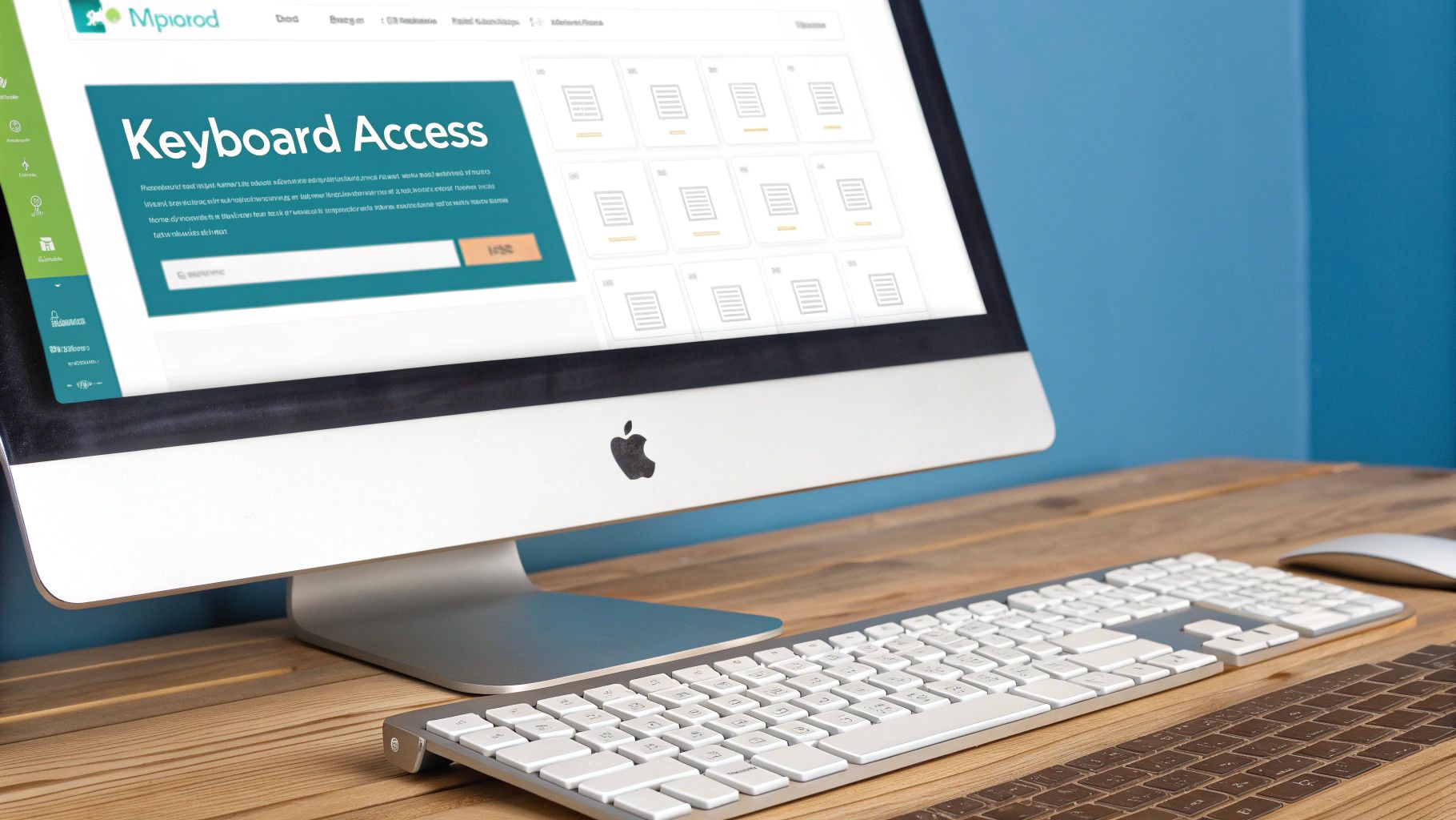
3. Keyboard Navigation Support
For users with motor disabilities or those who rely on screen readers, a mouse is not an option. Keyboard navigation support ensures that all interactive elements, links, forms, and controls can be accessed and operated using only a keyboard. This is a critical component of website accessibility best practices, as it provides a primary method of interaction for a significant portion of users, making your site truly operable for everyone.
When implemented correctly, users can logically move through a page using the Tab key to move forward, Shift+Tab to move backward, and Enter or the spacebar to activate elements. The order of navigation must be logical and predictable, typically following the visual layout of the page. Complex applications like GitHub excel at this, allowing users to navigate complex code review interfaces entirely with keyboard commands.
Why It’s a Top Priority
A website that cannot be fully navigated by keyboard is effectively broken for anyone who cannot use a mouse. This includes individuals with permanent motor impairments, temporary injuries, or even power users who prefer keyboard shortcuts for efficiency. Without proper focus indicators and a logical tab order, users can become lost on the page, unable to complete essential tasks like submitting a form or accessing a menu.
Key Insight: Keyboard accessibility isn’t an add-on; it’s a fundamental requirement for operability. If functionality is available to a mouse user, it must also be available to a keyboard-only user, ensuring equitable access to your entire website.
Actionable Implementation Tips
- Test Your Tab Order: Navigate your entire site using only the
Tab,Shift+Tab, andEnterkeys. Ensure the focus moves logically through all interactive elements and that you don’t get stuck in a “keyboard trap.” - Implement “Skip to Content” Links: Add a link at the very top of your page that allows users to bypass repetitive navigation headers and jump directly to the main content. This is a massive time-saver for keyboard and screen reader users.
- Ensure Visible Focus: Make sure the currently focused element has a clear visual indicator, like a prominent outline. Default browser outlines are often subtle; use CSS to create a more noticeable style that matches your brand while being highly visible. Practical Example: Use the
:focus-visiblepseudo-class in CSS to add a bright blue, 2-pixel solid outline to any element that receives keyboard focus:a:focus-visible { outline: 2px solid blue; }. - Avoid Hover-Only Interactions: Any content or functionality that appears on mouse hover (like a dropdown menu) must also be triggerable through keyboard focus or a click/enter action.
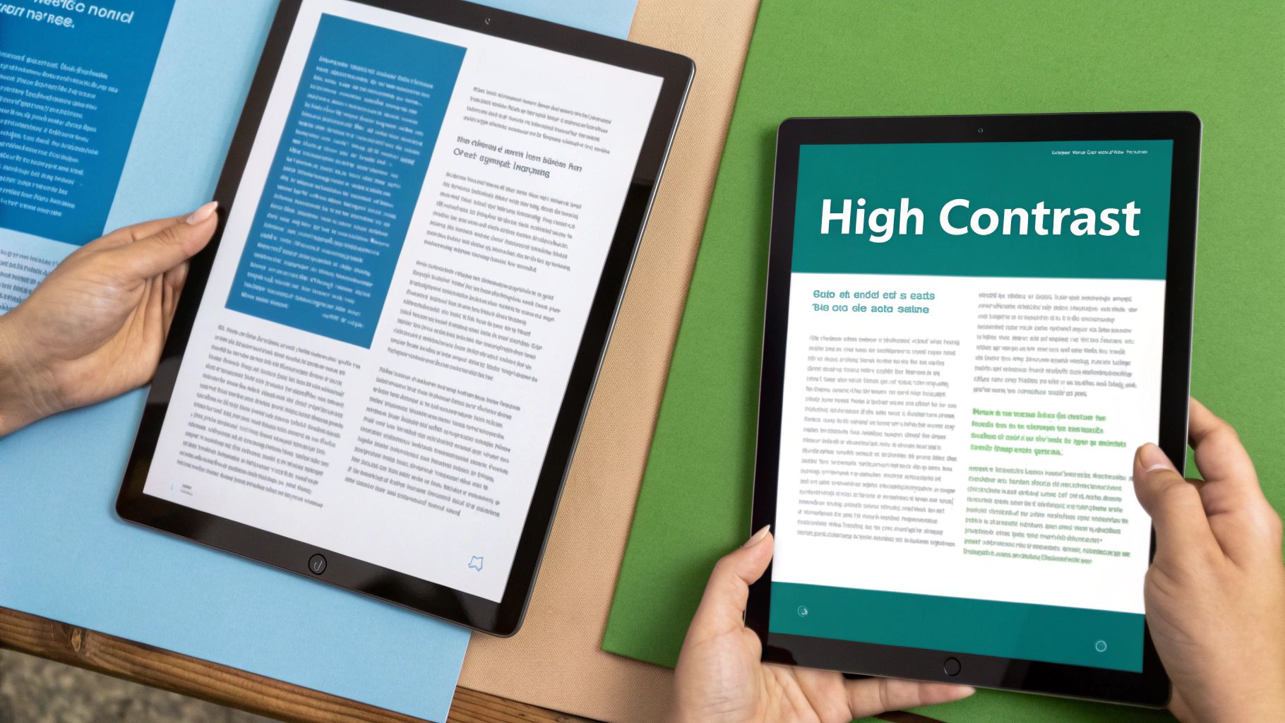
4. Color Contrast and Visual Design
Visual design is about more than aesthetics; it’s about readability. Ensuring sufficient color contrast between text and its background is critical for making content legible for everyone, especially users with visual impairments like low vision or color blindness. This practice involves meeting specific Web Content Accessibility Guidelines (WCAG) contrast ratios and ensuring that color is never the only means of conveying information. Adhering to these visual standards is a core component of website accessibility best practices.
When text color is too similar to its background color, it becomes difficult or impossible for many users to read. This excludes a significant portion of the population and can render important information, from navigation links to error messages, completely inaccessible. A well-designed, high-contrast interface serves all users by improving clarity and reducing eye strain, regardless of their visual ability.
Why It’s a Top Priority
Poor color contrast can make a website unusable for millions of people. For users with low vision, the text can blend into the background, while for users with color blindness, certain color combinations may appear as a single, indistinguishable color. By prioritizing strong contrast and not relying solely on color cues, you ensure your design is robust, inclusive, and functionally effective for the widest possible audience.
Key Insight: Good contrast isn’t a limitation on creativity; it’s a fundamental principle of effective communication. An accessible color palette ensures that your message, not just your branding, is clearly visible to every user on any device and in any lighting condition.
Actionable Implementation Tips
- Meet WCAG Ratios: Use a tool like WebAIM’s Contrast Checker to test your color pairings. Aim for a contrast ratio of at least 4.5:1 for normal text and 3:1 for large text (18pt or 14pt bold).
- Don’t Rely Only on Color: When indicating errors, required fields, or link states, supplement color with icons, text labels, or patterns. Practical Example: In a form, instead of only making the label for a required field red, also add an asterisk (
*) and the word “(required)” to the label. - Simulate Different Visions: Use tools built into browsers or design software like Adobe Creative Suite to simulate how your design appears to users with various forms of color blindness. This helps identify potential issues early.
- Plan for High-Contrast Modes: Design with system-level settings in mind, such as Windows High Contrast Mode or macOS’s “Increase contrast” option. This ensures your site remains usable for people who rely on these operating system features.
5. Form Accessibility and Labels
Forms are the primary way users interact with a website, from signing up for a newsletter to completing a purchase. Accessible forms ensure that all users, regardless of ability, can understand, fill out, and submit information successfully. This involves providing clear labels, instructions, and error feedback that are programmatically associated with their corresponding form controls. For assistive technologies, this direct association is non-negotiable, making form design a critical component of website accessibility best practices.
When a form control like an input field or a checkbox is correctly labeled, a screen reader can announce the label’s text when the control receives focus. This tells the user exactly what information is expected. Without this link, a user navigating with a screen reader encounters an “unlabeled” input, making it impossible to know its purpose. The forms on the UK Government website are a prime example of clarity, using visible labels and simple instructions for every field.
Why It’s a Top Priority
Inaccessible forms are a direct barrier to conversion and participation. If a user cannot complete a contact form, sign-up process, or checkout, the website fails at its core function. Proper labeling and error handling are essential for providing the context and guidance necessary for users of assistive technology to complete these critical tasks independently and without frustration.
Key Insight: An accessible form is a conversation between the website and the user. Clear labels act as the questions, and well-handled errors provide helpful corrections, ensuring the conversation doesn’t break down for users relying on assistive technology.
Actionable Implementation Tips
- Use
<label>for Every Input: Explicitly associate every form control (<input>,<textarea>,<select>) with a<label>element using theforandidattributes. Practical Example:<label for="email">Email Address:</label><input type="email" id="email">. This direct link is robust and universally supported. - Group Related Fields: When you have a set of related controls, like a series of radio buttons or checkboxes, group them using
<fieldset>and provide a group label with<legend>. This gives context to the entire group, such as “Choose a delivery method.” - Provide Clear Instructions: Use
aria-describedbyto link longer instructions or formatting requirements to a specific input. This provides helpful hints without cluttering the primary label. - Test with a Screen Reader: Navigate your forms using only a screen reader and the keyboard. Ensure every field is clearly announced, that you can select all options, and that error messages are read aloud when they appear.
6. ARIA Labels and Landmarks
While semantic HTML provides a strong foundation, modern web applications often contain complex, dynamic components that native HTML cannot fully describe. This is where Accessible Rich Internet Applications (ARIA) comes in. ARIA is a set of attributes you can add to HTML elements to provide additional semantic information and context for assistive technologies. It acts as a bridge, making custom widgets like sliders, menus, and live content updates understandable to screen readers. This makes implementing ARIA one of the most crucial website accessibility best practices for interactive sites.
For example, a <div> styled to look like a checkbox is invisible to a screen reader. By adding role="checkbox" and aria-checked="true", you explicitly tell the screen reader what the element is and its current state. Major platforms like Google Drive rely on ARIA to make their complex file management interfaces navigable, announcing actions and states for drag-and-drop features and context menus.
Why It’s a Top Priority
Without ARIA, users of assistive technologies can get lost in dynamic interfaces. Content that updates without a page reload, such as a live chat feed or a notification badge, might go completely unnoticed. ARIA provides the necessary signals to announce these changes, describe the function of custom controls, and define key navigational regions, ensuring an equitable experience for all users interacting with advanced web features.
Key Insight: ARIA does not change the browser’s functionality or appearance; it only modifies the accessibility tree that assistive technologies use. Think of it as adding descriptive labels and instructions exclusively for screen readers and other assistive tools.
Actionable Implementation Tips
- Prioritize Native HTML: The first rule of ARIA is to not use ARIA if a native HTML element already provides the needed semantics. For example, always use a
<button>element instead of addingrole="button"to a<div>. - Use ARIA for Dynamic Content: Use
aria-liveregions to announce content that updates asynchronously, such as form validation errors or new messages in a feed. Set the value topolite(waits for a pause) orassertive(interrupts immediately) based on urgency. Practical Example: An e-commerce “Item added to cart” notification should usearia-live="polite"to avoid interrupting the user’s shopping flow. - Label Custom Controls: For interactive elements without native text, such as an icon-only button, use
aria-labelto provide a concise, descriptive text alternative. For example, a magnifying glass icon button should havearia-label="Search". - Test with Screen Readers: Validate your implementation using multiple screen readers like NVDA, JAWS, or VoiceOver. This is the only way to ensure your ARIA attributes are creating a genuinely usable and logical experience.
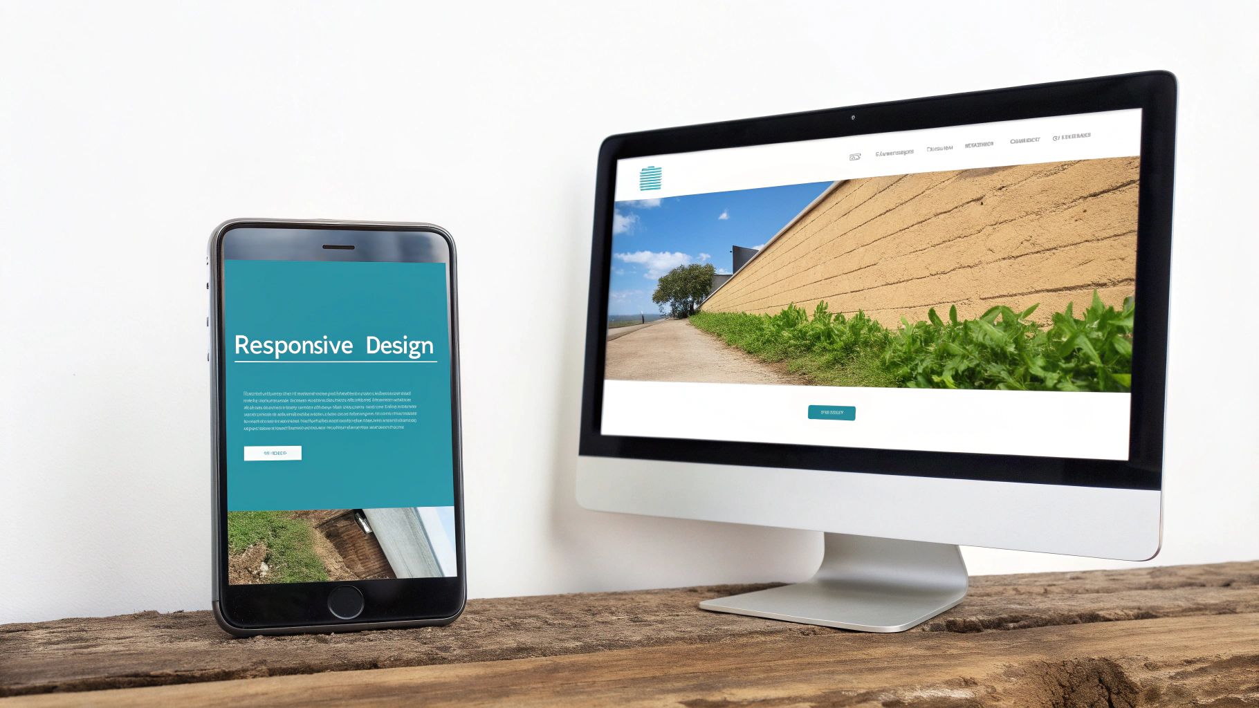
7. Responsive and Mobile Accessibility
With the majority of web traffic originating from mobile devices, ensuring your site is accessible on smaller screens is non-negotiable. Responsive design automatically adjusts content and layout to fit any screen size, but true mobile accessibility goes deeper. It involves considering touch targets, device orientation, and varying input methods to create a seamless experience for everyone, including users with disabilities who rely on mobile assistive technologies. This commitment is a core pillar of modern website accessibility best practices.
A website that works flawlessly on a desktop can become a usability nightmare on a smartphone if not designed with mobile users in mind. Elements may become too small to tap accurately, content might require excessive horizontal scrolling, or complex navigation might be impossible to use with one hand. Addressing these challenges ensures that your website remains functional and user-friendly, regardless of how it’s accessed.
Why It’s a Top Priority
An inaccessible mobile experience effectively excludes a massive portion of your audience. Users with motor impairments may struggle with small touch targets, while those with low vision may find text unreadable if it doesn’t reflow properly when zoomed. A responsive and mobile-first approach ensures that functionality and content are equally available to all users across all platforms, preventing frustration and abandonment.
Key Insight: Mobile accessibility is not just about responsive layouts; it’s about designing for the context of mobile use. This includes considering limited screen real estate, touch-based interactions, and the diverse needs of users who depend on their mobile devices as their primary tool for accessing the web.
Actionable Implementation Tips
- Ensure Large Touch Targets: Interactive elements like buttons and links should have a minimum touch target size of 44×44 CSS pixels to be easily and accurately tapped, with sufficient spacing between them to prevent accidental clicks.
- Test Text Scaling: Users should be able to zoom in on text up to 200% without breaking the layout or requiring horizontal scrolling. This is crucial for users with low vision.
- Support All Orientations: Your website’s content and functionality must be available in both portrait and landscape orientations. Do not lock users into a single view. To ensure your website adapts gracefully across various devices and to illustrate how to implement adaptable layouts, you can explore various examples of responsive web design.
- Test with Mobile Screen Readers: Routinely test your site using mobile-specific screen readers like VoiceOver (iOS) and TalkBack (Android) to identify navigation and usability issues that may not be present on desktop versions.
- Design for One-Handed Use: Consider how users might interact with your site using just one hand, placing primary navigation and key actions within easy reach of the thumb. Learn more about mobile-friendly website design on galantstudios.com.
8. Video and Media Accessibility
As video and audio content become central to digital experiences, ensuring they are accessible to all users is paramount. Media accessibility involves providing alternatives for users who cannot see or hear the content. This includes captions for the deaf and hard of hearing, audio descriptions for the blind and visually impaired, and transcripts for both. Implementing these features is a core component of modern website accessibility best practices, transforming multimedia from a potential barrier into an inclusive tool.
Without these accommodations, a significant portion of your audience is completely excluded from your message. Captions not only help users with hearing impairments but also benefit those in noisy environments or non-native speakers. Similarly, audio descriptions, which narrate key visual information, allow users with visual impairments to understand the full context of a video. Platforms like Netflix and YouTube have set a high standard, demonstrating how integral these features are to a quality user experience.
Why It’s a Top Priority
Multimedia content that lacks accessible alternatives creates a dead-end for many users. It effectively locks away information, entertainment, and instruction from individuals with sensory disabilities. Providing captions, transcripts, and audio descriptions ensures that everyone can engage with your content, maximizing its reach and impact while meeting legal and ethical standards.
Key Insight: Accessible media is not an add-on; it’s an essential part of the content itself. By providing text and audio alternatives, you are ensuring your message is communicated clearly and equitably, regardless of a user’s abilities or viewing context.
Actionable Implementation Tips
- Provide Accurate Captions: Use closed captions (which can be turned on or off) for all video content. While auto-generated captions are a starting point, they often contain errors. Always review and edit them for accuracy, or use a professional captioning service for important content.
- Offer Full Transcripts: A transcript is a text version of all spoken dialogue and important non-speech sounds. This is incredibly useful for users who are deaf-blind and use braille displays. For audio and video content, providing accurate transcripts is a key accessibility practice. You can find helpful resources such as the best AI transcription apps to assist in creating these.
- Include Audio Descriptions: For videos where visual information is critical to understanding the content, provide an audio description track that narrates important on-screen actions, characters, and scene changes. Practical Example: During a silent scene in a movie where a character looks anxiously at a ticking clock, the audio description would say, “The character glances nervously at the wall clock; the hands show it’s one minute to midnight.”
- Ensure Accessible Media Players: Your media player must be operable with a keyboard alone. Users should be able to play, pause, stop, and adjust the volume and captions using keyboard commands, without needing a mouse.
9. Performance and Loading Accessibility
Website performance is not just a technical metric; it is a critical accessibility issue. Slow loading times, unresponsive interfaces, and unexpected timeouts can create significant barriers for users with disabilities, particularly those on slower internet connections or less powerful devices. Performance and loading accessibility ensures that all users can access and interact with content efficiently, regardless of their technical constraints. This is one of the most overlooked website accessibility best practices, as it directly impacts usability for a wide range of individuals.
When a site loads slowly, essential accessibility features might be delayed, leaving users unable to navigate. For example, a user relying on a screen reader might face a blank, unresponsive page while scripts load in the background. Similarly, someone with a cognitive disability could become frustrated or confused by components that appear to be broken or unresponsive. A fast, stable experience is a more accessible experience.
Why It’s a Top Priority
Poor performance disproportionately affects users with disabilities. It can prevent them from completing essential tasks, like filling out a form on a banking website before a session times out. A slow website can also exacerbate anxiety or stress for users with cognitive impairments. Prioritizing performance ensures your website is robust, reliable, and respectful of every user’s time and needs.
Key Insight: Performance is the bedrock of digital inclusion. A website that fails to load quickly or provide clear feedback on its status effectively excludes users with slower connections or assistive technologies that are waiting for the page to become interactive.
Actionable Implementation Tips
- Implement Accessible Loading Indicators: Don’t leave users guessing. Use ARIA live regions (e.g.,
aria-live="polite") to announce loading states like “Loading search results…” to screen reader users. This provides crucial feedback and manages expectations. - Provide Timeout Warnings: For any time-limited session, such as on banking or e-commerce sites, warn users before their session expires. Crucially, provide a simple way to extend the session, as required by WCAG 2.1 Success Criterion 2.2.1.
- Use Accessible Skeleton Screens: Skeleton screens are a great way to improve perceived performance, but ensure they don’t confuse screen readers. Use
aria-busy="true"on the container while content is loading to prevent the assistive technology from announcing an empty or incomplete structure. - Test on Slower Connections: Use browser developer tools to throttle your network speed and CPU. This helps you experience your site as a user with technical limitations would, revealing critical performance bottlenecks that impact accessibility. If you want to dive deeper into this topic, you can learn more about Core Web Vitals optimization.
Accessibility Best Practices Comparison
| Accessibility Technique | Implementation Complexity 🔄 | Resource Requirements ⚡ | Expected Outcomes 📊 | Ideal Use Cases 💡 | Key Advantages ⭐ |
|---|---|---|---|---|---|
| Semantic HTML Structure | Moderate – requires restructuring and training | Low to moderate – mainly development effort | Improved screen reader navigation, SEO | Websites needing clear document structure | Better SEO, easier maintenance, assistive tech friendly |
| Alternative Text for Images | Low to moderate – writing and maintaining alt text | Low – content writers or developers | Accessible images, SEO boost | Image-heavy sites, e-commerce, educational content | Improved accessibility and fallback for images |
| Keyboard Navigation Support | Moderate to high – requires careful focus & keyboard control management | Moderate – development and testing effort | Full keyboard operability, better usability | Complex web apps, interactive sites | Essential for motor-impaired users, power user friendly |
| Color Contrast and Visual Design | Low to moderate – design phase and testing | Low to moderate – design and testing tools | Better readability, accessible color schemes | All user interfaces, especially visual-heavy sites | Enhances readability and visual appeal |
| Form Accessibility and Labels | Moderate – requires thorough labeling & error handling | Moderate – development and UX effort | Higher form completion, fewer errors | Websites with forms, e-commerce, registrations | Improved usability and screen reader support |
| ARIA Labels and Landmarks | High – advanced knowledge and testing needed | Moderate – development and testing | Accessible complex UIs, enhanced navigation | Dynamic web apps, custom UI components | Improves navigation for complex interfaces |
| Responsive and Mobile Accessibility | Moderate – requires multi-device testing | Moderate to high – design, development, testing | Usable across devices, mobile-friendly | Mobile-first sites, cross-device applications | Better reach, improved mobile usability |
| Video and Media Accessibility | High – captioning, transcripts, audio descriptions | High – content creation and maintenance | Accessible multimedia content | Video platforms, educational and corporate videos | Inclusive content for hearing and visually impaired |
| Performance and Loading Accessibility | Moderate – requires optimization and accessibility focus | Moderate – development and testing | Better experience in slow networks | High-traffic, performance-critical websites | Improves accessibility in slow or impaired contexts |
Your Next Steps Toward a More Accessible Future
Navigating the landscape of digital inclusion can seem complex, but as we’ve explored, the journey toward a more accessible website is built upon a series of concrete, achievable actions. Moving beyond a simple checklist, adopting these website accessibility best practices is about fundamentally shifting your perspective. It’s about recognizing that users interact with your content in diverse ways and that a truly successful digital experience is one that welcomes everyone, regardless of ability.
Throughout this guide, we’ve broken down nine critical pillars of accessibility, from the foundational logic of semantic HTML and the descriptive power of alt text to the functional necessity of keyboard navigation and the visual clarity of high-contrast design. We’ve seen how accessible forms prevent user frustration and how ARIA landmarks create a navigable map for assistive technologies. These aren’t isolated tweaks; they are interconnected components of a holistic strategy that benefits every single visitor.
From Theory to Action: Key Takeaways
The most important takeaway is that accessibility is not a final destination but an ongoing commitment. Technology evolves, user needs change, and our understanding of inclusive design deepens over time. To truly embed these principles into your workflow, focus on these core ideas:
- Proactive, Not Reactive: Integrate accessibility from the very beginning of a project. It is far more efficient and effective to build an accessible foundation than it is to retrofit a site that was designed without considering diverse user needs. This means thinking about color contrast in the initial design phase and structuring content with semantic HTML from the first line of code.
- Empathy is Your Best Tool: Put yourself in the shoes of different users. Imagine navigating your site using only a keyboard. Consider how someone with low vision might perceive your color choices. Use a screen reader to listen to your content. This empathetic approach turns abstract guidelines into tangible user experiences.
- Small Steps Create Big Impact: You don’t have to overhaul your entire website overnight. Start with a simple audit. Pick one of the practices we discussed, like checking your image alt text or testing your forms for proper labels. Consistent, incremental improvements will compound over time, leading to a significantly more inclusive and robust digital presence.
Building Your Accessibility Roadmap
To translate these insights into a practical plan, consider a phased approach. First, conduct a baseline audit. Use automated tools like WAVE or Axe DevTools as a starting point to identify low-hanging fruit, but remember to supplement them with manual testing. Can you successfully navigate your entire site and complete a key action (like filling out a contact form or making a purchase) using only your keyboard? This simple test often reveals critical usability gaps.
Next, prioritize your findings based on impact. Issues that create major barriers for users, such as missing form labels or videos without captions, should be at the top of your list. For an in-depth understanding of the standards that guide these priorities, refer to the official Web Content Accessibility Guidelines (WCAG), which provide the global benchmark for digital accessibility.
Finally, document your processes and educate your team. Create an accessibility style guide that complements your brand guidelines. Ensure that everyone, from content creators to developers, understands their role in maintaining an inclusive website. By making accessibility a shared responsibility, you foster a culture that values every user’s experience. This commitment doesn’t just mitigate legal risks; it enhances your brand’s reputation, improves SEO, and ultimately expands your market reach to the millions of users who rely on accessible design.
Feeling overwhelmed or unsure where to start your accessibility journey? The team at Galant Studios specializes in building user-centric, SEO-driven websites with accessibility at their core. We can audit your current site or partner with you to create a new digital experience that is welcoming, compliant, and effective for all users. Visit Galant Studios to learn how we can help you build a more inclusive future for your brand.