In the digital marketplace, your website is your hardest-working salesperson. It’s your primary conversion engine and the cornerstone of your brand’s credibility. A visitor’s decision to stay or leave is made in milliseconds, hinging on a delicate balance of aesthetics, functionality, and trust. While a beautiful design might catch their eye, it’s strategic, conversion-focused design that persuades them to act. This guide cuts through fleeting trends to deliver the foundational web design best practices that turn visitors into loyal customers.
Each principle detailed here is a critical lever you can pull to create an online experience that not only delights users but also delivers measurable business results. From mobile-first responsiveness that meets users where they are, to lightning-fast performance that respects their time, we’ll provide a blueprint for excellence. The following sections offer actionable insights for crafting a digital presence that is both user-centric and conversion-focused. Implementing these practices will transform your website from a simple online brochure into a powerful asset that drives growth.
The core objective is to systematically remove friction from the user journey, guiding visitors seamlessly toward a desired action. This process, often called conversion rate optimization, is built on a deep understanding of user behavior. For a deeper dive into turning website visitors into valuable customers, explore a comprehensive guide to website conversion rate optimization. This article will arm you with the fundamental design tactics that form the bedrock of any successful optimization strategy.
1. Mobile-First Responsive Design
Mobile-first design isn’t a trend; it’s the new standard. This strategic approach starts the design process with the smallest screen—your phone—and scales up for larger devices like tablets and desktops. Why? Because it forces you to prioritize what truly matters. By designing for constraints first, you inherently create a more focused, faster, and cleaner user experience for everyone, on any device.
This practice is non-negotiable. Mobile traffic now dominates desktop globally, and Google’s mobile-first indexing means your website’s mobile version is what primarily determines its search ranking. A poor mobile experience doesn’t just frustrate users; it makes you invisible to them. A mobile-first strategy is a critical pillar of effective web design best practices and the foundation of modern SEO.
Key Benefits of a Mobile-First Approach
Adopting a mobile-first philosophy delivers a powerful one-two punch. First, it forces you to focus on core content, cutting the fluff to create a streamlined user journey. This naturally leads to faster loading times—a crucial factor in keeping visitors engaged. Second, it guarantees a high-quality experience for the majority of your audience, which directly boosts conversion rates and strengthens brand perception.
Actionable Implementation Tips
Ready to build for the real world? Here’s how to put mobile-first design into action:
- Start Small: Begin your design mockups at a narrow width, like 320px, to solve for the most constrained mobile devices first.
- Embrace Modern CSS: Use flexible layout tools like CSS Flexbox and Grid. They allow your design to adapt fluidly as the screen size increases, without complex code.
- Design for Thumbs: Ensure all buttons, links, and interactive elements are large enough for easy tapping—aim for a minimum touch target of 44×44 pixels. Place key actions where thumbs can easily reach them.
- Optimize Your Media: Use responsive image techniques, like the
srcsetattribute, to serve smaller images to mobile devices. This simple step can drastically cut load times. - Test on Real Devices: Don’t just rely on browser simulators. Continuously test your design on actual smartphones and tablets to catch real-world usability issues.
2. Fast Loading Speed and Performance Optimization
In web design, speed sells. Every millisecond your site takes to load is a potential customer lost. Performance optimization is the discipline of making your website load faster and feel more responsive. A high-performing website is no longer a “nice-to-have”; it’s a fundamental user expectation that directly impacts your bottom line.
The business case for speed is undeniable. Amazon famously calculated that a 100ms delay in load time cost them 1% in sales. Google found that the probability of a user bouncing increases by 32% as page load time goes from 1 to 3 seconds. This makes performance a critical lever in your web design best practices toolkit, directly influencing both user experience and revenue. For more in-depth strategies, explore these website performance optimization techniques.
Key Benefits of Performance Optimization
A fast website delivers a superior user experience, which immediately reduces bounce rates and increases the time visitors spend on your site. Faster sites achieve higher conversion rates because users encounter less friction. On top of that, Google uses page speed as a significant ranking factor in its search results. Optimizing for performance is one of the most direct ways to improve your SEO.
The data below shows just how costly a slow website can be.
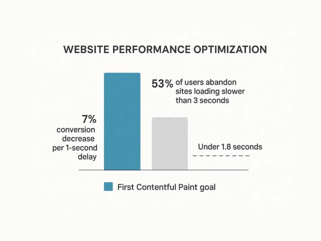
This visualization drives the point home: a majority of users will abandon a site that fails to load within three seconds. Even a one-second delay can significantly erode your conversion potential.
Actionable Implementation Tips
Ready to speed things up? Here are concrete actions you can take to optimize your site’s performance:
- Audit and Measure: Use tools like Google PageSpeed Insights to get a baseline score. Your goal should be a First Contentful Paint (FCP) under 1.8 seconds.
- Optimize Images: Compress your images and serve them in modern formats like WebP or AVIF. Implement lazy loading so images below the fold only load as the user scrolls to them.
- Minimize Code: Use tools to minify your HTML, CSS, and JavaScript, which removes unnecessary characters from the code without changing its functionality.
- Leverage Browser Caching: Configure your server to tell browsers to store static files (like your logo, CSS, and JavaScript). This means repeat visitors won’t have to re-download them, making subsequent page loads much faster.
- Defer Non-Critical Scripts: Use the
deferorasyncattributes for JavaScript files. This tells the browser not to wait for a script to load before rendering the rest of the page.
3. Intuitive Navigation and Information Architecture
If a user can’t find it, it doesn’t exist. Intuitive navigation and a logical Information Architecture (IA) are the unsung heroes of a high-converting website. They ensure users can find what they need with minimal effort. As usability expert Steve Krug famously said, the goal is simple: Don’t Make Me Think. A good structure reduces cognitive load, allowing users to achieve their goals without frustration.
A well-structured site is a win-win. Users who can easily find information are more likely to stay, engage, and convert. Search engines also rely on your site’s structure to understand and index your content, making IA a critical component of SEO. For a masterclass in simplicity, look at the Gov.uk website. Its user-centered redesign focused on clear, task-based navigation, dramatically improving task completion rates for millions of citizens.
Key Benefits of Strong Information Architecture
A clear IA and intuitive navigation system deliver huge advantages. It dramatically boosts usability, leading to higher user satisfaction and lower bounce rates. By organizing content logically, it clarifies your site’s purpose for both users and search engines. This creates a scalable framework that can grow with your business, saving you from a costly redesign down the line.
Actionable Implementation Tips
To build a navigation system that feels effortless for your users, apply these proven techniques:
- Limit Your Main Menu: Stick to 5-7 top-level navigation items. This avoids overwhelming users with too many choices, a phenomenon known as choice paralysis.
- Use Simple Language: Label your navigation with clear, descriptive terms that your users would actually use. Avoid industry jargon. For example, use “Pricing” instead of “Investment Tiers.”
- Implement Breadcrumbs: On pages deep within your site, use breadcrumb trails (e.g., Home > Services > Web Design) to show users where they are and how they got there.
- Make Your Logo a Home Button: This is a universal convention. Users expect to be able to click your logo in the top-left corner to return to the homepage.
- Provide a Visible Search Bar: For any site with more than a dozen pages, a prominent and functional search bar is essential for helping users find specific information quickly.
- Test Your Structure: Use a simple technique called card sorting. Write your page topics on cards and ask real users to group them into categories that make sense to them. This will reveal their mental model and help you build a truly intuitive structure.
4. Accessibility and Inclusive Design (WCAG Compliance)
Great design is accessible design. This means creating websites that can be used by everyone, including people with visual, auditory, motor, or cognitive disabilities. This practice involves following the Web Content Accessibility Guidelines (WCAG), the global standard for making the web work for all people. By designing for inclusivity, you create a better, more equitable digital presence.

This isn’t just an ethical imperative; it’s a smart business decision and, in many places, a legal requirement. An accessible website expands your market reach to the millions of people who have disabilities. It also enhances your brand reputation and mitigates legal risks. More importantly, designing for accessibility often results in a better user experience for everyone.
Key Benefits of Inclusive Design
An accessible website creates a better experience for all visitors. High-contrast text is easier for everyone to read in bright sunlight. Clear navigation helps people who are distracted or in a hurry. Many accessibility practices, like using descriptive alt text for images and proper heading structures, directly improve your SEO. Explore more about website accessibility best practices to understand its full impact.
Actionable Implementation Tips
To ensure your website is inclusive, refer to a detailed WCAG compliance checklist and implement these fundamental steps:
- Ensure Keyboard Navigation: Unplug your mouse. Can you access and operate every interactive element—links, buttons, forms—using only the Tab, Enter, and arrow keys? You should be able to.
- Use Descriptive Alt Text: For every meaningful image, write alternative text that describes its content and purpose for users who rely on screen readers. For decorative images, leave the alt text blank (
alt=""). - Maintain High Color Contrast: Text should stand out clearly from its background. Use a contrast checker tool to ensure your color combinations meet a minimum WCAG AA ratio of 4.5:1 for normal text.
- Use Proper Heading Structure: Organize your content with a logical hierarchy of headings (one
<h1>per page, followed by<h2>,<h3>, etc.). This creates a navigable outline for screen reader users. - Label Your Form Fields: Every input field in a form needs a corresponding
<label>tag. This tells screen reader users what information is required in each field.
5. Clear Visual Hierarchy and Typography
Visual hierarchy is the art of arranging elements to guide a user’s attention. Through strategic use of size, color, contrast, and spacing, you create a clear path for the eye to follow, telling users what’s most important at a glance. Good typography is the workhorse of this hierarchy. It doesn’t just make text readable; it establishes your brand’s voice and professional tone.
This isn’t just about making things look pretty; it’s about making them work. A strong hierarchy allows users to scan a page and find what they need in seconds, reducing frustration and keeping them engaged. For a masterclass in visual hierarchy, look at the homepage of Stripe. They use bold typography, vibrant colors, and generous spacing to direct your focus immediately to their core value proposition and call-to-action, demonstrating how hierarchy is a core tenet of conversion-focused web design best practices.
Key Benefits of Strong Hierarchy and Typography
A clear visual hierarchy makes your site instantly scannable, allowing users to absorb its structure and key messages effortlessly. This improves usability and content comprehension, which builds trust and credibility. Strategically, it gives you control over the user journey, allowing you to highlight primary calls-to-action and guide visitors smoothly through your conversion funnel.
Actionable Implementation Tips
To establish a powerful visual hierarchy that guides your users, follow these practical steps:
- Follow the “Squint Test”: Take a step back from your screen and squint your eyes. What elements stand out? If it’s not your main headline or primary call-to-action, your hierarchy needs work.
- Use One or Two Fonts, Max: More is not better. Stick to one font family for headings and another for body text to create a clean, consistent look.
- Establish a Typographic Scale: Don’t choose font sizes randomly. Use a consistent scale (e.g., 16px, 20px, 25px, 31px, 39px) to create a harmonious and logical relationship between your headings and body text.
- Prioritize Readability: Your body text is where the core message lives. Ensure it’s at least 16px and has sufficient line height (around 1.5 times the font size) for comfortable reading.
- Use Color and Weight for Emphasis: Use bolder font weights and contrasting colors to make important elements pop. A bright, clickable button will always get more attention than plain text.
6. Consistent and Purposeful Use of White Space
White space, or negative space, is the empty area around the elements on your page. It’s not “wasted” space; it’s an active and powerful design tool. Strategic use of white space makes your content more readable, directs the user’s focus, and gives your design a sense of elegance and clarity. It works by reducing visual clutter, which lowers cognitive load and makes your interface feel more intuitive.
The power of white space is rooted in psychology. Studies have shown that proper use of white space can increase user comprehension by up to 20%. It helps group related items and separate unrelated ones, creating a clear visual map for the user. Luxury brands like Apple are masters of this, using generous white space to create a premium feel and focus all attention on their products. This makes it a core component of effective web design best practices.
Key Benefits of Strategic White Space
Using white space deliberately has huge payoffs. It dramatically improves content legibility and readability, making your text less intimidating and more inviting. This encourages users to spend more time engaging with your content. From a branding perspective, ample white space can convey sophistication and luxury, while also making your most important elements, like calls-to-action, stand out more effectively.
Actionable Implementation Tips
To use white space as a powerful design tool, follow these actionable guidelines:
- Increase Your Line-Height: The space between lines of text is crucial for readability. Set your body text
line-heightproperty in CSS to at least 1.5 to give your paragraphs room to breathe. - Define Your Margins: Don’t let your content touch the edges of the screen. Establish generous and consistent margins around your main content block.
- Group Related Elements: Use the law of proximity. Place related items (like an image and its caption, or a form label and its input field) close together. Add more space between unrelated groups to create logical visual chunks.
- Create Focus: To make an element like a call-to-action button the hero of the page, surround it with plenty of white space. The emptiness will act as a frame, drawing the user’s eye directly to it.
- Don’t Fear Emptiness: Resist the urge to fill every pixel. Empty space is not wasted space. It’s a tool that provides visual relief and guides the user’s journey through your content.
7. User-Centered Design and Usability Testing
User-centered design (UCD) is a simple but powerful idea: design for the people who will actually use your product. This philosophy moves beyond your own assumptions and focuses on understanding user needs, behaviors, and pain points through research and testing. Designs become hypotheses, which are then validated with real users to ensure the final product is intuitive, valuable, and solves a real problem.
The impact of UCD is clear. When Bank of America launched its “Keep the Change” feature, it wasn’t a guess. It came from observing how customers struggled with saving money. By grounding design in real human insight, you create solutions that resonate and drive adoption. This commitment to the end-user is a cornerstone of modern web design best practices and directly impacts satisfaction and conversion. To learn more about this discipline, explore the fundamentals of user experience design on galantstudios.com.
Key Benefits of a User-Centered Approach
A user-centered approach is a massive competitive advantage. It dramatically reduces the risk of building something nobody wants, saving you time and money. By gathering user feedback early and often, you can identify and fix usability issues before they become expensive problems. This leads to higher adoption, increased engagement, and fiercely loyal customers.
Actionable Implementation Tips
To make your design process truly user-centered, integrate these practical steps:
- Talk to Your Users: Before you write a single line of code, conduct 3-5 interviews with people from your target audience. Ask them about their goals, their frustrations, and how they currently solve the problem your website addresses.
- Test Early and Often: Don’t wait until the end. Test your low-fidelity wireframes and prototypes with real users. According to the Nielsen Norman Group, testing with just five users can uncover about 85% of usability problems.
- Give Users Real Tasks: When testing, don’t ask “Do you like this design?” Instead, give them a realistic task to complete, like “Imagine you’re looking for a gift for your friend. Find a blue t-shirt and add it to your cart.” Then, watch where they struggle.
- Create User Personas: Based on your research, create 1-3 user personas. These are fictional characters that represent your key audience segments. Give them a name, a photo, and a story. This helps your team stay focused on designing for a real person.
- Use Both Qualitative and Quantitative Data: Combine the “why” from user interviews with the “what” from your website analytics. If analytics show a high drop-off rate on a certain page, user testing can tell you why people are leaving.
8. Strategic Call-to-Action (CTA) Design
A call-to-action (CTA) is the most important element on any commercial webpage. It’s the button or link that guides a user toward your conversion goal, whether that’s “Buy Now,” “Sign Up for Free,” or “Request a Demo.” An effective CTA is a powerful combination of persuasive copy, eye-catching design, and strategic placement. It’s the pivotal moment where you turn a passive browser into an active customer.
The impact of a well-designed CTA is massive. A vague or poorly placed CTA leads to confusion, inaction, and lost revenue. A compelling one can dramatically increase conversion rates. For example, Performable (now part of HubSpot) saw a 21% increase in conversions by changing their button color from green to red. Dropbox famously boosted sign-ups by 10% simply by changing the button text from “Sign up” to “Sign up for free.” This shows how critical CTAs are to effective web design best practices.
Key Benefits of Strategic CTA Design
A methodical approach to your CTAs yields direct, measurable results. It clarifies the user journey, reducing friction and making the next step obvious and appealing. This directly leads to higher conversion rates. Well-designed CTAs also improve the overall user experience by providing clear, action-oriented guidance that builds confidence and satisfaction.
Actionable Implementation Tips
To design CTAs that get clicked, integrate these proven tactics:
- Use a Contrasting Color: Your primary CTA button should be the most visually striking element on the page. Choose a color that stands out from the background and surrounding elements.
- Write Action-Oriented Copy: Start your CTA text with a strong verb. Instead of “Submit,” try “Get Your Free Quote.” Focus on what the user gets, not what they have to do.
- Make It Look Clickable: Use visual cues like shadows, gradients, and hover effects to make your CTAs look like tangible, clickable buttons.
- Size Matters: Your CTA should be large enough to be easily seen and tapped on a mobile device, but not so large that it’s obnoxious.
- Leverage White Space: Surround your CTA with plenty of empty space. This makes it stand out and draws the user’s eye directly to it.
- Test Everything: Never assume you know what will work best. Use A/B testing to experiment with different copy, colors, sizes, and placements to discover what truly resonates with your audience.
9. Progressive Disclosure and Minimalist Design
Progressive disclosure is an interaction design pattern that keeps interfaces clean and focused. Instead of showing everything at once, it reveals information and options in stages. This approach, championed by usability expert Jakob Nielsen, dramatically reduces cognitive load by breaking down complex processes into manageable steps, preventing users from feeling overwhelmed.
This practice is essential for designing clean interfaces that guide users toward a goal without causing frustration. By hiding advanced or rarely used features behind a click, you create a simpler experience for most users while still allowing experts to access more powerful functions. This translates directly to higher completion rates for forms, checkouts, and onboarding flows, making it one of the most powerful web design best practices for boosting conversions.
Key Benefits of Progressive Disclosure
Implementing progressive disclosure creates a far more streamlined and less intimidating user experience. It significantly reduces the risk of information overload, helping users stay focused on the task at hand. This leads to fewer errors, faster task completion, and higher user satisfaction. For any complex process, like filing taxes with TurboTax or completing a multi-page checkout, this method is key to guiding users to the finish line.
Actionable Implementation Tips
To integrate progressive disclosure and create a more minimalist design, apply these strategies:
- Break Down Long Forms: Instead of presenting a form with 20 fields, break it into 3-4 logical steps. This is far less daunting and increases the likelihood of completion.
- Use “Read More” Links: For long blocks of text, show the first paragraph or two and hide the rest behind a “Read More” link. This keeps the page scannable for users who are just browsing.
- Hide Advanced Settings: In an application or settings panel, display only the most commonly used options by default. Place less-common or expert-level settings behind an “Advanced Settings” toggle.
- Use Tooltips and Hover-Overs: Instead of cluttering the interface with explanatory text, use tooltips (small info icons) that reveal helpful information on hover or click.
- Show a Progress Bar: For multi-step processes like a checkout, use a visual progress bar. This manages user expectations by showing them where they are in the process and how much is left.
10. Trust Signals and Social Proof
Trust is the currency of the web. Before a user will give you their email, their credit card number, or their time, they need to trust you. Trust signals and social proof are elements that build this credibility and reduce user anxiety. Social proof is the psychological idea that people are more likely to do something if they see others doing it. As detailed by psychologist Robert Cialdini in his book Influence: The Psychology of Persuasion, it’s a powerful force for guiding user decisions.
These elements aren’t just nice-to-haves; they are essential for conversion. By showcasing testimonials, customer reviews, security badges, and brand logos, you create an environment of safety and reliability. Amazon’s customer reviews are a perfect example—they directly influence purchasing decisions. SaaS companies feature logos of well-known clients to establish instant authority. This practice is a cornerstone of modern web design best practices, directly impacting user confidence and your bottom line.
Key Benefits of Trust Signals
Integrating trust signals and social proof gives you a huge advantage. It directly addresses common user fears: “Is this product any good?” “Is my data safe?” “Is this company legitimate?” By answering these questions proactively, you increase conversion rates, reduce shopping cart abandonment, and build long-term customer loyalty.
Actionable Implementation Tips
To build a credible online presence that converts, apply these specific strategies:
- Showcase Real Testimonials: Use testimonials that include a real person’s photo, full name, and company (with their permission). The most powerful quotes are specific, addressing a common pain point or highlighting a tangible result (e.g., “This tool helped us increase our leads by 40% in two months”).
- Display Customer Logos: If you’re a B2B company, prominently display the logos of your most recognizable clients on your homepage. This is an instant credibility booster.
- Use Data and Numbers: Be specific. Instead of saying “Many users love our product,” say “Trusted by over 50,000 teams worldwide.” Numbers feel more concrete and believable.
- Feature Security Badges: Place security badges (like SSL certificates) and payment logos (Visa, PayPal) prominently on your checkout and sign-up pages. This reassures users that their information is secure.
- Leverage Case Studies: For complex products or services, create detailed case studies that tell the story of how you helped a customer solve a problem. Include specific data and results to provide compelling proof of your value.
Top 10 Web Design Best Practices Comparison
| Aspect | Mobile-First Responsive Design | Fast Loading Speed & Performance Optimization | Intuitive Navigation & Information Architecture | Accessibility & Inclusive Design (WCAG Compliance) | Clear Visual Hierarchy & Typography | Consistent & Purposeful Use of White Space | User-Centered Design & Usability Testing | Strategic Call-to-Action (CTA) Design | Progressive Disclosure & Minimalist Design | Trust Signals & Social Proof |
|---|---|---|---|---|---|---|---|---|---|---|
| Implementation Complexity 🔄 | Moderate; requires upfront mobile planning and wireframing | High; involves technical skills and ongoing tuning | Moderate; needs extensive user research and testing | High; specialized knowledge, continuous testing required | Moderate; demands design expertise and testing | Low to moderate; balancing space and content can be tricky | High; involves iterative research and testing | Moderate; requires A/B testing and copy optimization | Moderate; needs thoughtful content hierarchy and interaction | Moderate; ongoing curation and authenticity maintenance |
| Resource Requirements ⚡ | Medium; design and development time focused on mobile | High; technical resources for monitoring and optimization | Medium; user research and design resources needed | High; expertise in accessibility, testing tools and audits | Medium; design-focused resources for typography and layout | Low; primarily design and layout adjustments | High; user research time, tools, and analysis | Medium; analytics and design teams for testing and iteration | Medium; design and development collaboration | Medium; content creation and verification effort |
| Expected Outcomes 📊 | ⭐⭐⭐⭐ Better mobile performance, SEO boost, future-proofing | ⭐⭐⭐⭐⭐ Faster load times, improved conversions & SEO | ⭐⭐⭐⭐ Enhanced usability, lower bounce, better SEO | ⭐⭐⭐⭐⭐ Broader audience reach, legal compliance, improved UX | ⭐⭐⭐⭐ Improved readability & brand identity | ⭐⭐⭐ Improved clarity, sophistication, user focus | ⭐⭐⭐⭐ Higher user satisfaction, reduced development risks | ⭐⭐⭐⭐ Increased conversions and clearer user guidance | ⭐⭐⭐ Improved task completion, reduced cognitive load | ⭐⭐⭐⭐ Higher trust, conversions, and reduced anxiety |
| Ideal Use Cases 💡 | Websites with high mobile traffic and multi-device reach | Sites needing fast load times, like e-commerce & media | Content-rich sites with complex structure | Public-facing sites, legal compliance required, inclusive UX | Content-focused sites emphasizing readability and branding | Minimalist, luxury, or content-heavy designs | New products/features needing validation | Conversion-focused pages, landing pages, and funnels | Complex forms, onboarding, and mobile-limited interfaces | E-commerce, SaaS, and sites needing credibility |
| Key Advantages ⭐ | Prioritizes mobile UX, SEO friendly, scalable designs | Dramatically improves performance, reduces bounce rates | Lowers frustration, intuitive, boosts engagement | Expands accessibility, improves SEO, legal safety | Guides attention, reduces fatigue, reinforces brand | Enhances comprehension & user focus, adds elegance | Reduces risk, user insight improves design decisions | Direct impact on conversions, easy to measure effectiveness | Prevents overwhelm, supports diverse user expertise | Builds credibility, validates brand, increases trust |
Building Your Digital Future, One Best Practice at a Time
The journey through the landscape of web design best practices reveals a fundamental truth: a successful website is not a static brochure but a dynamic, user-centric ecosystem. It is an intricate synthesis of art and science, where aesthetics meet analytics and creativity is guided by data. From the foundational necessity of mobile-first responsive design to the psychological nuance of trust signals, each principle we have explored serves a singular, overarching goal: to create a seamless, valuable, and persuasive experience for your visitor.
Mastering these concepts is not an academic exercise; it is a strategic business imperative. A website that loads in under two seconds is not just a technical achievement; it is a direct response to user impatience that can reduce bounce rates and improve conversions. Similarly, achieving WCAG compliance is more than a legal safeguard; it is a commitment to inclusivity that expands your potential audience and strengthens your brand’s reputation for social responsibility. Each practice, from intuitive navigation to strategic use of white space, contributes to a whole that is far greater than the sum of its parts.
Synthesizing Strategy into Action
The core takeaway is that these principles are interconnected. A clear visual hierarchy is ineffective on a site that is too slow to load. A compelling Call-to-Action will be missed if the information architecture is confusing. Effective web design is about orchestrating these elements in harmony.
To translate this knowledge into tangible results, consider the following actionable steps:
- Conduct a Comprehensive Audit: Begin by evaluating your current website against the ten principles discussed. Use tools like Google’s PageSpeed Insights to measure performance, conduct simple usability tests with real users, and review your site’s accessibility using a WAVE Web Accessibility Evaluation Tool. This initial audit will provide a clear roadmap for improvement.
- Prioritize for Impact: You do not need to overhaul everything at once. Identify the low-hanging fruit. For example, compressing images to improve load speed or rewriting CTA copy for clarity can yield significant returns with minimal investment. Address the most critical user pain points first to build momentum.
- Embrace an Iterative Mindset: The digital landscape is in constant flux. The most effective web design best practices are not set in stone but evolve with technology and user expectations. Commit to a cycle of continuous improvement: implement changes, measure their impact through analytics and user feedback, and refine your approach accordingly. A/B testing different CTA placements or headline variations is a perfect example of this iterative process.
The Lasting Value of User-Centric Design
Ultimately, the consistent application of these web design best practices culminates in a powerful competitive advantage. It builds trust, fosters brand loyalty, and directly influences your bottom line. When a user can effortlessly find the information they need, complete a transaction without friction, and feel that their time is respected, they are more likely to become a customer and a long-term advocate for your brand.
Your website is often the first and most critical touchpoint a potential customer has with your business. By investing in a design that is performant, accessible, and intuitive, you are not just building a better website; you are building stronger relationships and a more resilient digital future for your organization. This commitment to excellence is what separates a transient online presence from an enduring digital asset that consistently drives growth.
Are you ready to transform your website from a simple online presence into a powerful engine for business growth? The team at Galant Studios specializes in implementing these exact web design best practices to create high-performing, user-centric digital experiences that deliver measurable results. Let us help you build a website that not only looks exceptional but also works tirelessly to achieve your business objectives.
