Your brand guidelines are more than a rulebook; they’re the DNA of your brand’s identity, that is why it’s very important to know how to create brand guidelines. They articulate your mission, define the visual system for your logo, colors, and typography, and codify the voice that makes you unforgettable. The ultimate goal is to create a single source of truth that empowers everyone to communicate who you are with unwavering consistency.
Why Your Brand Needs a Unified Playbook
Before you document a single rule, you need to understand what brand guidelines truly are: a strategic asset, not just a design checklist. Their value isn’t just about making things look cohesive; they provide a framework that fuels focused creativity, cuts down on inefficiency, and helps you scale your business. When done right, they become the foundation for nearly every decision your team makes.
Think of them less as a set of rigid restrictions and more as a tool for empowerment. Clear guidelines enable your teams to move forward with confidence, eliminating the creative guesswork and endless back-and-forth that stalls projects. Instead of getting lost in subjective debates over design or messaging, everyone can refer back to the playbook and find the answer.
The Strategic Value of Cohesion
This unified approach ensures every customer touchpoint, from a fleeting social media post to a critical sales presentation, builds trust and deepens recognition. A consistent look, feel, and voice makes a brand feel stable, professional, and reliable. This isn’t just a feeling—brands that maintain consistency can increase their revenue by up to 23%. That’s tangible proof that a unified playbook delivers a real return on investment.
A brand guideline isn’t about limiting creativity. It’s about providing a framework that channels creativity in a consistent, recognizable direction. It’s what turns your brand from a collection of assets into a cohesive experience.
This infographic breaks down the core value of investing the time and effort to develop comprehensive guidelines.
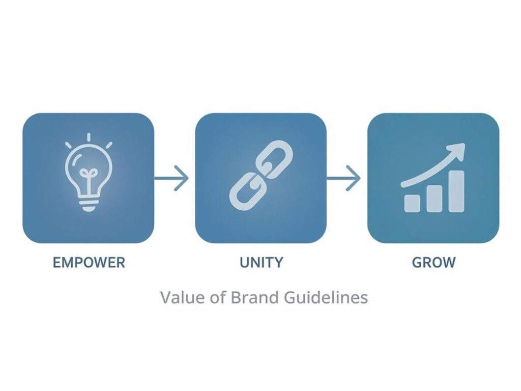
As you can see, these guidelines do more than keep things looking tidy—they empower your teams, unify the brand experience, and ultimately drive business growth.
A Framework for Decisive Action
Here’s a practical example: a marketing manager confidently approves a new ad campaign because they know it aligns perfectly with the established typography and imagery rules. Or a new sales hire quickly learns the right tone for client emails, sounding like a seasoned member of the team from day one. This level of efficiency is critical for scaling a business without diluting its identity.
Brands like Slack are masters of this. Their guidelines ensure they maintain a distinct, helpful, and slightly quirky personality across every platform. Their consistency is a deliberate strategy that turns their brand into a competitive advantage. No matter where you encounter Slack—on their website, in their app, or through a support ticket—the experience is familiar and trustworthy. This is the ultimate goal when you learn how to create brand guidelines: turning consistency into a powerful engine for recognition and loyalty.
Defining Your Brand’s Core Identity and Voice
Before you pick a single color or font, you have to lay the groundwork. Your brand guidelines are meaningless without a solid foundation—one that anchors your brand’s purpose, personality, and strategic direction. These core elements aren’t just abstract ideas; they are the practical filters through which every creative and strategic decision must pass.
The first step is to articulate the “why” behind your brand. This means defining your mission, vision, and core values. A deep understanding of how to build brand identity is crucial here, as it ensures your guidelines are rooted in your core purpose from the start.

Articulating Your Brand’s Purpose
Let’s get these foundational statements down on paper. They provide the strategic bedrock for your entire brand and are non-negotiable for anyone learning how to create guidelines that last.
- Mission Statement: This is your “what” and “why” for today. What does your company do, who do you serve, and what is the core value you provide? Practical Example: “To provide small businesses with affordable and effective tools for online growth.” It’s clear, concise, and actionable.
- Vision Statement: This is your future-facing “why.” What is the ultimate impact you want to have on the world if you succeed? Practical Example: “A world where every small business can compete on a level playing field, regardless of budget.”
- Core Values: These are the non-negotiable principles guiding your actions. Think of values like “Integrity,” “Innovation,” or “Customer-Centricity” as the conscience of your brand, shaping your culture and decisions.
Documenting these first ensures that every rule that follows—from logo placement to social media voice—is perfectly aligned with your brand’s soul.
Crafting a Distinct Brand Voice and Tone
With your strategic foundation set, it’s time to define how your brand communicates. Your brand voice is your brand’s consistent personality. Your tone is the emotional inflection that adapts to different situations.
Think of it like this: your voice is fixed, but your tone is flexible. A brand might always have a “helpful” voice, but its tone could be “reassuring” when handling a customer complaint or “enthusiastic” when announcing a new product.
A consistent brand voice transforms communication from a simple exchange of information into a memorable experience. It’s the difference between being another company and becoming a trusted, recognizable personality in your industry.
To nail this down, ask yourself: If my brand were a person, who would it be? Are you the witty, clever friend like Wendy’s, known for its sharp social media presence? Or are you the trusted, authoritative expert like IBM, communicating with precision and confidence?
Establishing Clear Messaging Pillars
To apply that authentic voice consistently, you need clear messaging pillars. These are the 3-5 key themes or topics your brand owns. They are the core messages you want your audience to immediately associate with you.
For a digital agency, these messaging pillars might be:
- Strategic Growth: We focus on data-driven results that expand your business.
- Creative Excellence: We deliver high-quality design and innovative solutions.
- Client Partnership: We work as a collaborative and supportive extension of your team.
These pillars become guideposts for content creation, ensuring everyone from marketing to sales is speaking the same language and reinforcing the same core ideas. This coherence isn’t just about looking good; it has a direct financial impact. According to a Lucidpress report, consistent branding can increase revenue by 10-20%, yet less than a quarter of organizations have brand guidelines that are consistently enforced. By defining your identity, voice, and messaging, you create a unified brand that connects with audiences and drives measurable growth.
Building Your Visual Foundation with Logos and Colors
Once you’ve defined your brand’s core identity and voice, it’s time to translate that personality into the visual elements people will see every day. This is where your brand stops being an abstract idea and starts becoming a recognizable face. To keep that face consistent, you must meticulously document your logo and color palette. This isn’t just about aesthetics; it’s about preventing the visual chaos that erodes trust.
Your logo is the most identifiable piece of your brand. It will appear everywhere—from a tiny website favicon to a massive trade show banner—so setting ironclad rules for its use is non-negotiable. Getting this right ensures your primary mark is always presented with integrity, which is fundamental to building strong brand recognition.
Defining Your Logo Usage Rules
A useful set of logo guidelines anticipates every possible way your logo might be used—and misused. The goal is to give designers, partners, and your team crystal-clear instructions, leaving no room for creative interpretations that could dilute the brand. You want to make it easy to get it right and almost impossible to get it wrong.
Start by clearly outlining the different versions of your logo and when to use them.
- Primary Logo: Your hero. This is the main, full-color version that should be used by default whenever possible.
- Secondary Lockups: Alternate arrangements, like a stacked vertical version for social profiles or a wide horizontal one for website headers. Specify the context for each.
- Monochromatic and Icon-Only Versions: You need a simple, one-color version (all-white or all-black) for busy backgrounds or branded merchandise. The icon-only version (logomark) should be reserved for places where the brand is already well-established, like an app icon.
After defining the logo variations, you need to establish the rules of engagement.
Establishing Clear Space and Minimum Size
For your logo to always look its best, it needs breathing room and legibility. This is where clear space and minimum size rules are critical.
Clear space (or exclusion zone) is the protected area around your logo. No other text, graphics, or distracting elements should ever intrude on this space. Practical Example: A common technique is to use a key element from the logo itself, like the height of the main letter, to define the buffer zone on all sides. This simple rule prevents your logo from feeling crowded and ensures it always stands out.
Equally important is the minimum size. This is the absolute smallest your logo can be displayed in digital and print formats before it becomes an unreadable blur. Be specific. Define these sizes in pixels for web (e.g., 72px wide) and inches or millimeters for print (e.g., 1 inch wide). Skipping this step is asking for a damaged professional image. For a deeper dive, check out this guide on the essentials of designing a logo.
A “Don’ts” section with visual examples is one of the most powerful parts of any brand guide. By showing exactly how not to use the logo—stretched, with altered colors, on a low-contrast background—you proactively shut down the most common branding mistakes before they happen.
Specifying Your Brand Color Palette
While the logo is your signature, your color palette sets the mood. Color is a powerful psychological tool. Research shows a signature color can boost brand recognition by up to 80%, and as many as 90% of snap judgments about products are based on color alone. That’s why documenting your colors with scientific precision is so critical. You can find more data on this in this roundup of branding statistics and their impact on consumer perception.
Your guidelines must clearly define your primary, secondary, and accent colors. For every color, provide the exact values for every context to guarantee perfect consistency.
- HEX: For all web and digital applications.
- RGB: For anything displayed on a screen, like presentations or videos.
- CMYK: For anything printed, from business cards to packaging.
A simple table is the clearest way to present this information.
Here’s an example of how you can structure the color data in your guidelines to make it foolproof for anyone to use.
Brand Color Palette Specification Example
| Color Role | Swatch | HEX | RGB | CMYK | Usage Notes |
|---|---|---|---|---|---|
| Primary | #005A9C | 0, 90, 156 | 100, 42, 0, 39 | Main brand color for headers, logos, and primary calls-to-action. Meets WCAG AA contrast with white text. | |
| Secondary | #F5A623 | 245, 166, 35 | 0, 32, 86, 4 | Use for secondary buttons, highlights, and accents. Use with dark text for accessibility. | |
| Neutral | #F2F2F2 | 242, 242, 242 | 0, 0, 0, 5 | Background color for content sections to provide visual separation. | |
| Dark Text | #333333 | 51, 51, 51 | 0, 0, 0, 80 | Standard color for all body copy and paragraph text to ensure maximum readability. |
This table leaves no guesswork, ensuring that whether your brand appears on a screen in New York or on a billboard in Tokyo, the colors remain exactly the same.
Ensuring Accessibility in Your Colors
A modern brand isn’t just visually appealing—it’s inclusive. The Web Content Accessibility Guidelines (WCAG) provide the global standard for color contrast, ensuring text is readable for everyone, including people with visual impairments.
Your brand guidelines must specify which color combinations are approved for use. For example, state that white text is approved on your primary blue, but light gray text is not, because it fails the minimum AA contrast ratio. Building these rules directly into your guide is a proactive way to ensure your brand is both beautiful and usable for all. It’s not just good ethics; it’s good business.
Establishing a Clear and Cohesive Typography System
Think of your typography as the visual tone of your brand’s voice. While your color palette sets the mood, the fonts you choose give that voice its distinct character. Are you modern and clean? Classic and trustworthy? Bold and innovative? The right typography makes that clear before a single word is read.
A well-defined typography system is more than just picking fonts you like. It’s about creating a consistent, readable, and recognizable experience. Without one, your communications can quickly become a mess of conflicting styles, making content difficult to follow and weakening your professional image.
Selecting Your Primary and Secondary Typefaces
The best place to start is by selecting a core pair of typefaces. For most brands, a two-font system works wonders: one for attention-grabbing headlines and another for easy-to-read body text. This creates an immediate visual hierarchy and is simple enough for anyone on your team to apply correctly.
- Primary Typeface (Headlines): This is your statement font. It should capture your brand’s essence. This could be a sophisticated serif or a distinctive sans-serif, and it will be used for your main H1s, H2s, and key headings. Its job is to draw the eye.
- Secondary Typeface (Body Text): Here, readability is king. You need a workhorse font that’s clean, simple, and comfortable to read in long passages. A neutral sans-serif like Open Sans or a classic serif are popular for a reason—they just work, especially at smaller sizes.
A quick but critical note on licensing: always check your font licenses. Some fonts are free for commercial use through services like Google Fonts, while premium typefaces require a purchased license. Ensure your choice is legally accessible and affordable for your entire organization.
Establishing a Typographic Scale
Once your fonts are chosen, you need a system of sizes and weights to bring order. This is where a typographic scale comes in. It’s a pre-defined set of font sizes that are mathematically related, ensuring they look harmonious. It stops designers from picking random sizes and keeps everything looking intentional.
A modular scale is a practical way to build this. You just need a base font size for your body text (e.g., 16px) and a ratio (e.g., 1.250). From there, you multiply up to create your heading sizes.
Here’s a practical example with a 16px base and a 1.250 ratio:
- Body Text: 16px (Base)
- H4 (Small Heading): 20px (16 x 1.250)
- H3 (Subheading): 25px (20 x 1.250)
- H2 (Section Heading): 31.25px (25 x 1.250)
- H1 (Main Heading): 39.06px (31.25 x 1.250)
This isn’t just arbitrary math; it creates a progression of sizes that is naturally pleasing to the human eye. Your guidelines should document these exact pixel values for every heading level.
Your typographic scale is the backbone of your brand’s written communication. It’s an invisible framework that guides the reader’s eye, making your content more scannable, understandable, and professional.
Defining Rules for Spacing and Style
The final touches are what separate good typography from great typography. Your brand guidelines must get specific about spacing and styling to ensure a polished, consistent look. These details have a massive impact on readability.
Be sure to define and provide examples for these rules:
- Line Height (Leading): The vertical space between lines. A solid rule of thumb is a line height of 1.5 times the font size for body copy (e.g., 16px text gets a 24px line height). This gives text room to breathe.
- Letter Spacing (Tracking): The horizontal space between characters. Headlines often look better with slightly tighter tracking to feel more solid, while body text should stick to standard spacing. Define exact values (e.g., -1% tracking for H1).
- Font Weights: Be explicit. State which weights to use for which elements—for example, Bold (700) for headlines and Regular (400) for body text. Prohibit the use of “faux bold” or “faux italics,” as they distort the original letterforms.
- Paragraph Styles: Lay out rules for paragraph indentation, the space between paragraphs, and the ideal line length (aim for 50-75 characters) to create the most comfortable reading experience.
By documenting these precise typographic rules, you empower your team to produce consistently clear, readable, and on-brand communications. This attention to detail is the hallmark of a professional brand.
Guiding Imagery and Creative Asset Application
Great brand guidelines go far beyond logos and fonts; they orchestrate the entire visual experience. This is your chance to define the mood and feeling of your brand through photography, illustration, and iconography. When done right, every asset—from a website hero image to a tiny social media icon—feels like it comes from the same creative universe.
Without this direction, a brand’s visual presence becomes a jarring mess. Imagine a marketing campaign using bright, polished stock photos while the website features gritty, documentary-style shots. This inconsistency creates confusion and weakens the brand’s personality. The goal is to build a unified look that people recognize instantly.
Defining Your Photography Style
Think of your photography as a powerful storytelling tool. The style you choose must be a direct reflection of your core values and voice. A good starting point is to define the overall feeling you want your images to evoke. Should they feel candid and authentic, or polished and aspirational?
Once you’ve settled on that core direction, you can establish specific rules to guide photographers, designers, and marketers in creating or choosing the right images.
- Subject Matter: Be explicit about what your photos show. Do they feature diverse teams collaborating, customers using your product in real-world settings, or abstract concepts tied to your industry? Providing concrete examples of what’s on-brand is essential.
- Composition: Lay out the ground rules for framing. Do you prefer centered, symmetrical compositions to convey stability, or do you use the rule of thirds for a more dynamic feel?
- Color Grading: Define the color treatment for all photography. Should images be warm and vibrant, or cool and desaturated? Providing a specific preset or filter details ensures every photo shares the same color DNA.
- Lighting: Specify the kind of lighting that fits your brand. Soft, natural light creates an approachable vibe, while high-contrast, dramatic lighting can communicate intensity and precision.
Outlining Illustration and Iconography Systems
Illustrations and icons offer a unique way to explain complex ideas and inject personality where a photograph might not fit. Your guidelines must define a consistent style, whether that means simple line art, detailed 3D renderings, or something else entirely. Consistency is everything; it’s what builds a strong, memorable visual identity.
To see this done well, look at some of the top 10 good design examples that inspire creativity. Many demonstrate a masterful use of custom illustration and iconography to build a distinct brand.
Your icon library isn’t just decoration; it’s a functional part of your brand’s visual language. By creating a custom set where every icon shares the same line weight, color palette, and stylistic details, you create a seamless user experience and reinforce your brand identity in even the smallest interactions.
Document the specific attributes of your illustration and icon styles. Specify line weights, the corner radius for shapes, rules for applying color, and whether to use flat colors or gradients. This level of detail removes guesswork and ensures every new graphic feels like it belongs.
Creating Usable Templates and Assets
Rules are only useful if people can follow them. To help your team apply these standards, support your guidelines with a library of pre-made templates for common assets. This not only speeds up content creation but also drastically reduces the chance of someone going off-brand.
Consider building ready-to-use templates for:
- Social media graphics (Instagram posts, LinkedIn banners)
- Presentation decks
- Email newsletter headers
- Blog post feature images
To ensure these assets are used correctly, follow strong digital asset management best practices. This framework helps you organize, store, and distribute all your approved photos, icons, and templates, guaranteeing everyone has access to the most current, on-brand resources. This is how you create brand guidelines that people actually use.
Making Your Brand Guidelines a Living Resource
You’ve built a comprehensive set of brand guidelines. That’s a massive accomplishment. But the job isn’t over. A guideline document gathering digital dust is worthless. The real challenge is transforming that rulebook into a dynamic, living resource your entire organization actually uses.
Let’s be honest: a static PDF is doomed from the start. The moment a new logo variation is created or a secondary color is tweaked, that document is obsolete. This leads to confusion, frustration, and an inconsistent brand. That’s why the most effective brands have moved to dynamic, web-based brand portals.
From Static PDF to Dynamic Portal
Platforms like Notion, Frontify, or even a well-structured section of your company intranet can turn your guidelines into an interactive, central hub. This isn’t a minor upgrade; it’s a fundamental shift in how your brand is managed.
- A True Single Source of Truth: Any update—from a new font style to a revised mission statement—is reflected instantly for everyone. This eliminates the risk of someone using an outdated version.
- Instantly Accessible Assets: A digital portal does more than just show your logo; it lets people download the exact file they need, right then and there. This removes friction and makes it easy for people to do the right thing.
- Effortless Searchability: Need the exact dimensions for a LinkedIn banner ad? A quick search gets you the answer in seconds, instead of scrolling through a 100-page document.
This transition from a static file to a digital resource is the key to widespread adoption. When your guidelines are easy to find and genuinely helpful, your team will naturally start to rely on them.
Launching and Championing Your Guidelines
Don’t just send a company-wide email with a link. A thoughtful internal launch is critical for building buy-in and showing everyone how this new resource makes their jobs easier. Host interactive workshops and walk different teams through the portal, explaining the “why” behind the rules. Context builds understanding and respect for the brand.
The most effective brand guidelines are not enforced from the top down; they are championed from within. Identify and empower brand champions in key departments—like marketing, sales, and HR—to act as go-to experts for their colleagues.
These individuals become local authorities on the brand. They can answer quick questions, offer friendly advice, and help foster a culture where brand consistency is a shared responsibility, not a chore. This peer-to-peer support is infinitely more powerful than top-down policing.
Finally, establish a clear governance process. Who approves new creative? Who is responsible for updating the brand portal? Treat your guidelines as an evolving system. Schedule annual reviews to ensure the brand playbook grows and adapts with the business, cementing its place as an invaluable tool for years to come.
Common Questions About Brand Guidelines
Even with the clearest roadmap, putting together a brand playbook always brings up questions. Getting these common sticking points sorted out early helps everyone move forward with confidence and use the guidelines as intended.
Here are some of the questions we hear most often.
How Often Should I Update My Brand Guidelines?
Your brand guidelines should be a living document. Plan for an annual check-in to make small tweaks—perhaps adding a new logo lockup for a partnership or refining accessibility notes. Think of it as routine maintenance.
A complete overhaul is a different story. You’ll need to dive much deeper during major business shifts.
Triggers for a comprehensive update include:
- A full rebrand or major visual refresh.
- A merger or acquisition.
- A significant change in your core business strategy.
- Expansion into new markets with different cultural nuances.
The goal is to ensure your guidelines stay relevant and genuinely useful. If they aren’t helping your team, they aren’t working.
What Is the Difference Between a Style Guide and Brand Guidelines?
People often use these terms interchangeably, but they serve different purposes. A style guide is tactical. It covers the nitty-gritty of content and design rules: grammar, punctuation, code formatting, and the specific application of visual elements.
Brand guidelines are strategic. They are much broader and contain the style guide within them. They also articulate the brand’s mission, core values, personality, and voice.
Brand guidelines explain the “why” behind the rules, grounding every decision in the core identity of the business. A style guide simply explains the “how.”
Can a Small Business Create Effective Brand Guidelines?
Absolutely. In fact, it’s one of the highest-impact things a small business can do. Consistency is how you build recognition and trust when you’re starting out, and you don’t need a massive document to do it.
A simple, one-page guide can be incredibly powerful. Clearly define your primary logo usage, your main color palette, and your chosen fonts. That’s a fantastic start. Your guidelines can—and should—evolve in complexity as your business grows.
Ready to build a brand that stands out? The team at Galant Studios has over 8 years of experience helping businesses like yours achieve their goals with expert branding and SEO.
Discover how our services can elevate your brand today
