
Before you can address a high bounce rate, you must first understand why people are leaving. It’s less about chasing an arbitrary number and more about diagnosing the real friction points in your user’s journey. Once you know the why, you can make changes that actually improve engagement and drive conversions.
Understanding Why Visitors Really Leave Your Site
Let’s start with the basics. A “bounce” is simply a one-page session. Someone lands on your site and leaves without clicking to another page, filling out a form, or buying anything. That’s it.
But a high bounce rate isn’t automatically a bad thing. Context is everything.
- A “Good” Bounce: Someone searches for a specific fact, lands on your blog post, gets the answer they need instantly, and leaves happy. For example, a user looks up “how many ounces in a cup,” your cooking blog provides the answer in the first sentence, and they leave. The bounce rate is high, but you successfully solved their problem.
- A “Bad” Bounce: A potential customer lands on your product page, gets confused by the layout, and leaves out of frustration. That’s a high bounce rate signaling a lost sale.
So, the first real step is to stop looking at the overall number and start digging into the user journey to find which pages are actually underperforming.
Get In Touch
Setting Realistic Goals With Industry Benchmarks
One of the biggest mistakes is aiming for an impossibly low bounce rate without considering your industry. A blog will almost always have a higher bounce rate than an e-commerce store—that’s just the nature of how people use them.
People often visit a blog to read one article and then leave. On an e-commerce site, the goal is to get them to browse multiple products and, eventually, check out.
Looking at industry benchmarks helps set the right expectations. According to 2025 benchmarks, a healthy bounce rate for a transactional site is typically between 26% and 40%. For content sites and blogs, that number can be anywhere from 65% to 90%, and that’s perfectly fine. For example, shopping sites average around 45.7%, while news or food sites can easily top 65%.
Using these figures as a guide helps you set goals that make sense for your specific market. You can explore more 2025 benchmarks to see where you stand.
A data-driven approach lets you focus your energy where it will make a difference. This table breaks down what you can expect across different site types.
Industry Average Bounce Rate Benchmarks
A comparison of typical bounce rate ranges across different website types to help you set realistic performance goals.
| Website Type | Typical Bounce Rate Range | What This Means for Strategy |
|---|---|---|
| E-commerce & Retail | 20% – 45% | Users are expected to browse. A high bounce rate here often points to UX issues, poor product descriptions, or pricing problems. |
| B2B & SaaS | 25% – 55% | Visitors are often researching solutions. High bounce rates can signal a disconnect between marketing messages and landing page content. |
| Landing Pages | 60% – 90% | Designed for a single action. If users don’t convert, they bounce. This range is normal, but the goal is to optimize the conversion rate. |
| Blogs & News Sites | 65% – 90% | People often come for one article. The key is to encourage further reading with clear internal links and related content suggestions. |
This data confirms that your strategy should be tailored. A 40% bounce rate is great for a blog but a major red flag for an e–commerce store.
The chart below offers a simple visual for this idea.
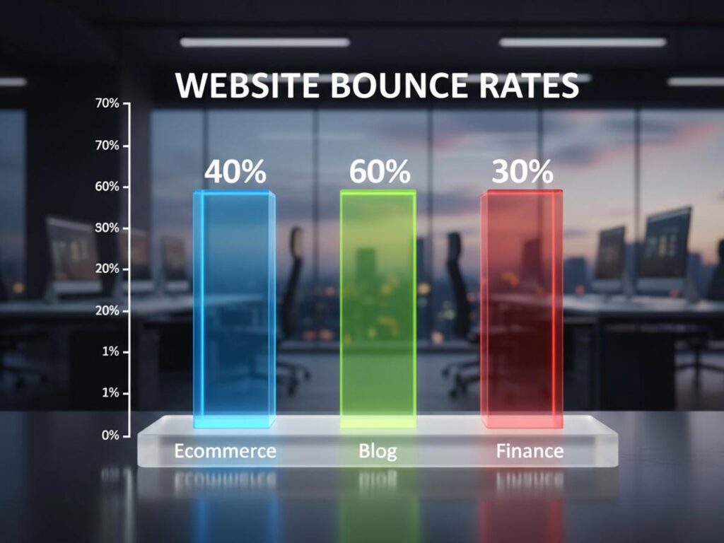
As you can see, a 60% bounce rate on a blog might be just fine, while that same 40% on an e-commerce site could be a sign that something needs to be fixed.
Pinpointing Problem Pages in Google Analytics
Now it’s time to turn these ideas into action. You need to find the exact pages causing the problem, and for that, Google Analytics is your best friend.
Head to the “Engagement” section and find the “Pages and screens” report. From there, you can add “Bounce rate” as a metric to your table and sort the list to see your worst offenders.
The goal here isn’t just to find pages with high bounce rates. You’re looking for a pattern. Are all your top-bouncing pages product pages? Or maybe they’re blog posts targeting a specific keyword? Finding a trend is the key to uncovering a systemic issue.
Once you have this data, you can start forming hypotheses. A landing page with a shockingly high bounce rate might mean your ad copy doesn’t match what’s on the page. If all your blog posts have high bounce rates, maybe the text is hard to read or you aren’t giving readers a clear next step with internal links.
This is how you turn a simple metric into a powerful diagnostic tool. You’re no longer just looking at a number; you’re actively improving the user experience.
Get In Touch
Winning the First Three Seconds with Site Speed
In the online world, patience is a currency most people don’t have. You get a tiny window—maybe three seconds, if you’re lucky—to make an impression. If your page is still chugging along, that visitor is gone. They’ll hit the back button without a second thought, and you’ve just gained another tick in your bounce rate report.
This isn’t just a hunch; it’s a hard reality backed by data. Tackling your site’s load speed is one of the most direct ways to keep people from leaving. Analyses from 2024–2025 are clear: even a one-second delay sends bounce rates climbing. For every extra second a user is forced to wait, page views can drop by up to 11%, and customer satisfaction plummets by 16%.
The numbers are stark. Nearly half (47%) of users will leave a site that takes longer than two seconds to load. As that wait time drags on from one to ten seconds, the likelihood of a user bouncing can skyrocket by an incredible 123%.
Site performance isn’t just a job for the IT department anymore. It’s a fundamental part of marketing and user experience.
Compress Images Without Compromise
One of the biggest culprits behind a sluggish website? Bloated, unoptimized images. Of course, you want high-resolution photos, but they come at a steep performance cost if you don’t handle them correctly. The trick is to shrink the file size without any noticeable drop in visual quality.
Think about a product page on an e-commerce site with five beautiful, high-res images. If each one is over 2MB, you’re forcing users to download 10MB of data just for the pictures. That can absolutely kill your load time, especially for someone on a mobile connection. The good news is that image compression tools can often cut file sizes by 70% or more, and most people will never see the difference.
A few practical tips for image optimization:
- Pick the Right Format: Use JPEG for photographs. For graphics with transparent backgrounds, PNG is your best bet. And if you can, look into modern formats like WebP, which offer fantastic compression and quality.
- Use Compression Tools: There’s no need to do this manually. A WordPress plugin like Smush or a simple online tool like TinyPNG can automate the entire process.
- Turn on Lazy Loading: This is a game-changer. It tells the browser to only load images as the user scrolls them into view, dramatically speeding up that crucial initial page load.
Master Browser Caching and Script Handling
Images are just one piece of the puzzle. The code that makes your website work also plays a massive role in its speed. Two powerful techniques can stop your site’s code from becoming a bottleneck: browser caching and smarter script handling.
Browser caching works by storing parts of your site—like your logo, CSS files, and JavaScript—on a visitor’s computer. When they come back, their browser can load those files from local storage instead of downloading them all over again. This makes return visits feel almost instantaneous.
At the same time, scripts from third-party tools (think analytics or live chat widgets) can actually stop your main content from appearing until they’ve finished loading. This is where defer and async attributes come in.
By adding a simple
deferattribute to a non-essential script tag, you’re telling the browser, “Hey, go ahead and load the visible content first. You can run this script after the important stuff is done.” It’s a small tweak that can make a huge difference in perceived load time, which is exactly what you need to reduce bounces.
If you want to get into the technical nitty-gritty, our complete guide on how to improve website speed walks you through these steps in much greater detail.
Leverage a Content Delivery Network
A Content Delivery Network, or CDN, is a must-have if your audience is spread out across the country or around the world. A CDN is essentially a network of servers located globally that keep copies of your website’s “heavy” assets, like images, CSS, and JavaScript.
Let’s say your main server is in New York, but someone from Japan visits your site. Without a CDN, their browser has to fetch all that data from halfway across the world. With a CDN, it instead grabs those files from a server in Asia. This move drastically cuts down on latency—the time it takes for data to travel—and makes your website feel snappy for everyone, no matter where they are.
Think of it as having local warehouses for your website’s biggest parts. Instead of a long-haul shipment from one central hub, you’re delivering from the closest distribution point. It’s one of the most effective changes you can make to win that critical first-impression battle.
Designing a Clear Path for Your Users

Think of a great website as a silent guide. It anticipates what visitors need and leads them there effortlessly. A confusing site, on the other hand, is like a maze with no exit—and most people’s immediate reaction is to leave. If you want to keep visitors around, you have to build an intuitive path for them to follow.
When someone lands on your page, they should instantly know where they are and how to find what they’re looking for. This isn’t just about good aesthetics; it’s about building trust and lowering the mental effort it takes to use your site. Nail this, and visitors are far more likely to stick around.
Build an Intuitive Navigation Menu
Your main navigation is the roadmap for your entire website. If it’s cluttered, illogical, or full of vague terms, you’re basically handing your visitors a ticket to leave. The whole point is to anticipate their needs and lay out a clear, logical structure.
Put yourself in your customer’s shoes. What are the three to five key destinations they’re looking for? A classic mistake is to pack the menu with every possible link. A clean menu with essentials like “Services,” “About Us,” “Blog,” and “Contact” is always more effective than a dropdown menu with a dozen different choices.
A poor navigation structure is a top reason for a high bounce rate. You’ll find great strategies for improving website navigation that can help guide visitors more effectively. Remember to use simple, direct labels. “Pricing” will always beat clever but unclear jargon like “Investment Options.”
Provide a Sense of Place with Breadcrumbs
As users click deeper into your site, it’s easy for them to get lost. Breadcrumbs are a simple but powerful tool that shows people exactly where they are within your site’s hierarchy. Think of it as a “You Are Here” map.
This gives visitors a one-click way to get back to a parent category, which stops them from feeling trapped on a deep page. When people feel in control, they’re more inclined to explore instead of hitting the back button until they’re gone.
Implementing breadcrumbs is more than just a navigational aid; it’s a psychological cue that reinforces the structure and depth of your website, subtly encouraging users to explore related content.
The beauty of breadcrumbs is their simplicity. It’s a universally understood feature that requires zero learning, making it an easy win for improving user experience and, ultimately, your bounce rate.
Get In Touch
Prioritize Mobile Responsiveness
With well over half of all web traffic now coming from mobile devices, having a site that isn’t mobile-friendly is simply not an option. A design that forces users to pinch, zoom, and scroll horizontally is a recipe for frustration and an instant bounce.
Mobile responsiveness can’t be an afterthought; it needs to be central to your design strategy. Every single element, from menus to calls-to-action, must be easy to use on a small screen. This means buttons need to be large enough to tap and text has to be legible without zooming in.
For a true mobile-first design, focus on these areas:
- Simplified Navigation: A “hamburger” menu keeps navigation handy without cluttering the screen.
- Readable Fonts: Make sure your font sizes are comfortable to read on a phone.
- Thumb-Friendly Design: Place important interactive elements where a user’s thumb can easily reach them.
Paying close attention to the mobile experience shows you respect your users’ time and situation, which goes a long way in convincing them to stay.
Use Visual Hierarchy and Whitespace
Good design isn’t random; it guides the eye to the most important elements on the page. You accomplish this with a strong visual hierarchy. Key elements like headlines, subheadings, and buttons should stand out through their size, color, and placement.
Whitespace—the empty area around your content—is just as important. It’s not wasted space. It’s a powerful tool that makes your content easier to read and less overwhelming. Plenty of whitespace makes a page feel more approachable and scannable, preventing that “wall of text” feeling that makes people want to leave.
By using these design principles, you create a clear path that naturally moves users toward your goals. This whole approach is a critical piece of the larger strategy of customer journey optimization, which is all about refining every touchpoint to better serve both user needs and business objectives. A thoughtful design doesn’t just look good—it gets results.
Creating Content That Demands a Second Click
While site speed and design make the first impression, your content is what truly earns a visitor’s attention. Think of it as the real handshake. Exceptional content is the single most powerful reason for someone to stay and explore.
But if that content fails to deliver on its promise or greets the reader with an impenetrable wall of text, they’re gone. It’s that simple.
The whole game hinges on a simple, unbreakable rule of trust. Your headline makes a promise, and the first paragraph must prove you intend to keep it. Any mismatch between what you offer and what you deliver shatters that trust and sends your bounce rate through the roof.
Fulfill the Headline’s Promise Immediately
When someone clicks on your headline, they have a very specific expectation. Your one job is to meet that expectation right away, ideally within the first few sentences.
If your title is “5 Easy Ways to Improve Garden Soil,” your opening paragraph needs to confirm that you’re about to share actionable soil improvement techniques. No long, meandering stories about your grandfather’s garden. Get straight to the point.
A visitor who feels you’ve wasted their time with fluff will almost certainly bounce. This principle isn’t just for the intro, either. Every single section of your content has to align with that initial promise, delivering value from top to bottom.
Get In Touch
Structure Your Content for Scannability
Let’s be honest: people don’t read on the web; they scan. They’re hunting for key information, with their eyes darting to headings, lists, and bolded text that signal relevance. If your page is just a solid block of dense paragraphs, you’re making their job impossible.
An effective content structure makes it easy for users to find what they need fast. This isn’t just about being helpful—it’s a critical part of keeping them on the page.
A well-structured article is a visual roadmap. It lets users absorb the main points with minimal effort. This isn’t “dumbing down” your content; it’s about respecting their time and making your expertise more accessible.
To boost readability and encourage people to stick around, put these formatting tactics to work:
- Use Short Paragraphs: Keep paragraphs to a 2-3 sentence maximum. The whitespace makes the page feel less intimidating and much easier to process.
- Employ Descriptive Subheadings: Break your content into logical chunks with clear H2 and H3 tags. These act like signposts, helping readers jump to the sections that matter most to them.
- Incorporate Bullet Points and Numbered Lists: When you’re outlining steps, features, or takeaways, lists are infinitely more digestible than a long, convoluted sentence.
Nailing these structural elements can transform a daunting page into an inviting resource. For a deeper dive, exploring a guide on how to write website copy can give you a solid foundation for crafting content that truly connects.
Build a Journey with Strategic Internal Linking
Once you have a visitor hooked, the next move is to guide them toward other relevant information on your site. This is where internal linking becomes your best friend, turning a single page visit into a multi-page session.
A good internal link should feel like a natural, helpful next step. It’s not just about stuffing in links for SEO; it’s about anticipating the reader’s next question and already having the answer ready.
For example, if you’re writing about the benefits of organic gardening, it makes perfect sense to link to another article on how to start a compost bin. You’re creating a logical path for an interested reader to follow, which naturally increases their time on site and deepens their connection with your brand.
A smart internal linking strategy achieves several key goals:
- Reduces Bounce Rate: It gives visitors a clear next step, preventing them from leaving after they finish the first article.
- Increases Session Duration: By leading users to related content, you keep them on your site longer, which search engines love to see.
- Demonstrates Authority: A well-linked site shows the depth of your expertise, building crucial trust with your audience.
- Improves Site Architecture: It helps search engines understand how your pages relate to one another, boosting your site’s overall visibility.
By weaving together trustworthy content, scannable formatting, and strategic internal links, you create an experience that doesn’t just answer a question—it sparks curiosity. That’s how you get that second click.
Using Advanced Tactics to Boost Engagement
Once you’ve nailed the fundamentals—fast load times, intuitive navigation, and great content—it’s time to get a bit more sophisticated. The real magic happens when you shift your focus from simply providing information to creating a truly memorable experience.
These advanced strategies are all about turning passive scrollers into active participants. The idea is to give them a compelling reason to interact with your site, which in turn gives them a reason to stick around. Even a few seconds of active engagement can build a connection and dramatically lower the chance they’ll bounce away.
Turn Visitors into Participants with Interactive Tools
Let’s be honest: static content has its limits. Interactive elements, on the other hand, invite your audience to step into the experience. I’ve found that tools like quizzes, polls, and calculators work wonders because they offer instant, personalized value for very little effort from the user.
Think about a mortgage broker’s website. They could list their interest rates in a dry table, or they could embed a simple mortgage calculator. The second option allows visitors to plug in their own numbers and see immediate, relevant results. It’s far more engaging because it’s about them.
Here are a few practical ideas I’ve seen work well:
- Quizzes: A skincare brand could use a “Find Your Perfect Routine” quiz that recommends specific products. It’s fun, personalized, and leads directly to a sale.
- Polls: A marketing blog could ask, “What’s your biggest SEO challenge in 2024?” and display the real-time results. This creates a sense of community and provides valuable feedback.
- Calculators: A financial planning firm could offer a retirement savings calculator. It helps users visualize their future and positions the firm as a helpful authority.
These tools are effective because they tap into our natural curiosity and desire for personalized information. They stop the scroll and create a much deeper level of engagement.
Capture Attention with Non-Intrusive Pop-ups
I know, I know—pop-ups have a terrible reputation. But when used thoughtfully, they can be an incredibly powerful tool for preventing bounces. The secret is to ditch the aggressive, page-blocking pop-ups that assault visitors the moment they arrive. The real game-changer is exit-intent technology.
Exit-intent pop-ups are smart. They only appear when a user’s cursor movement suggests they’re about to leave your site, like moving up to close the tab. This is your final opportunity to make a compelling offer and change their mind.
A well-timed exit-intent pop-up respects the user’s experience. It waits until they’re done and then offers one last piece of value—a discount, a free guide, an invitation to a webinar. This single change can turn a potential bounce into a valuable conversion.
The offer itself needs to be highly relevant. If someone is reading a blog post on email marketing, don’t show them a generic “Don’t Go!” message. Instead, offer them a “Free Email Subject Line Checklist.” Context makes the pop-up feel helpful, not annoying.
Get In Touch
Craft the Perfect Call-to-Action
Every single page on your site needs a clear purpose, and that purpose is best communicated through a strong call-to-action (CTA). If you leave visitors wondering what to do next, their default action will almost always be to hit the “back” button.
Think of your CTA as the bridge between the content someone just read and the next logical step you want them to take. It needs to be direct, specific, and impossible to miss. Forget vague phrases like “Click Here.” Use action-oriented language like “Download Your Free Template” or “Start Your 14-Day Free Trial.” Be specific about the value they’ll receive.
Ultimately, getting your bounce rate under control is a critical first step in optimizing your overall ecommerce conversion rates. A powerful CTA is that final, crucial instruction that guides a visitor from passive reading to active conversion. It’s one of the most important elements you can get right.
Frequently Asked Questions About Bounce Rate

When you start digging into bounce rate, a lot of questions tend to pop up. Let’s tackle some of the most common ones to clear things up and help you focus your optimization efforts where they’ll make a real difference.
What Is The Fastest Way to Reduce My Bounce Rate?
If you’re looking for quick wins, start with the technical fundamentals. The two areas that deliver the biggest impact right away are site speed and mobile responsiveness.
Think about it from a user’s perspective. A page that takes forever to load is an instant deal-breaker. Most people will hit the back button before your content even has a chance to appear. The same goes for a site that’s a jumbled mess on a smartphone.
Fixing these core user experience issues can lead to a surprisingly fast drop in your bounce rate because you’re removing the most immediate barriers to engagement.
Does Bounce Rate Directly Affect My SEO Rankings?
This is a classic question. While Google has never officially said, “We use bounce rate as a direct ranking signal,” it’s absolutely a canary in the coal mine for user experience.
Search engines are obsessed with user intent. A consistently high bounce rate tells them your page isn’t giving people what they came for. Over time, algorithms will naturally favor pages that provide a better, more engaging experience. So, while it’s not a direct input, a poor bounce rate can definitely harm your rankings indirectly.
A high bounce rate isn’t the problem itself—it’s a symptom. It signals that your content, design, or performance isn’t meeting expectations. When you fix those underlying issues, you improve user engagement, which is exactly what search engines want to see.
How Do I Know If My Bounce Rate Is Too High?
Context is everything. What’s considered “good” can vary wildly between a blog, an e-commerce store, and a single-page landing site. That said, some general benchmarks can help you get your bearings. A bounce rate between 40% and 60% is a healthy average for many websites.
Here’s a rough guide to help you interpret your numbers:
- Below 40%: Fantastic. This suggests your audience is highly engaged with your content.
- 60% – 80%: This is on the high side. It’s time to start investigating what might be turning visitors away.
- Above 80%: This is a definite red flag. Something is likely broken or seriously misaligned with your traffic.
If your rate is hanging out above 70% consistently, consider it a clear signal to start optimizing. For more on interpreting web metrics, resources from organizations like the U.S. General Services Administration can be quite useful.
Is A Low Bounce Rate Always A Good Thing?
Not always. If you see a bounce rate that seems almost too good to be true—like something under 20%—it’s often a sign of a technical glitch, not phenomenal engagement.
The usual suspect is a duplicated analytics tracking code. When the code fires twice for a single pageview, it tricks your analytics platform into thinking every visitor viewed two pages, which artificially pushes the bounce rate to nearly zero. So, if your numbers look impossibly good, the first step should always be to audit your analytics setup for errors.
At Galant Studios, we turn your website into a powerful tool for growth. Our expert SEO and website optimization services are designed to lower your bounce rate, increase engagement, and drive meaningful conversions. Let us help you turn more visitors into loyal customers. Discover how Galant Studios can elevate your online presence today.