
Your startup’s website is more than a digital brochure. It’s your first handshake with a potential customer, your 24/7 sales pitch, and your opening argument to an investor—all rolled into one. For a new venture, an exceptional website doesn’t just look professional; it projects competence, builds immediate trust, and makes your value proposition crystal clear from the first click. It’s the bedrock of your credibility.
Your Website Is Your First Investor Pitch
Think of your website as the ultimate audition. Before an investor sees your deck, before a customer requests a demo, and long before top talent considers joining your team, they will visit your website. This is their first, unfiltered look into your vision, your professionalism, and your potential to execute.
A clunky, confusing, or outdated site is a major red flag. It signals a lack of attention to detail—the last impression you want to make on someone considering investing their time or money in your business.
Conversely, a thoughtfully designed website becomes your most tireless advocate. It works around the clock to tell your story, qualify leads, and build the authority you need to stand out. It’s not just an expense; it’s a strategic asset for winning customers and securing the funding you need to grow.
The Financial Impact of Strategic Design
Investing in high-quality design is about more than aesthetics; it has a direct, measurable impact on your bottom line. There’s a reason the global web design market is projected to reach around $92 billion by 2030—businesses know it delivers results.
The numbers are compelling. Studies consistently show that every $1 invested in user experience can yield a return of up to $100. Why? Because a well-crafted site makes it effortless for people to understand what you do and why it matters to them. A clear path to action naturally leads to more conversions, more sign-ups, and more revenue. It’s a direct line from good design to a healthier bottom line.
For a startup, your website is the primary vehicle for establishing legitimacy. It’s where you prove that your innovative idea is backed by a professional, trustworthy operation capable of execution.
Building Credibility from the First Click
Exceptional website design for a startup is about creating a seamless experience that builds confidence with every interaction. This means establishing a clear visual hierarchy, designing intuitive navigation, and crafting messaging that speaks directly to your ideal customer’s pain points. When these elements work in harmony, they create a foundation of trust that is essential for early-stage growth.
This initial trust is also the first step toward building a memorable brand. Your site acts as the central hub for all your marketing efforts, and a strong, consistent design helps solidify your identity. To explore this concept further, you can learn more about how to build brand awareness through your digital presence.
For a comprehensive guide on building your foundational online presence and making your website an effective investor pitch, explore these essential tips for web development for startups.
Building Your Strategic Design Blueprint
Before you choose a color palette or write a line of code, the real work begins. This is the blueprint phase—the part where you create a documented plan that anchors every future decision. It’s about getting brutally honest about who your website is for, what it must achieve, and how you’ll measure success.
Diving straight into visual design without this strategic foundation is a classic, costly mistake. It’s like building a house without architectural plans. You might end up with something that looks interesting, but it almost certainly won’t function correctly or serve the people living inside. This process forces you to step outside your own assumptions and focus on what truly matters: your business goals and your customers’ needs.

Defining Your Ideal Customer with User Personas
First, get laser-focused on your audience. Forget vague demographics and start building practical user personas. A persona is a semi-fictional profile of your ideal customer, grounded in real data and insights. It’s not just about age or location; it’s about understanding their world.
An effective persona digs deep into a user’s motivations, daily frustrations, and what they’re trying to accomplish. For example, instead of targeting “small business owners,” create “Alex, the time-strapped cafe owner.”
- Pain Point: Alex is overwhelmed trying to manage online orders during the lunch rush, losing business to chains with slick apps.
- Goal: Alex needs a simple, affordable online ordering system that integrates with their existing POS and doesn’t require a tech degree to operate.
- Behavior: They research solutions late at night on their phone and trust reviews from other local restaurant owners.
See the difference? This level of detail is a strategic goldmine. It ensures every design decision, from the words on a button to the layout of a page, is made with Alex in mind. This process forces you out of your own bubble and helps you build a site that genuinely solves a problem for a real person.
A website designed for everyone is ultimately a website designed for no one. Focused user personas are the bedrock of an effective user experience, ensuring your design resonates with the people who matter most to your startup’s survival.
This empathetic, user-centric approach is the core of great design. Building a site that anticipates what users need and removes friction is what separates a bounce from a conversion. If you’re looking to go deeper on this, our guide offers a great breakdown of what user experience design is and its critical role in business success.
Crafting a Compelling Value Proposition
Once you know exactly who you’re talking to, your next job is to distill your startup’s entire mission into a single, powerful value proposition. This isn’t a fluffy tagline; it’s a clear, concise statement that instantly answers three questions for your visitor:
- Relevance: How does your product solve my problem or improve my situation?
- Quantified Value: What specific benefits can I expect?
- Unique Differentiation: Why should I choose you over the competition?
Consider the contrast. A weak value proposition is, “We sell innovative accounting software.” It’s vague and forgettable. A strong one, aimed squarely at our persona Alex, would be: “The 10-minute bookkeeping software for busy cafe owners. Spend less time on paperwork and more time with your customers.” It’s specific, benefit-driven, and speaks directly to Alex’s pain. This statement must be front and center on your website, grabbing attention and compelling visitors to learn more.
Translating Strategy into Measurable KPIs
Finally, a solid blueprint defines what success looks like in concrete numbers. This means translating your high-level business goals into specific Key Performance Indicators (KPIs). Vague objectives like “increase engagement” are useless because they are impossible to measure effectively. You need to be specific and actionable.
For example:
- Business Goal: Generate qualified leads.
- KPI: Number of Demo Request Form Submissions.
- Business Goal: Build an early-adopter community.
- KPI: Weekly Newsletter Sign-ups.
- Business Goal: Validate product-market fit.
- KPI: Free Trial Activation Rate.
By setting these KPIs before you start designing, you create a filter for every decision. Does this new feature help drive more demo requests? Does this page layout make it easier to sign up? This data-informed mindset ensures your website isn’t just an aesthetic showpiece but a high-performing asset built for growth.
Designing for Trust and Conversion
With your strategic blueprint locked in, it’s time to translate those plans into a tangible user experience. For a startup, this is where you build instant trust. Let’s be clear: trust isn’t a “nice-to-have”—it’s the currency that fuels every click, sign-up, and sale on your site.
A visitor’s decision to stay or leave happens in seconds. Your goal is to create an online environment where a potential customer feels understood, respected, and confident you can solve their problem. This is how you move from abstract ideas to concrete design elements that guide users seamlessly from curiosity to conversion. It’s about making every action feel effortless and intuitive.
The Psychology of a High-Converting Website
Great design is fundamentally applied psychology. People arrive on your site with a goal, and they have very little patience. A design that respects their time and cognitive energy is naturally more trustworthy and, therefore, more persuasive.
Consider this: 75% of visitors judge a company’s credibility based on its website design alone. That statistic says it all. Your design is your first and most powerful argument for why a customer should choose you.
Yet, a shocking 70% of small businesses have no clear call-to-action (CTA) on their homepage. They leave potential customers stranded, unsure of what to do next. When you consider that retailers can lose up to $2.6 billion annually from slow-loading pages, the financial case for thoughtful, conversion-focused design becomes undeniable.
This infographic breaks down the key metrics a well-designed startup website should be focused on optimizing: user satisfaction, task completion time, and bounce rate.
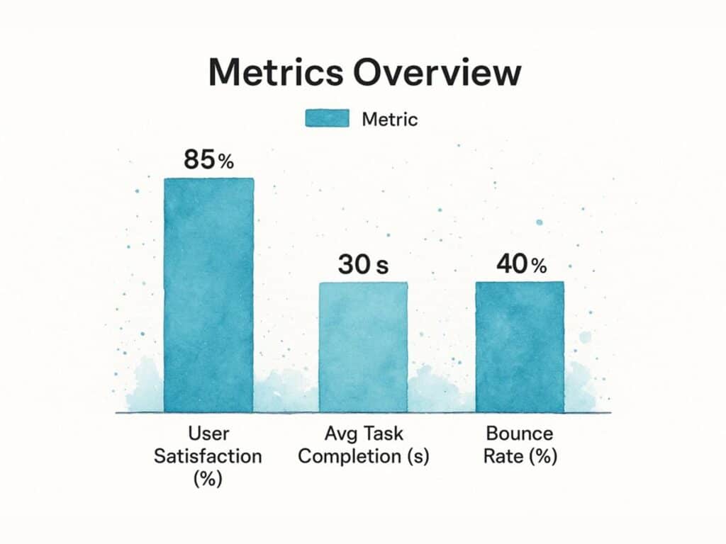
As you can see, there’s a direct line between a positive user experience—where people are satisfied and can get things done quickly—and a lower bounce rate. That’s a critical win for any startup.
Structuring Your Site for Intuitive Navigation
A user should never have to think about where to go next. Your website’s navigation is their roadmap, and it must be simple, logical, and predictable. Startups often try to get clever with navigation, but it almost always backfires, leading to frustrated visitors who simply leave.
Here are a few actionable principles for intuitive navigation:
- Keep Your Main Menu Lean: Stick to five to seven essential items. More than that creates choice paralysis and dilutes your core message.
- Use Plain Language: Ditch industry jargon. Use words your audience actually uses, like “Pricing,” “Features,” or “Contact.”
- Make Your CTA Pop: The single most important action you want someone to take—like “Get a Demo” or “Start Free Trial”—needs to stand out. Place it on the far right of the navigation bar and give it a contrasting color or button style to draw the eye.
A B2B SaaS startup I worked with had vague navigation terms like “Solutions” and “Resources.” We switched them to clear, action-oriented labels: “Features,” “Pricing,” and “Integrations.” The result? A 25% decrease in bounce rate on their homepage. Simple changes, massive impact.
A great website makes visitors feel smart. When navigation is intuitive and calls-to-action are clear, you empower users. That builds the confidence they need to take the next step and convert.
Building Authority with Social Proof
As a startup, you’re fighting an uphill battle against skepticism. Without decades of brand history, you must build credibility quickly. This is where social proof becomes your most powerful persuasive tool.
Social proof is the psychological principle that people adopt the actions of others in an attempt to reflect correct behavior. On your website, this translates to:
- Customer Testimonials: Short, powerful quotes from happy customers highlighting specific benefits. Use a name, company, and photo to maximize authenticity.
- Case Studies: Detailed stories that outline a customer’s problem, your solution, and the measurable results they achieved.
- Client Logos: Displaying the logos of companies you work with—especially well-known ones—is an instant credibility booster.
- Trust Badges & Certifications: Security seals (like SSL certificates) or industry awards immediately ease a visitor’s concerns.
The key is to weave these elements throughout your site, not just relegate them to a “reviews” page. Reinforce your value at every critical decision point. For a startup, converting visitors into customers is everything; exploring various strategies to improve website conversion rates can offer fresh ideas. To dive deeper into this, our guide on conversion rate optimization tips is a great next step.
Choosing Your Tech Stack Without The Headache
The technology choices you make today will echo for years, shaping how agile your startup can be. Picking a tech stack is far more than a technical detail; it’s a core business decision that dictates your speed to market, your ability to scale, and your control over your most valuable digital asset.
The goal isn’t to chase the newest, shiniest tool. It’s to find a practical path that fuels your growth instead of creating a roadblock. Let’s cut through the noise and focus on what really matters for an early-stage company: balancing your immediate needs with your long-term vision, all while respecting your budget and team’s capabilities.
Comparing The Core Platform Options
Every startup’s needs are unique, but most will choose one of three main routes for their website. Each presents a distinct mix of cost, flexibility, and ease of use. A smart website design for startups begins with a clear-eyed assessment of these trade-offs.
No-Code Builders (e.g., Webflow, Framer): These platforms are a game-changer for startups needing a highly custom, polished website without an in-house developer. Webflow, for example, provides incredible design freedom and a robust Content Management System (CMS), making it a top choice for many SaaS and tech companies.
Content Management Systems (e.g., WordPress): The workhorse of the web, WordPress is famous for its massive ecosystem of plugins and themes. It’s a powerful choice for content-heavy sites like blogs or publications, but it comes with a steeper learning curve and the ongoing responsibility of maintenance and security updates.
Custom Development (e.g., React, Next.js): For startups with unique functional requirements or those building a full-fledged web application, building from scratch offers unlimited potential. Using frameworks like React provides ultimate control, but it’s also the most expensive and time-intensive path by a significant margin.
The best tech stack isn’t the one with the most features. It’s the one that empowers your team to move fast, test ideas, and respond to customer feedback without being held back by technical friction.
Who Should Actually Build Your Website?
Once you have a platform in mind, you need to decide who will bring it to life. This choice boils down to a classic trade-off: time, money, or expertise. There’s no single right answer; it all depends on your startup’s resources and priorities at this moment.
DIY (Do-It-Yourself)
- Best For: Founders on a shoestring budget with some technical aptitude and more time than cash.
- Pros: Minimal upfront cost and total control.
- Cons: It’s incredibly time-consuming and risks an unprofessional result that could damage your credibility.
Hiring a Freelancer
- Best For: Startups with a defined budget and a clear, well-scoped project.
- Pros: You get specialized expertise without the overhead of an agency.
- Cons: Success hinges entirely on the quality of one person. You’ll also need to act as the project manager.
Partnering with an Agency
- Best For: Funded startups seeking a strategic partner for design, development, and ongoing strategy.
- Pros: You get a full team of specialists—strategists, designers, developers—and a proven process.
- Cons: This is the most expensive option.
By 2025, an overwhelming 73% of small businesses in the U.S. have a website, proving it’s no longer optional. The investment can vary dramatically. A basic DIY site might run you $50 to $100 monthly, whereas a professionally built custom site often falls in the $2,000 to $9,000 range for the initial project.
These figures underscore why it’s so critical to align your build strategy with your capital. You can discover more insights about small business website costs to help benchmark your own budget.
Weaving SEO Into Your Website’s DNA
A beautiful website is a great start, but if potential customers can’t find it, it’s just an expensive, invisible business card. Search Engine Optimization (SEO) isn’t a post-launch task you sprinkle on top. It must be woven into the very fabric of your site from the first wireframe. The success of your website design for startups hinges on its visibility in search results.
As a new company, you’re competing against established players with years of authority. It’s a tough fight. But a smart approach to structural SEO can give you a crucial advantage. This goes beyond just keywords; it’s about building a website that search engines can easily understand, trust, and confidently recommend to users.

Building an Architecture Search Engines Love
Think of your website’s architecture as its skeleton. A logical, well-organized skeleton allows search engine crawlers to move through your content effortlessly, understanding how pages relate to each other and indexing everything correctly. A messy, confusing structure will stop them in their tracks and severely damage your ranking potential.
A solid site architecture includes:
- A Logical Hierarchy: Your homepage should link to main category pages (e.g., “Features,” “Pricing”), which then link down to more specific subpages. This creates a clear path from broad topics to granular details.
- Clean URL Structures: Your URLs should be simple and descriptive. For example,
yourstartup.com/features/reporting-toolis far better for both users and search engines thanyourstartup.com/page-id-789?cat=42. - Strategic Internal Linking: Linking between relevant pages on your site helps spread authority and guides both visitors and search bots to your most valuable content.
This clean organization signals to search engines that your site is a credible, well-thought-out resource—a massive factor in how they decide to rank your content.
The Non-Negotiable Mobile-First Approach
Today, designing for mobile isn’t an option; it’s the default. Google now primarily uses the mobile version of a website for indexing and ranking. This policy, known as mobile-first indexing, means that if your site is difficult to use on a smartphone, your search visibility will suffer across all devices, including desktops.
A genuinely mobile-first design isn’t just a shrunken-down version of your desktop site. It’s a complete rethinking of the user journey for a smaller screen, with touch controls and different user expectations in mind.
A slow, clunky website doesn’t reflect expertise or innovation. For investors who value speed-to-market and customers who demand a seamless experience, a poorly optimized mobile site screams incompetence.
This is why responsive design is essential. Your website must automatically adjust its layout, images, and menus to work perfectly on any screen size. The goal isn’t just to make your site usable on mobile, but to make it a genuinely pleasant and effective experience. For more on creating accessible web experiences, the guidelines from the World Wide Web Consortium (W3C) are the industry gold standard.
Standing Out with Structured Data
One of the most powerful and underutilized SEO tools for startups is schema markup, also known as structured data. This is a vocabulary of code you add to your site’s HTML to give search engines explicit context about your content. It’s like adding descriptive labels to your information so Google knows exactly what it’s looking at.
For instance, you can use schema to tell Google that:
- A block of text is a customer review with a 5-star rating.
- A string of numbers is the price of your product.
- A page contains details about an upcoming webinar, including the date and time.
When you provide this clear context, search engines can feature your content in rich results—those eye-catching search listings with star ratings, prices, or event dates. These “rich snippets” can dramatically increase your click-through rate, helping you capture more traffic even if you’re not in the #1 spot. It’s a technical but powerful way to gain a competitive edge.
From Launch Day To Lasting Growth
Launching your website isn’t the finish line—it’s the starting pistol. While the design and development phases are intense, the real work of turning your site into a growth engine begins the moment it goes live. A successful website is never “finished.” It is a dynamic tool that must evolve with your business and your customers.
Before you deploy, a final pre-launch check is critical. This isn’t the time for second-guessing design choices; it’s about technical readiness and quality assurance. A focused checklist can help you sidestep common day-one problems that could tarnish your startup’s credibility before you even begin.
Your Essential Pre-Launch Checklist
Think of this as your final flight check. Running through these points ensures your site is technically sound and ready to make that crucial first impression.
- Functionality and Link Testing: Click every single link, button, and form. Ensure internal links point to the right pages, external links open correctly, and that every form submission sends a notification to the right inbox. You’d be amazed how often this gets missed.
- Browser and Device Compatibility: Your site may look perfect on your laptop in Chrome, but what about Safari on an iPhone or Firefox on an Android tablet? Test across multiple browsers and devices to catch layout bugs and ensure a consistent, professional experience for every visitor.
- Performance and Speed Check: Page speed is a non-negotiable conversion factor. A slow site frustrates users and hurts your search rankings. Use a tool like Google’s PageSpeed Insights to analyze load times and identify performance bottlenecks that need to be fixed before launch.
The most effective startup websites are treated less like a static project and more like a living product. They are constantly monitored, measured, and improved based on real user behavior, not just assumptions.
The Growth Loop After You Launch
Once your site is live, the real optimization begins. The key is to adopt an iterative mindset focused on a simple, repeatable loop: gather feedback, analyze data, and make informed improvements. This approach transforms your website from a simple brochure into your hardest-working employee.
This cycle breaks down into three core activities:
- Gather User Feedback: Use tools like heatmaps and user session recordings to see how people actually interact with your site. Understand what’s working and, more importantly, what’s causing friction.
- Analyze The Data: Dive into your analytics to find patterns. Where are users dropping off? Which pages drive the most conversions? Data provides the objective truth behind user behavior.
- Make Informed Improvements: Armed with both qualitative and quantitative insights, form a hypothesis (“If we change the button text, more people will click”) and test it. This data-driven process ensures every update has a clear purpose and is aimed at improving a specific, meaningful metric.
Answering Your Top Questions About Startup Website Design
When you’re building a startup, questions about your website can feel overwhelming. You’re juggling decisions about technology, budget, and strategy, often without a dedicated web team. Let’s demystify some of the most common concerns founders face.
How Much Should a Startup Really Spend on a Website?
This is the big question, and the honest answer is: it depends entirely on your funding stage and strategic goals. A pre-seed or bootstrapped startup can get a professional, conversion-focused website built for somewhere in the $3,000 to $8,000 range. For a Series A company, that investment will naturally be higher to match its new scale. The key is to view it not as a cost, but as an investment aligned with your immediate business objectives, like lead generation or user acquisition.
What’s a Realistic Timeline for Building a Startup Site?
From my experience, a well-executed startup website project typically takes between six and twelve weeks from kickoff to launch.
This timeline is heavily influenced by the site’s complexity—a simple marketing site is faster than one with complex integrations—and the speed of feedback from the founding team. A clear decision-making process is crucial to keeping things on track.
A typical project flow breaks down like this:
- Strategy & Discovery: 1-2 weeks
- Design & UX/UI: 2-4 weeks
- Development & Implementation: 3-5 weeks
- Testing & Launch: 1 week
Rushing this process is a classic founder mistake. A hurried launch almost always leads to a confusing user experience and creates technical debt that costs far more to fix later than it would have to build it right the first time.
If You Can Only Get One Thing Right, What Should It Be?
While great design and solid code are vital, the single most critical element to get right is the clarity of your value proposition.
Think about it: if a potential customer lands on your homepage and can’t figure out what you do and why they should care within five seconds, nothing else matters. The most beautiful design and cleverest animations won’t stop them from hitting the back button.
Your headline, your hero image, and your primary call-to-action must work in perfect harmony to instantly communicate your value. Get that right, and you’ve built a foundation for everything else to succeed.
At Galant Studios, we build websites that not only answer these questions but also drive real growth. We’re here to help you create your startup’s most powerful asset.
