
Let’s cut to the chase. If you need a quick rule, here it is: keep your website images under 150 KB and never make them wider than they need to be. For a full-width hero image, that’s often just 1280px. Follow that one simple guideline, and you’ll dramatically speed up your site and ensure your visuals look stunning on any device.
Why Image Size Is Your Website’s Silent Conversion Killer
Before diving into the technical details, let’s be clear: oversized images are actively costing you money. They are the single biggest reason pages load slowly. This isn’t just a minor annoyance; it’s a direct roadblock that drives away customers, tanks your conversion rates, and hurts your search engine rankings.
Many business owners treat image optimization as an afterthought, but it’s a foundational business strategy. A slow website creates a massive gap between a potential customer and a sale. Just one heavy image can cripple a page’s load time, especially for the majority of your audience on mobile devices. In fact, research shows a delay of just a few seconds causes 53% of mobile visitors to abandon your site. This is precisely why mastering the optimal size of images for websites isn’t just a technical task—it’s a powerful lever for growth.
The Pillars Of Image Optimization
To transform your website’s performance, you need to understand three core concepts that work in harmony to create a fast, visually compelling experience. Think of these as the essential pillars holding up a high-converting site.
- Image Dimensions (in pixels): This is the literal width and height of an image. Your goal is simple: serve an image that’s no bigger than the space it fills on the screen. Forcing the browser to shrink down a massive 4000px photo to fit a 1200px space is a huge waste of time and data.
- File Size (in kilobytes): This is the image’s digital “weight.” A lighter file downloads faster, which is the secret to improving page speed. Through smart compression, we can dramatically shrink this file size without destroying visual quality.
- File Format (like JPEG or WebP): Choosing the right format is like using the right tool for the job. Modern formats like WebP are far more efficient, offering superior compression that results in much smaller files than old-school JPEGs—all while maintaining the same beautiful quality.
To make this crystal clear, here’s a quick summary of how these pillars support your business goals.
Key Pillars of Website Image Optimization
| Optimization Pillar | Primary Goal | Key Takeaway |
|---|---|---|
| Image Dimensions | Match the image’s pixel size to its display area. | Avoid forcing the browser to resize huge images, which wastes processing power. |
| File Size | Reduce the “weight” of the image file in kilobytes. | Smaller files download faster, directly improving page load speed and user satisfaction. |
| File Format | Select the most efficient format for the image type. | Modern formats like WebP deliver high quality with significantly smaller file sizes. |
Mastering these elements is about more than just appeasing search engines. It’s a direct investment in your user’s experience.
Optimizing these three elements is not just about technical SEO; it’s a direct investment in user experience and conversion rates. A faster, more efficient website keeps users engaged and encourages them to take action.
Image optimization is a crucial piece of a much larger puzzle. To see how it fits into the broader strategy of turning visitors into customers, explore these comprehensive e-commerce conversion rate optimization ideas. And if you’re ready to tackle performance head-on, our guide on improving website speed is the perfect next step.
Matching Image Dimensions to Web Page Elements
Imagine trying to furnish a house using only oversized couches. It would be clumsy, inefficient, and look terrible. The same principle applies to your website’s images. A one-size-fits-all approach is a recipe for slow load times and a poor user experience that costs you conversions.
To get the size of your images just right, you have to think about their specific job on the page. Each visual, whether it’s a massive hero banner or a tiny thumbnail, fits into a specific container. Your mission is to match the image’s pixel dimensions to that container before you upload it.
When you upload an oversized image, you’re forcing the user’s browser to do the heavy lifting of resizing it on the fly. This wastes processing power and, more importantly, adds precious seconds to your loading time—seconds you can’t afford to lose.
Sizing For Common Web Elements
Let’s turn this theory into practical, real-world numbers. Use these guidelines to keep your visuals crisp, correctly proportioned, and lightning-fast across your site.
- Hero Banners: This is your digital storefront window. A width of 1280 pixels is an excellent target, delivering high-quality visuals on most desktop screens without being excessive.
- Blog Post Images: For images inside your content, aim for a width of 1200 pixels. This ensures they are clear and detailed, fitting perfectly within the main body of your articles.
- Product Thumbnails: Here, speed and clarity are paramount. For e-commerce grids, a square dimension of 300 x 300 pixels is the perfect workhorse for showcasing products without slowing down the page.
The core idea is precision. When you size your images correctly from the start, you take direct control over your site’s performance and ensure a polished, professional look.
This infographic provides a clear visual summary of ideal pixel dimensions for key image types, showing how they adapt for different devices.
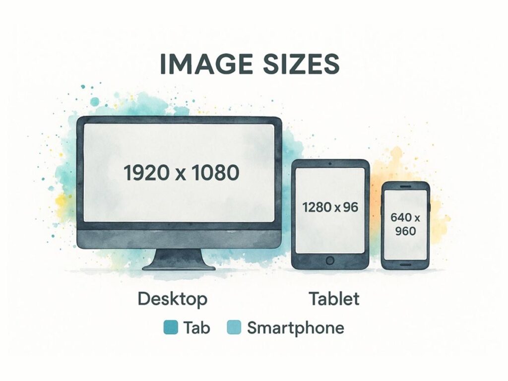
As you can see, dimensions need to scale down for mobile screens. This simple adjustment conserves bandwidth and ensures your images fit gracefully into much smaller viewports, creating a better mobile experience.
A Quick Guide to Dimensions
To make this even easier, here is a table with our recommended dimensions for common website images. Keep these numbers handy as a starting point for your own projects.
| Image Type | Recommended Desktop Dimensions (pixels) | Recommended Mobile Dimensions (pixels) | Common Aspect Ratio |
|---|---|---|---|
| Hero Image | 1280 x 720 | 360 x 200 | 16:9 |
| Full-Width Banner | 1600 x 900 | 480 x 270 | 16:9 |
| Blog Post Header | 1200 x 675 | 360 x 203 | 16:9 |
| In-Content Image | 1200 (width) | 320 (width) | Varies |
| Product Thumbnail | 300 x 300 | 150 x 150 | 1:1 |
| Gallery Image | 800 x 600 | 320 x 240 | 4:3 |
| Background Image | 1920 x 1080 | N/A | 16:9 |
These dimensions provide a solid foundation for building a fast, visually consistent website that looks fantastic on any device.
Understanding Aspect Ratios
Beyond raw pixel counts, the aspect ratio is your key to visual harmony. This is simply the proportional relationship between an image’s width and height. For example, a 16:9 ratio is the standard for widescreen formats, making it perfect for hero banners that need to feel expansive and cinematic.
By maintaining consistent aspect ratios for similar image types—like ensuring all your blog headers are 16:9—you create a clean, predictable rhythm that makes your site feel more professional. For instance, a desktop hero image at 1280 x 720 pixels (16:9) delivers that visual punch, while its mobile counterpart at 360 x 200 pixels maintains the same proportions.
Even huge background images, often sized at 1920 x 1080 pixels, benefit from this thinking. The key is to pair that high resolution with aggressive file size optimization—always aiming to keep them under 200 KB to prevent them from grinding your page to a halt. You can always find more data-backed image sizing recommendations to help fine-tune your strategy.
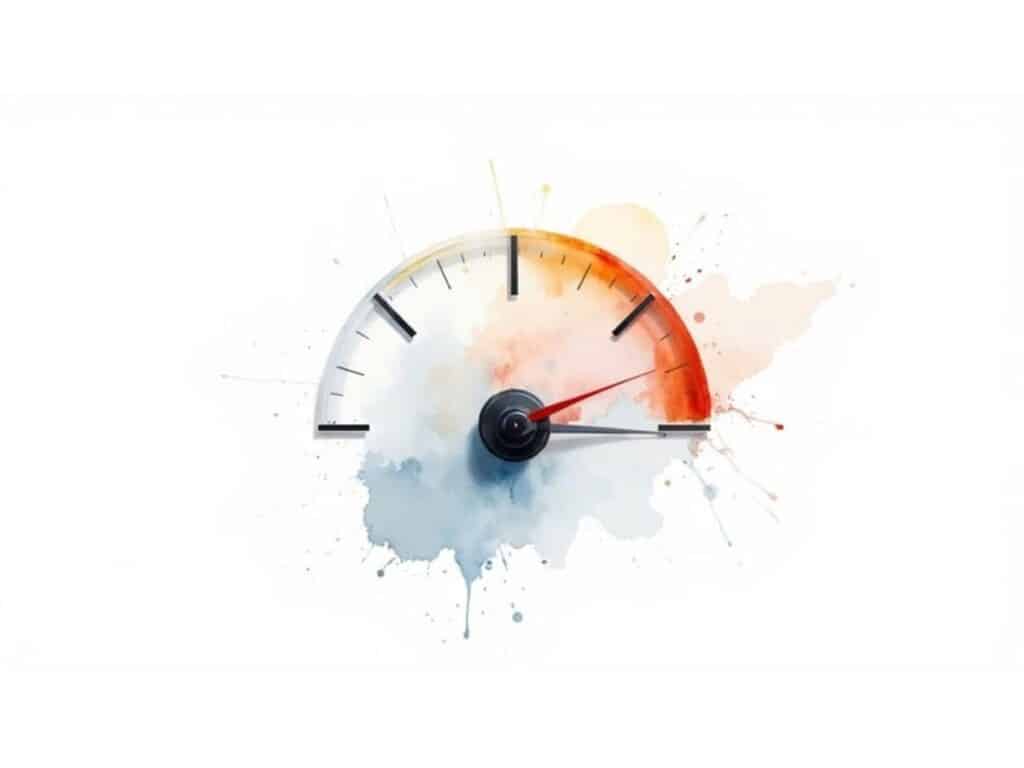
Mastering File Size for Faster Load Speeds
While pixel dimensions define an image’s space on a screen, its file size determines its digital “weight.” A heavy image is like a suitcase filled with bricks—it slows the entire journey down. For a website, that journey is the loading process, and heavy images will frustrate your visitors and drag down your search engine rankings.
Every single kilobyte matters. A beautiful, high-resolution photo that weighs several megabytes (MB) will bring your page to a screeching halt, especially for anyone on a mobile network. The true art is finding the sweet spot: an image that looks sharp and clear but is light enough to download in a flash.
The 150 KB Target Rule
As a powerful rule of thumb, aim to keep most web images under 150 KB. This isn’t a strict law, but it’s an invaluable guideline that forces you to prioritize performance.
Of course, this varies. A tiny icon might be only 10 KB, while a large, complex hero image might need to be closer to 200 KB. The core principle is to make every image as lean as possible without a noticeable drop in visual quality.
The key to hitting this target is compression. This process cleverly removes redundant data from the image file, shrinking its weight without your visitors ever noticing. And you don’t need expensive software to do it right.
With modern compression tools, it’s common to slash an image’s file size by 50-70% with no visible degradation. This screenshot from a free tool called Compressor.io shows just how effective this can be, reducing a file by over 70% with a simple drag-and-drop.
This makes it incredibly easy for anyone to shrink their images before ever uploading them to a website.
Lazy Loading: A Smarter Way to Load Images
Beyond shrinking the files themselves, we can also be smarter about how they’re loaded. This is where a clever technique called lazy loading comes into play.
Instead of forcing a visitor’s browser to download every single image on a page at once, lazy loading defers the process. It only loads images that are currently visible on the screen. As the user scrolls down, images are loaded just-in-time, right before they appear.
This simple change dramatically improves the initial load time. Your page feels significantly faster because visitors can start engaging with your content immediately, rather than waiting for images far down the page to finish downloading.
Lazy loading delivers a smoother, faster experience without sacrificing quality. It’s a strategic way to manage heavy assets, ensuring that your website feels responsive and immediate from the very first click.
Optimizing image file sizes and implementing techniques like lazy loading are fundamental steps in making your entire site faster. For a more comprehensive approach, consult this practical guide on improving website speed.
Choosing the Right Image Format for the Job
Picking the right image format is like choosing the right tool for a job. You wouldn’t use a hammer to turn a screw, so why would you default to JPEG for every image? Each format is built for a specific purpose, and understanding their strengths is fundamental to mastering the optimal size of images for websites.
Your choice of format has a direct and significant impact on the final file weight. Using the wrong one can bloat your file size for no good reason, slowing everything down. The right one, however, can deliver crisp, beautiful visuals at a surprisingly low weight.
The Classic Formats: JPEG and PNG
For years, the web has been dominated by two main formats, each with a clear role.
- JPEG (or JPG): The go-to choice for photographs and complex images with lots of colors and gradients. Its “lossy” compression is incredibly efficient at shrinking these types of images, striking a fantastic balance between quality and file size.
- PNG: This format shines where JPEGs fall short. Using “lossless” compression, it’s perfect for graphics with sharp lines, solid colors, or text, as it preserves every detail. Crucially, PNGs support transparent backgrounds, making them essential for logos, icons, or any graphic that needs to sit seamlessly over a colored background.
While these two are still reliable, relying on them exclusively means you’re leaving a lot of performance on the table.
Modern Formats: WebP and AVIF
The real magic for modern web performance lies in next-generation formats. These were engineered from the ground up for the web, and their compression technology is simply on another level.
Modern formats like WebP and AVIF are your high-performance champions. They can slash file sizes by an additional 25-50% compared to an equivalent JPEG or PNG, often without any noticeable loss in visual quality.
WebP, a format developed by Google, is a fantastic all-rounder. It supports both lossy and lossless compression, transparency, and even animation. This makes it a versatile replacement for both JPEGs and PNGs, but at a much smaller file size.
AVIF is the newer contender, offering even more aggressive compression. It can produce some of the smallest file sizes possible while maintaining impressive quality. While its adoption is still growing, it’s a clear look at the future of highly optimized web images.
Worried about compatibility? Don’t be—at least not with WebP. As this screenshot from CanIUse.com shows, the support is already there.

As you can see, every major modern browser fully supports WebP, making it a safe and incredibly effective choice for your website today. Getting the format right is a huge step, and you can dive even deeper with our complete guide on how to optimize website images. This knowledge is power—the power to make your site faster for your users and more attractive to search engines.
Implementing Responsive Images for a Flawless Mobile Experience
In a world where most of your audience is on a smartphone, you can’t just shrink a desktop image and call it a day. While that old trick might make an image look right, it comes with a heavy penalty: the user’s phone is still forced to download a massive, high-resolution file it doesn’t need. This burns through their data and kills your page speed.
This is exactly why responsive images are non-negotiable for a high-performing website. The strategy is to serve each user an image that’s perfectly optimized for their specific device. This approach delivers sharp visuals without the baggage of an oversized file, creating a better, faster experience for everyone.
Using srcset and <picture> for True Responsiveness
The two workhorses for this job are the srcset attribute and the <picture> element. Think of them like a coffee shop offering small, medium, and large lattes. Instead of forcing everyone to take a giant cup, you let them pick the size that’s right for them.
These HTML tools allow you to provide the browser with a menu of image options. From there, the browser intelligently analyzes the device’s screen size, pixel density, and even network speed to select the most efficient image from your list. This simple step prevents a phone on a shaky 4G connection from ever downloading an image meant for a 27-inch iMac.
By providing multiple image sources, you empower the browser to make the smartest choice for the user. This simple act of giving the browser options is the key to creating a truly fast and adaptive visual experience for everyone.
The srcset attribute is fantastic for the most common scenario: serving different sizes of the same image. For more complex situations, the <picture> element gives you surgical control, letting you serve completely different images or formats based on specific rules—a technique often called “art direction.”
The Mozilla Developer Network, a gold-standard resource for web developers, provides a perfect, practical example of how srcset works in action. The code shows how different image files (elva-fairy-480w.jpg, elva-fairy-800w.jpg) are listed with their actual widths (480w, 800w). The browser uses this information, plus the sizes attribute, to figure out which one is the most efficient to download.
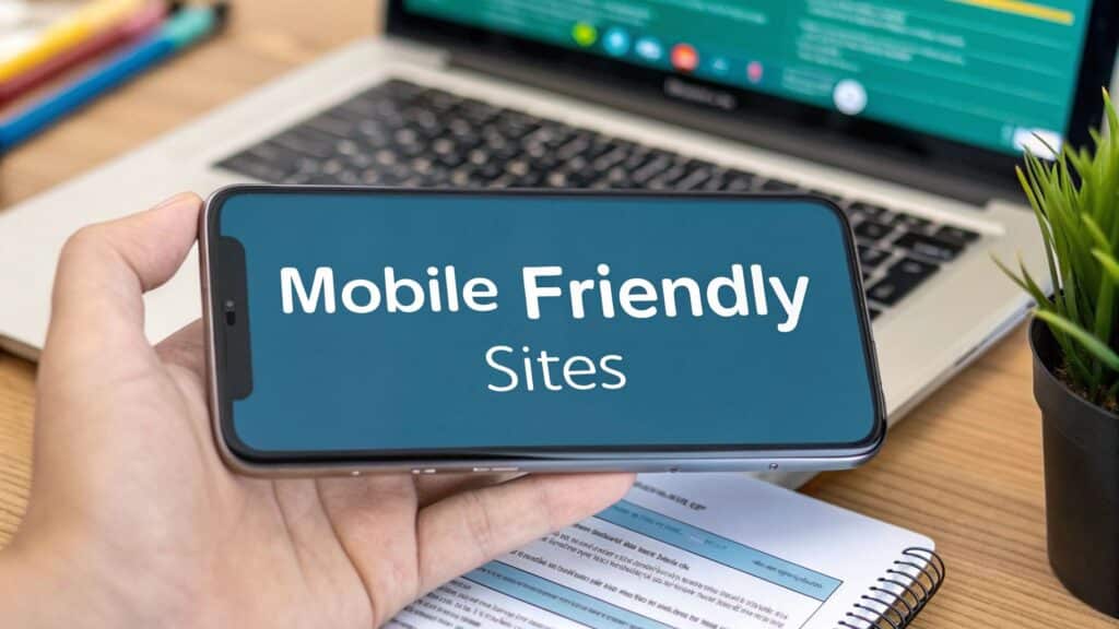
Mastering these techniques is a cornerstone of professional web development. To learn more about building a seamless mobile experience, check out our guide on mobile-friendly website design.
Your Go-To Image Optimization Checklist
Putting everything we’ve discussed into practice is what separates a fast, professional website from a slow, frustrating one. Use this checklist as your final pre-flight check before you upload any image. Following these steps consistently is the surest way to build a site that loads quickly and keeps visitors engaged.
The Optimization Workflow
Get the Dimensions Right: First, resize your images before you upload them. Match the image width to its largest possible container on your site. A practical guideline is 1280px wide for a full-width hero image and around 1200px wide for a standard blog post image.
Pick the Right Format: Your default format should almost always be WebP. It offers a fantastic mix of high quality and small file size. Only use PNG when you absolutely require a transparent background.
Compress, Compress, Compress: Every single image needs to go on a diet. Your target weight should be under 150 KB. You can usually achieve this by setting the quality to 70-80% in your compression tool. This slashes the file size dramatically without any noticeable drop in visual quality.
Code for Responsiveness: This is where the magic happens for your mobile users. Use the
srcsetattribute in your<img>tags to provide the browser with a menu of image sizes. It will then automatically serve the smallest, most efficient file for whatever screen it’s being viewed on.
Common Questions About Image Sizing
You’ve got the basics down, but a few practical questions always come up. Let’s tackle some of the most common ones I hear from clients and colleagues.
Will Compressing My Images Make Them Look Blurry?
Not if you do it right. This is an understandable fear, but modern compression tools are incredibly sophisticated. They use smart algorithms to reduce file size without any perceivable loss in quality.
For most web images, a quality setting of 70-80% hits the sweet spot. We call this “visually lossless” compression—the file is dramatically smaller, but to the human eye, it looks just as sharp as the original. Always give your compressed image a final check before publishing to ensure it meets your standards.
What Are the Best Free Tools for Image Optimization?
You don’t need to spend a fortune to get professional results. There are several fantastic free tools that I recommend all the time.
- For quick, drag-and-drop compression online, you can’t go wrong with TinyPNG, Compressor.io, or Google’s own Squoosh. They are simple, fast, and effective.
- If you need more control, like resizing and offline editing, GIMP is an amazing open-source alternative to Photoshop.
Don’t forget that your website platform can often do the heavy lifting. If you’re on WordPress, for example, plugins like Smush or ShortPixel can automatically optimize every image you upload, saving you a huge amount of time.
How Should I Size Images for Retina Displays?
To keep your visuals looking crisp on high-resolution screens (often called “Retina” displays), the rule of thumb is to create a version that is twice the display size. For example, if your image container on the page is 400×300 pixels, you should also have an 800×600 pixel version ready.
Here’s the crucial part: you don’t want to serve that giant file to everyone. The best practice is to use the
srcsetattribute in your HTML<img>tag. This clever code lets the browser choose the right image—the standard 1x version for regular screens and the larger 2x version only for high-density displays. It’s the key to delivering sharp visuals without slowing down the site for everyone else. You can dig deeper into the technicals of screen resolutions on Wikipedia.
At Galant Studios, we turn these technical details into real-world business results. If you’re looking to build a faster, better-ranking website that turns visitors into loyal customers, check out our expert SEO and web design services.